 Deployant
New: MB&F; Horological Machine 9 ‘Flow’
MB&F; extends the HM9 model line with two new models in titanium and red gold, with two dial styles. Introducing the MB&F; HM9 "Flow".
5,234 articles · 46 videos found · page 150 of 176
Deployant
MB&F; extends the HM9 model line with two new models in titanium and red gold, with two dial styles. Introducing the MB&F; HM9 "Flow".
 SJX Watches
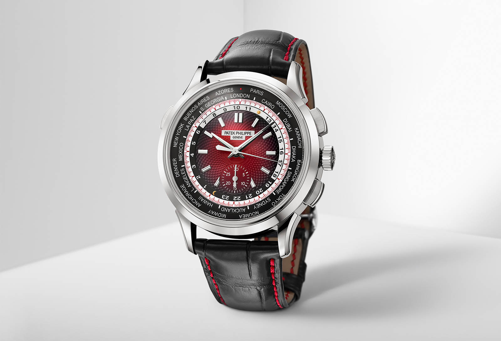
To mark the Singapore Grand Exhibition, which is now into its second day, Patek Philippe has unveiled a special-edition World Time Chronograph ref. 5930G-011 for the Southeast Asian market. Limited to 300 pieces, the watch has a white gold case paired with a smoked, red guilloche dial that darkens towards the edges. It features a dark grey city disc, on which “Singapore” replaces “Beijing” for the time zone of GMT+8. The rest of the watch is identical to that of the standard version that was first unveiled in 2016 with a white gold case paired with a blue dial. It measures 39.5mm wide and 12.8mm in height, which is rather impressive considering it houses a full-rotor movement, with a vertical-clutch, column-wheel flyback chronograph as well as a world time module. A corrector pusher at 10 o’clock advances the cities disc, hour hand and 24-hour scale in one-hour increments. All that needs to be done is to set the city corresponding to the local time zone to the 12 o’clock position. The local time will be indicated by the hands while the time in all other time zones can be read off the 24-hour scale. The 30-minute counter for the chronograph is located at six o’clock, while the seconds scale for the chronograph is located between the cities and 24-hour discs. Visible through the sapphire case back, the CH 28-520 HU movement is based on the CH 28-520 chronograph caliber, controlled by a vertical clutch, with the addition of a world time module based on the co...
 SJX Watches
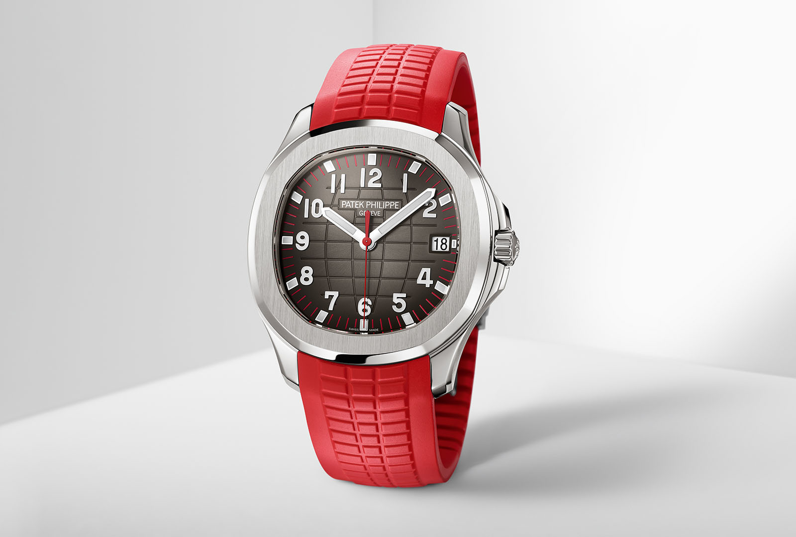
Since its introduction in 2007, the popularity of the Aquanaut 5167A has followed on the coattails of the Nautilus Ref 5711/1A. And now for the occasion of the Watch Art Grand Exhibition in Singapore, Patek Philippe has unveiled a special-edition Aquanaut ref. 5167A-012 with red accents and a red strap. The dial features the Aquanaut’s traditional chequerboard motif, but with red minute markers and a red central hand. The addition of colour is a nod to Singapore’s flag, which is red and white. Though the cosmetic changes are minimal, the overall effect of which is nonetheless striking and appealing. Depth rated to 120m, the case remains 40mm in diameter and is paired with a red composite strap. It houses the cal. 324 S C, which is visible through a sapphire case back that has been printed with the inscription “Patek Philippe Singapore 2019”. The cal. 324 S C is the brand’s central-rotor automatic movement that is fairly ordinary but attractively finished. It offers a short 35- to 45-hour power reserve, and as with all of Patek Philippe’s current movements, it is fitted with a Gyromax balance wheel, which is essentially a free-sprung, adjustable mass balance, as well as a silicon Spiromax hairspring. Key facts Diameter: 40mm Height: 8.1mm Material: Stainless steel Water-resistance: 120m Movement: cal. 324 S C Functions: Hours, minutes, seconds; date Winding: Self-winding Frequency: 28,800bph, or 4Hz Power reserve: 35 to 45 hours Strap: Red composite Pr...
 SJX Watches
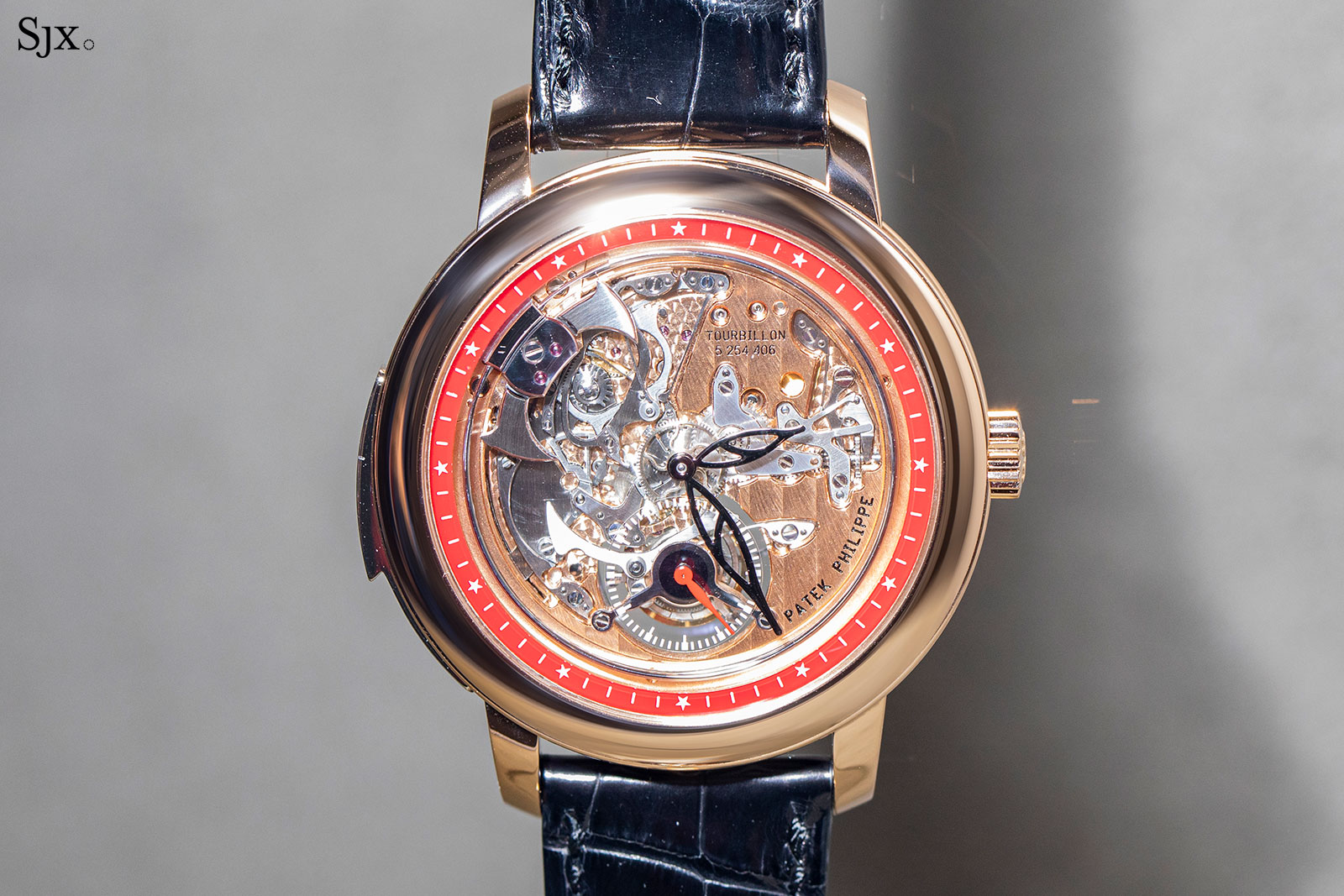
Of the special edition watches created for the Watch Art Grand Exhibition Singapore 2019, one is entirely new, and it also happens to be the most complicated – the Minute Repeater Tourbillon Singapore 2019 Ref. 5303R-010. The model reference reveals the key design feature of the watch, like the preceding ref. 5304R, the new watch has no dial, so the mechanics below are revealed in all their glory. This creates a first for a Patek Philippe wristwatch – it shows the tourbillon regulator at six o’clock, something that has historically been hidden on the back of all wristwatch tourbillons. Protecting the tourbillon The rationale for hiding the tourbillon from view was to prevent exposure to UV light, which can ostensibly break down the lubricants that keep the tourbillon in optimum running condition. Consequently, the sapphire disc over the tourbillon regulator has a UV protection coating to prevent the lubricants from being exposed to sunlight. A reworked movement The new ref. 5303R is powered by the R TO 27 PS movement, which combines a minute repeater and tourbillon. Though it’s based on the longstanding cal. R 27, the movement was significantly reengineered to show off the striking mechanism under the dial. Amongst the changes are a larger base plate, as well as a rearrangement of the hammers and gongs, which required 20 new components to be added. Interestingly, the hammers have been slightly ground down around the edges that point towards the hands, so as ...
 Revolution
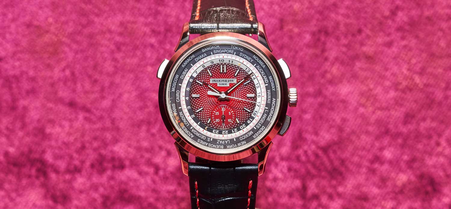
The five 2019 Patek Philippe Watch Art Grand Exhibition Special Editions indlucing the Ref. 5531 World Time Minute Repeater with cloisonné enamel dial
 Time+Tide
At the upcoming Sotheby’s Important Watches auction, you can browse the catalogue and find all manner of incredibly rare and important watches and clocks from all the best watchmakers in the world. There is everything you would expect, and more, including a possibly unique red dial Rolex Daytona, a factory gem-set yellow gold Rolex GMT-Master, … ContinuedThe post Best 5 watches for under $5K at the Sotheby’s Important Watches auction appeared first on Time+Tide Watches.
 SJX Watches
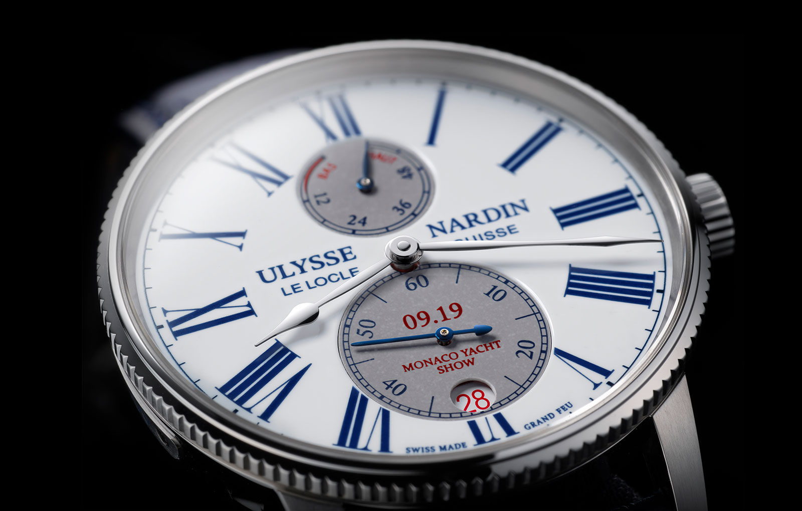
First introduced two years ago as an entry-level model styled on vintage marine chronometers, the Marine Torpilleur has just received an upgrade. The Marine Torpilleur Monaco Yacht Show is a limited edition fitted with a grand feu enamel dial, created to mark the watchmaker’s sponsorship, now in its 11th year, of the annual yachting event in Monte Carlo harbour. While the standard model has a brass dial, the Monaco edition has a three-part dial made of vitreous enamel that’s fired in an oven – a desirable feature that increases its retail price by a modest 20% or so. Like all of Ulysse Nardin’s enamel dials, it is produced by Donze Cadran, a subsidiary of the watchmaker that’s one of the few dial makers in Switzerland able to make fired enamel dials in substantial numbers. An old school dial The dial starts out as a copper disc that is covered with white enamel powder that’s then baked in a small oven, several dials at a go, to melt the enamel and fuse it to the dial. The dial has two apertures for each of the sub-dials, which are separate pieces that are covered in grey enamel and fired separately. After they are fired, the dials are printed with enamel markings, resulting in another trip to the oven to set the markings. Then the apertures on the main dial, as well as the edges of the sub-dials, are filed by hand to ensure a perfect fit with each other. Once complete, the sub-dials are soldered to the main dial. The dial is marked “09.19” – the m...
 WatchAdvice
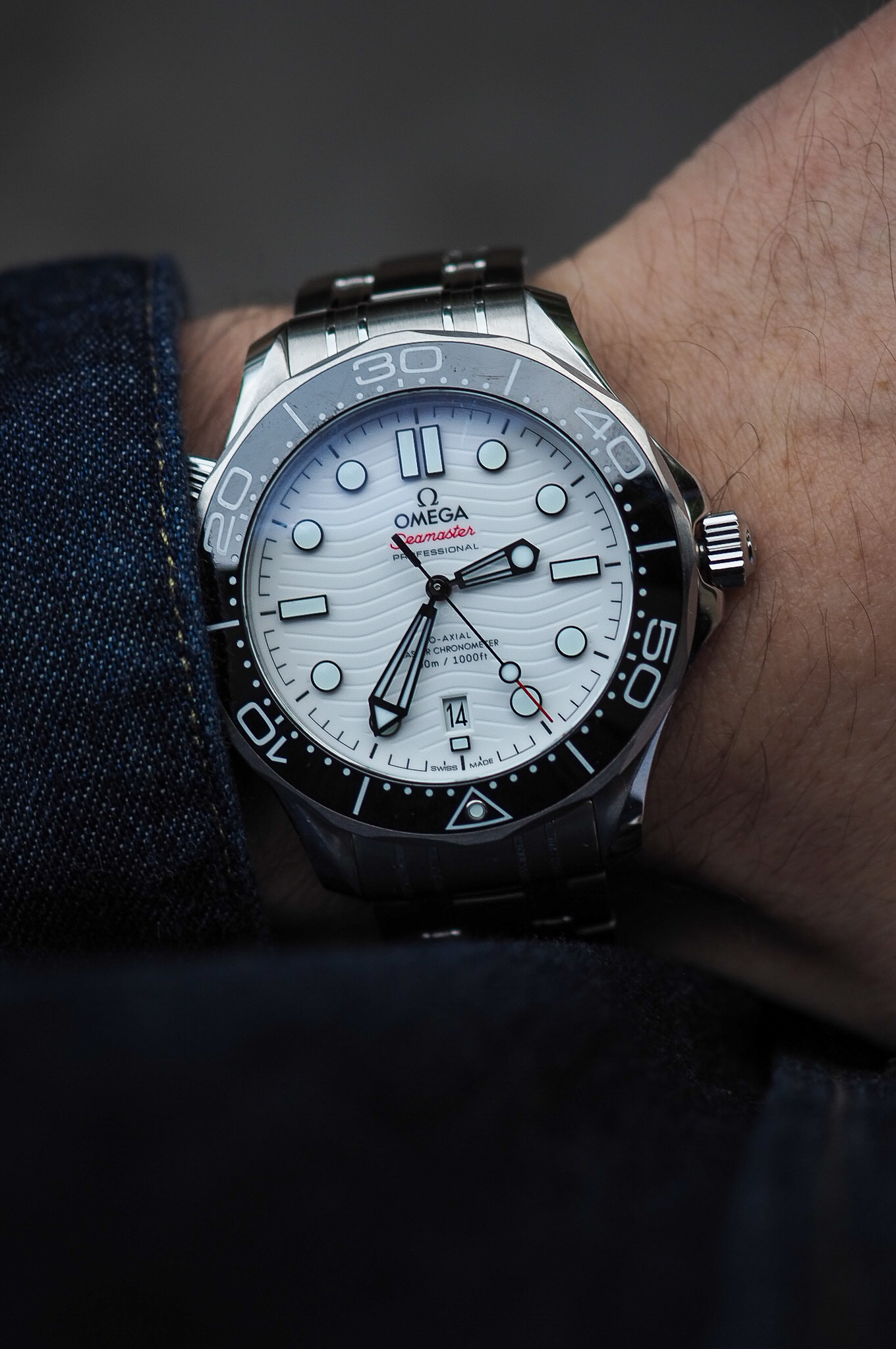
We recently had the opportunity to spend a weekend with the white dial Omega Seamaster Diver 300M, thanks to Omega Australia. Although this model was released in March this year at Time To Move 2019, the watch isn’t available for purchase just yet – so this was the first time I’ve had the chance to see it in the metal. The white dial variant of the Seamaster Diver 300M was an addition to the existing collection, and somewhat of a sleeper when launched, so I’ve been hanging to get some hands-on time with the timepiece. First impressions The white Seamaster Diver 300M is a handsome watch. The design is modern and forward-looking, at a time when a lot of dive watches are still looking to their past for inspiration. The build quality is impressive, and the price is right. If you’re a fan of dive watches, I highly recommend you check out the highly versatile Omega Seamaster Diver 300M collection, which is a compelling proposition in the $5,000 – $10,000 dive watch category. The case The stainless steel case comes in at 42mm, and 20mm between the lugs. On wrist, the case is comfortable, and hugs nicely. The Seamaster Diver 300M wears slightly smaller than your typical 42mm watch, which is due to the shorter lugs that balance out the larger case. Housed inside is the Omega Master Chronometer Calibre 8800, a self-winding movement, with METAS approval. Boasting a capable 55-hour power reserve, the Calibre 8800 is visible through a sapphire crystal display caseback. The ...
 Deployant
We bring you the details and our thoughts on the new Audemars Piguet Royal Oak Frosted Gold Chronograph in white gold with purple dial.
 SJX Watches
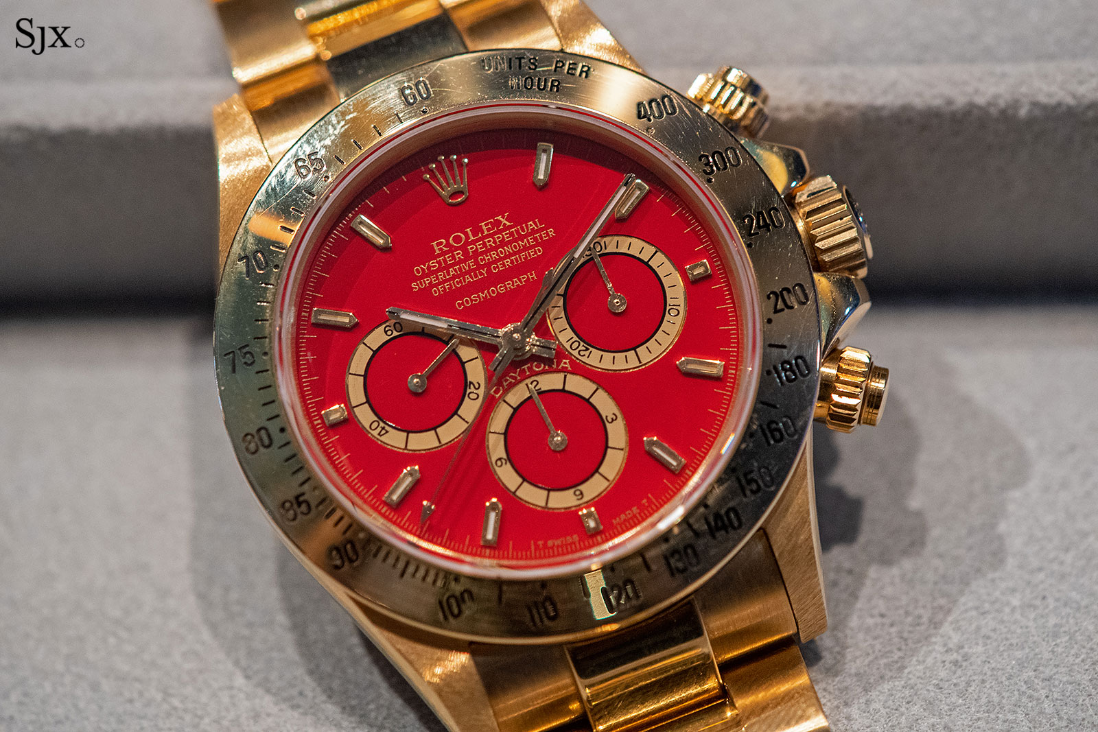
The most talked-about watch at Sotheby’s upcoming Important Watches auction in Hong Kong is lot 2300, a Rolex Cosmograph Daytona powered by a Zenith El Primero movement that’s described as “a possibly unique… chronograph wristwatch with a red dial”. And as with all high-profile watches, the auctioneers have given the watch an Italian nickname, “Luna Rossa”, which translates as “red moon”. The reason the “Luna Rossa” is controversial is because such a red dial has never ever been seen before. Usually unicorns are known and whispered about, even if seldom seen, but the “Luna Rossa” has surprised everyone. Experts and insiders I approached have neither encountered nor heard of such a dial, which makes it quite a revelation. But they all agree it is correct – in the sense that all elements are identical to known Rolex dials of the period – though of unknown origin. Sotheby’s itself hasn’t provided much background about the watch, either officially or unofficially. Unlike the unique platinum Daytona “Zenith” that Sotheby’s sold last year, setting a record price for a modern Daytona, which had a backstory that was I managed to uncover, the “Luna Rossa” remains a mystery. The dial is glossy red lacquer, with gold indices and sub-dials When such unusual dials emerge, the immediate question is one of authenticity. The “Luna Rossa” passes the test – the dial is correct in its details. The element usually regarded as crucia...
 Deployant
Brand new for BaselWorld 2019, Sinn has designed a limited edition of their classic pilots watch, the new Sinn 104 St Sa A G. Limited to 500 pieces globally, the Sinn 104 St Sa A G is the first 104 A model to feature a non-black dial. The watch is officially sold out and available only on the secondary market.
 Time+Tide
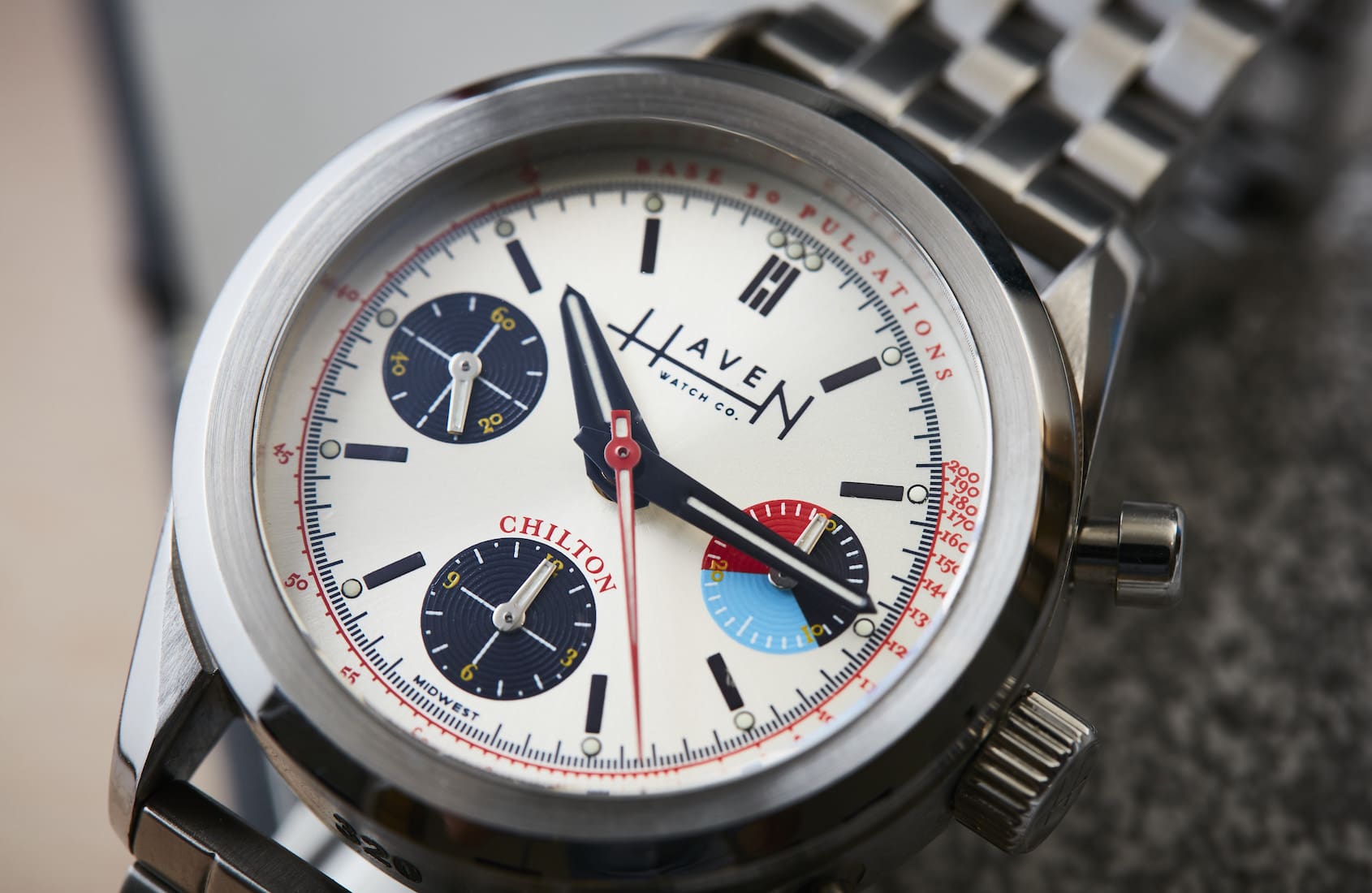
In an unending stream of vintage-inspired wristwatches that are just a little bit off (you know what I mean), you cling to a watch that gets it right like a life raft. The Haven Watch Co. Chilton is exactly that life-saving device, with it tastefully sized at 37mm, and offering a visually compelling dial. Taking … ContinuedThe post HANDS-ON: The Haven Watch Co. Chilton appeared first on Time+Tide Watches.
 SJX Watches
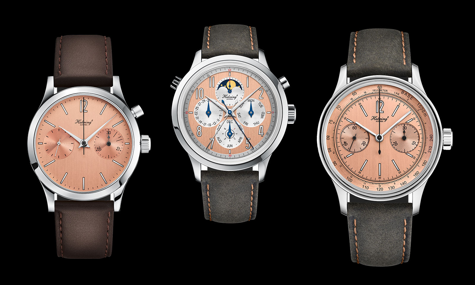
Austrian watchmaker Habring2, highly regarded for its smart, affordable watches, has just revealed the Salmon collection. The new line-up is made up of all of the brand’s key models, but with each watch now offered with a salmon dial. Once found occasionally on vintage watches and now a popular shade for that reason, salmon dials are a novelty for Habring2, led by husband and wife team Richard and Maria Habring. The brand typically offers its watches in more straightforward shades of silver, blue, black or grey. The salmon colour Habring2 opted for is a strong pink, closer to salmon than copper or pink gold. Here are a few photos of the watches “in the metal” supplied by the Habrings to show how the salmon dials vary in tone depending on the light. The top of the line model is the Perpetual Doppel, recently launched to mark the brand’s 15thanniversary. Its salmon dial is combined with silvered numerals and blued steel hands, the only model in the Salmon collection with heat-blued hands. The range also includes the entry-level, time-only Felix as well as the single-button Chrono-Felix. Both measure only 38.5mm in diameter, and are also the amongst the thinnest watches made by Habring2. And the more complicated models are the Doppel Felix split-seconds chronograph with its “bullhead” pusher layout, and the inventive COS Felix. Short for “crown operated system”, the COS chronograph is activated entirely via the crown, which is turned either forwards o...
 Deployant
Most seasoned watch collectors will easily recognize the usual culprits, the Pateks, Rolexes, APs, Richemont/Swatch/LVMH brands from a distance. In order to make this list of watches that qualify as stealth wealth, we have chosen timepieces that are 'unexpectedly' expensive, yet not instantly recognizable. They look simple on the dial side, yet have hidden complications and/or 'insane' finishing.
 Deployant
We take a quick look at the Vacheron Constantin FiftySix Complete Calendar in a gorgeous new blue dial. We covered the watch in detail earlier.
 Time+Tide
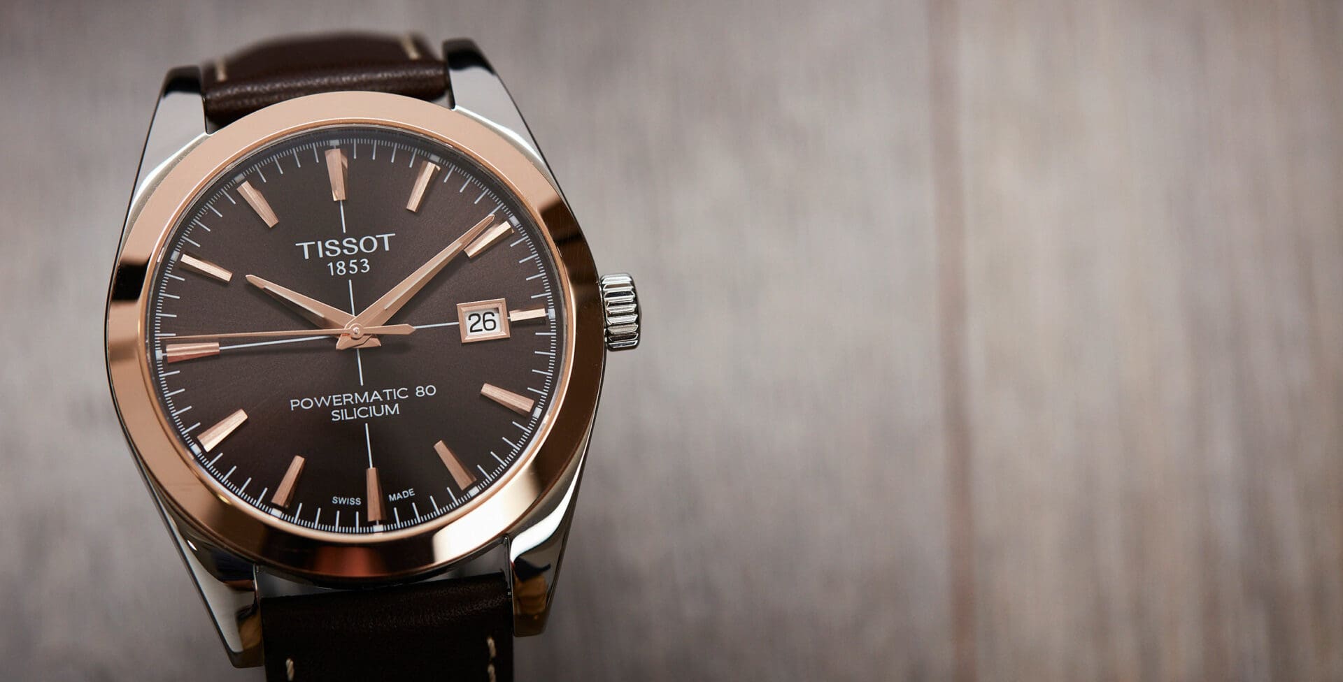
In the field of watch design there’s a lot to be said for restraint. Not every dial needs to be flashy, nor every case overwrought. Sometimes, all you need - all you want even - is a watch that looks good (no matter what), and can do anything, or at least anything most normal people … ContinuedThe post VIDEO: The perfect gentleman – Tissot’s Gentleman Automatic appeared first on Time+Tide Watches.
 Time+Tide
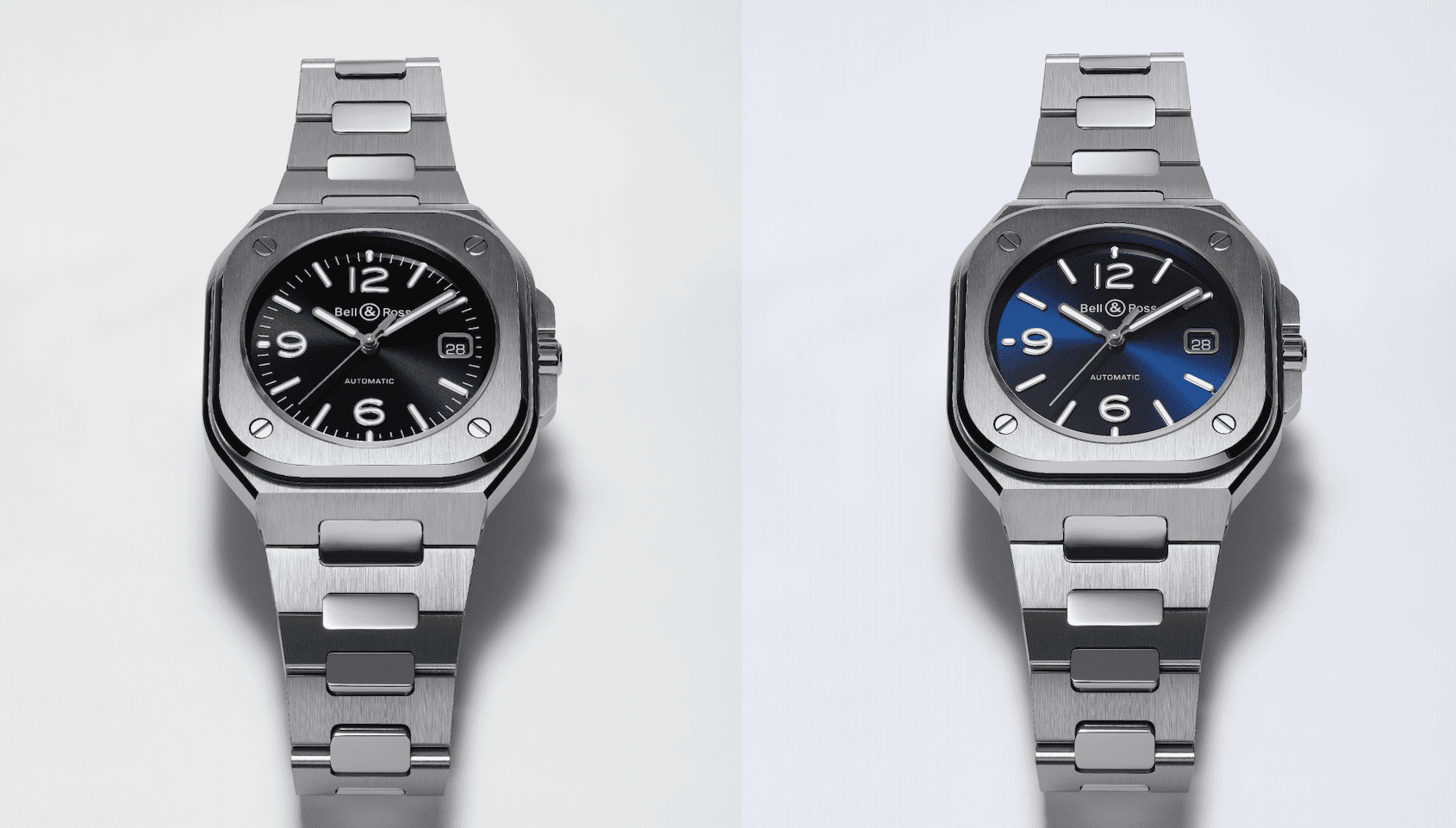
For any brand creating a new collection, the challenge lies in the tension between aesthetic innovation and consistent design language. With the new Bell & Ross BR05, the brand has successfully maintained their core visual identity with a circular dial and squared-off case, exposed screws at the corners of the case, and bold Arabic numerals. … ContinuedThe post INTRODUCING: The Bell & Ross BR05 appeared first on Time+Tide Watches.
 Hodinkee
A unique, complicated Rolex with a diamond dial and a strange history? Yes, please.
 SJX Watches
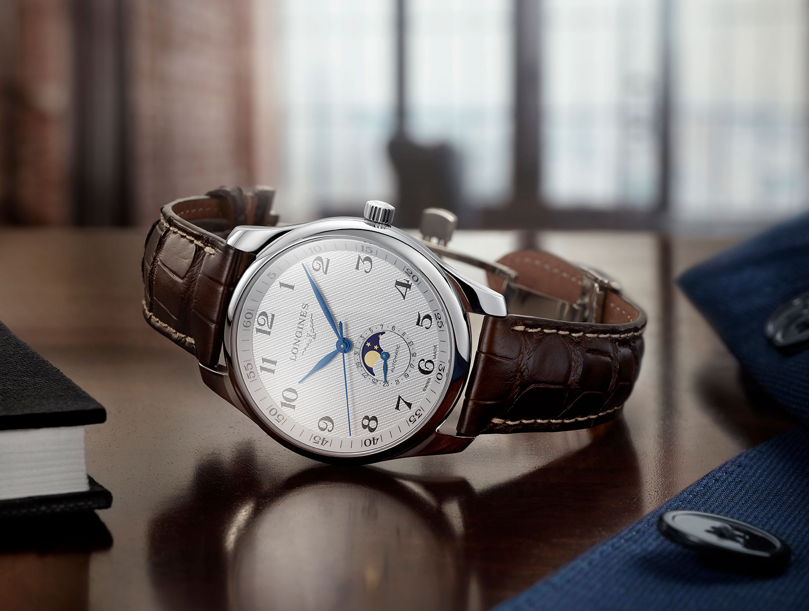
Longines’ Master Collection excels at entry-level complications that are affordably priced – last year’s annual calendar is a great buy – and the latest in the range is a moon phase and date. The Master Collection Moonphase is a watch that’s clear in what it wants to to. Aside from the time, it has a pointer date and moon indicators in a sub-dial at six, for a clean and symmetrical dial. The Master Collection Moonphase ref. L2.919.4.78.3 It’s powered by the L899 movement, an automatic based on the ETA A31.L91, which is an upgraded version of the common ETA 2892. The most obvious functional upgrade is the extended 64-hour power reserve, achieved in part by reducing the beat rate of the balance wheel from 4Hz to 3.5Hz. Like many other models in the Master Collection, the new moon phase is offered in two cases sizes – 40mm and 42mm – both in stainless steel. Dial options are silvered barleycorn guilloche, black barleycorn, or sun-ray brushed metallic blue. The smaller, 40mm case is also offered with brilliant-cut diamond hour markers on all dial styles. The Master Collection Moonphase 42mm The ref. L2.909.4.97.0 with diamond markers Key facts Diameter: 40mm or 42mm Material: Stainless steel Water resistance: 30m Movement: L899 Functions: Hours, minutes, second, moon phase and date Winding: Automatic Frequency: 25,200bph, or 3.5Hz Power reserve: 64 hours Strap: Leather strap or steel bracelet Price: US$2,350 for all versions, US$2,750 for the 40...
 SJX Watches
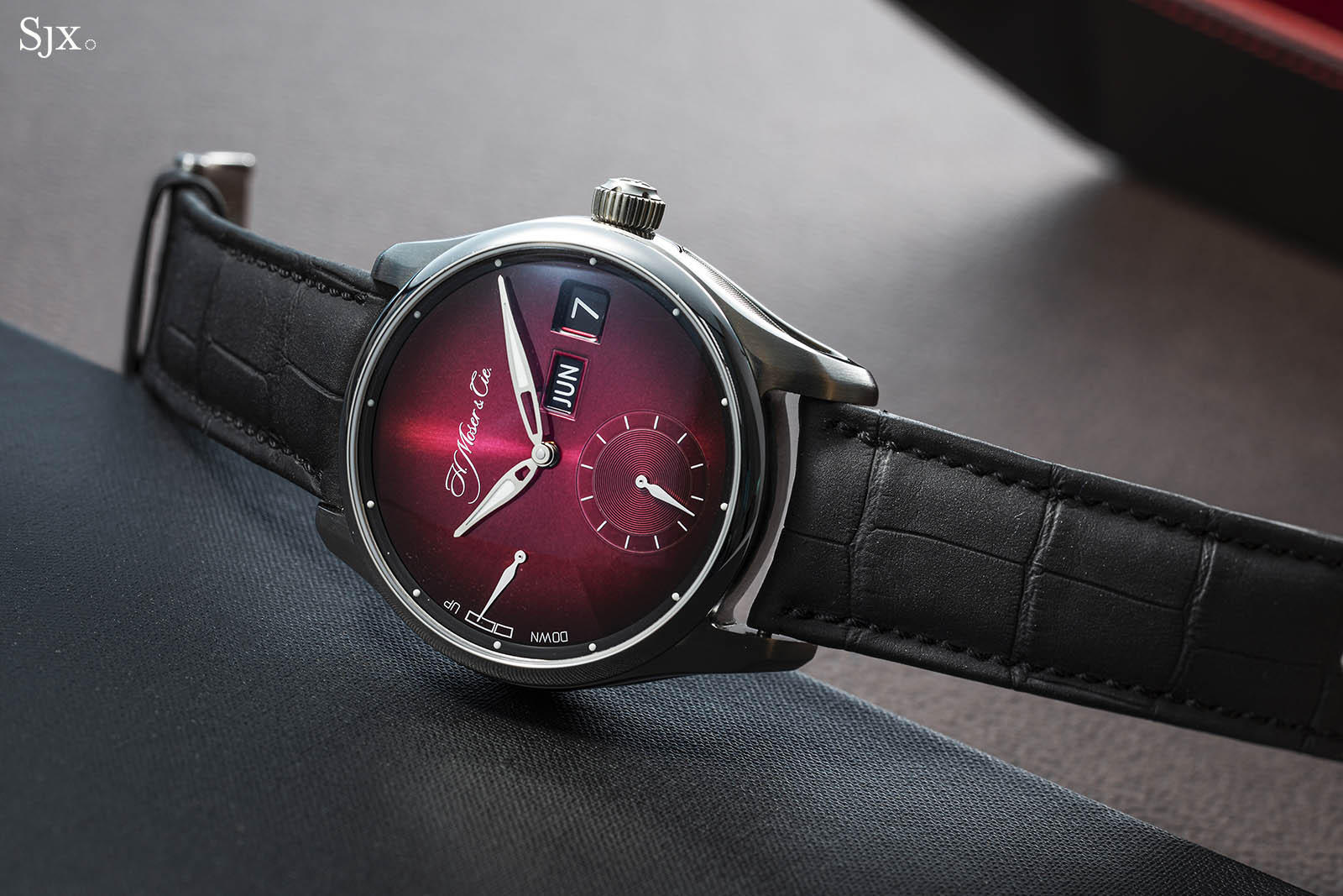
Over the last couple of years, H. Moser & Cie has become well-known for its playful jabs at the industry’s foibles – see exhibit one – as well as its provocatively pared back “concept” watches that are completely devoid of indications and logos. But its latest release, the Pioneer Perpetual Calendar MD “Raspberry”, is a return to its roots – a visual revamp of its ingenious perpetual calendar with the added flourish of a gorgeous burgundy fume dial. The perpetual calendar was the watch that made collectors sit up and take notice of Moser when the name was revived in 2005. With a minimalist, sensible display and ingenious mechanics, it was developed with the help of Andreas Strehler, an independent watchmaker who often builds complications for other brands. Though it has been around for over a decade now, it remains one of the most advanced perpetual calendars both in terms of function and practicality. The “Raspberry” is a variant of the perpetual calendar sports watch first launched two years ago. The new Pioneer Perpetual Calendar “Raspberry” Raspberry fumé In contrast to the classical Endeavour Perpetual Calendar that has is not a sports watch, hence its 30m depth rating, the Pioneer Perpetual Calendar MD incorporates a screw-down crown and is water-resistant to 120m. The case is stainless steel, and like most Moser watches, is substantially sized, measuring 42.8mm wide but a relatively slim 11.3mm in height, excluding the domed crys...
 Hodinkee
A "mystery dial" explores time and space.
 Deployant
We bring you the details and our thoughts on the new Toric Hémisphères Rétrograde Slate, now with a hand-engraved slate grey dial.
 Time+Tide
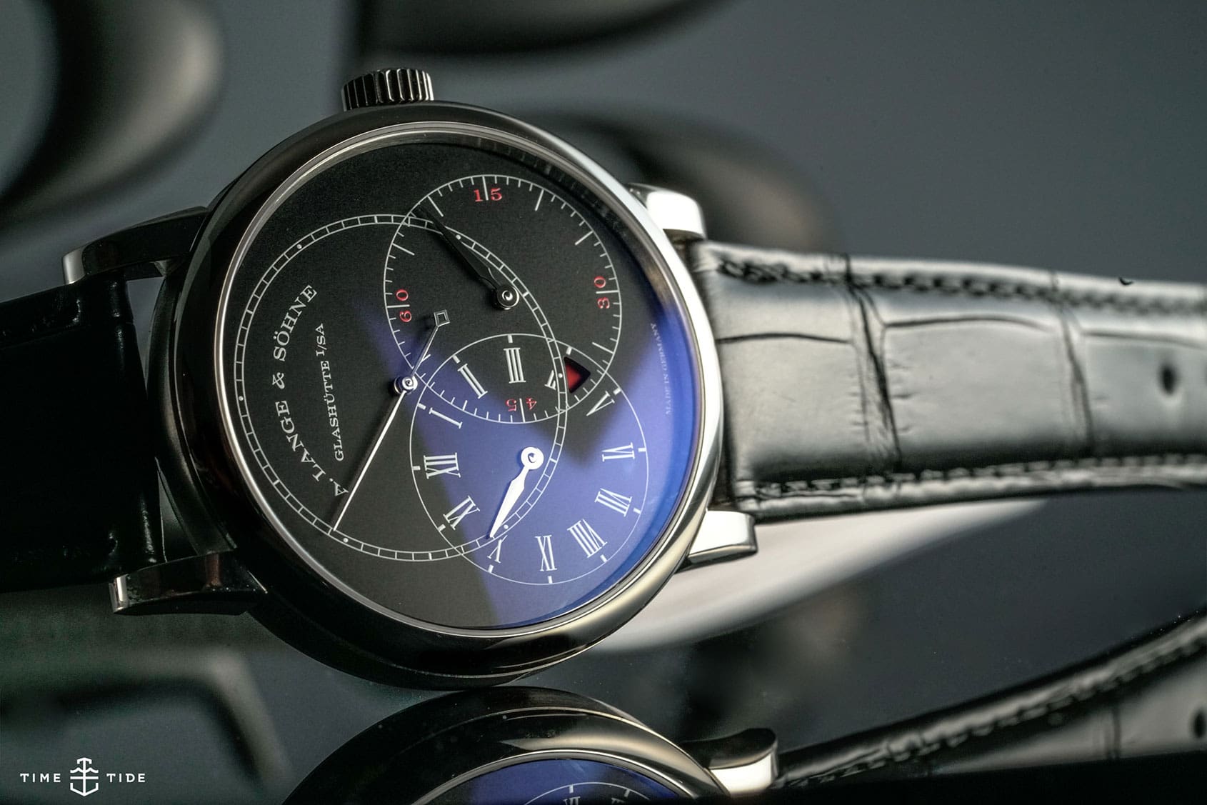
A. Lange & Söhne’s Richard Lange Jumping Seconds is a real insider watch. From the dial it looks much like many other Lange watches, but really, it’s something quite special. It’s a watch that’s been around since 2016, but this year we were treated to a chic new version, in white gold with a black … ContinuedThe post HANDS-ON: The A. Lange & Söhne Richard Lange Jumping Seconds in black appeared first on Time+Tide Watches.
 Time+Tide
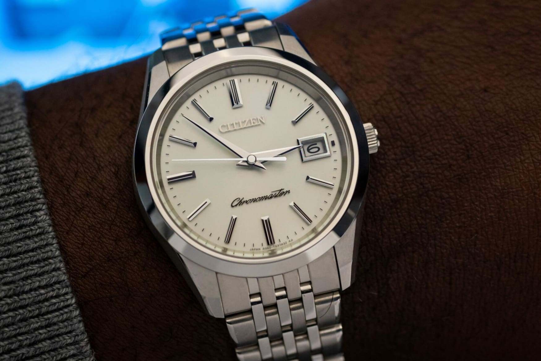
Citizen makes some very accurate quartz watches. The Citizen Chronomaster has just been released in new limited edition dial colours.The post Accurate AF – the Citizen Chronomaster limited editions appeared first on Time+Tide Watches.
 Time+Tide
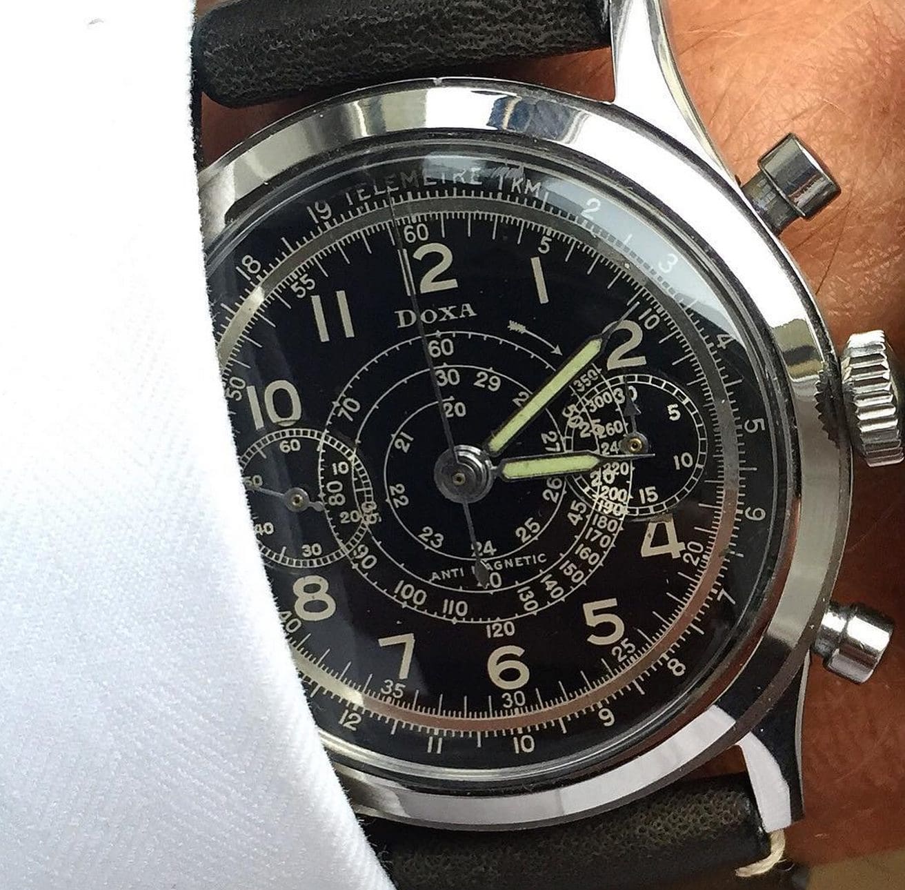
Editor’s note: Everyone knows Doxa make a great dive watch, but not as many people know they also produced excellent chronographs in the 1940s and ’50s. This is the story of one of those watches, a black dial Doxa chronograph with a spiral telemeter scale, worth significantly more than the €1200 Paul originally laid down … ContinuedThe post The DOXA Chronograph – as good as their divers? appeared first on Time+Tide Watches.
 Time+Tide
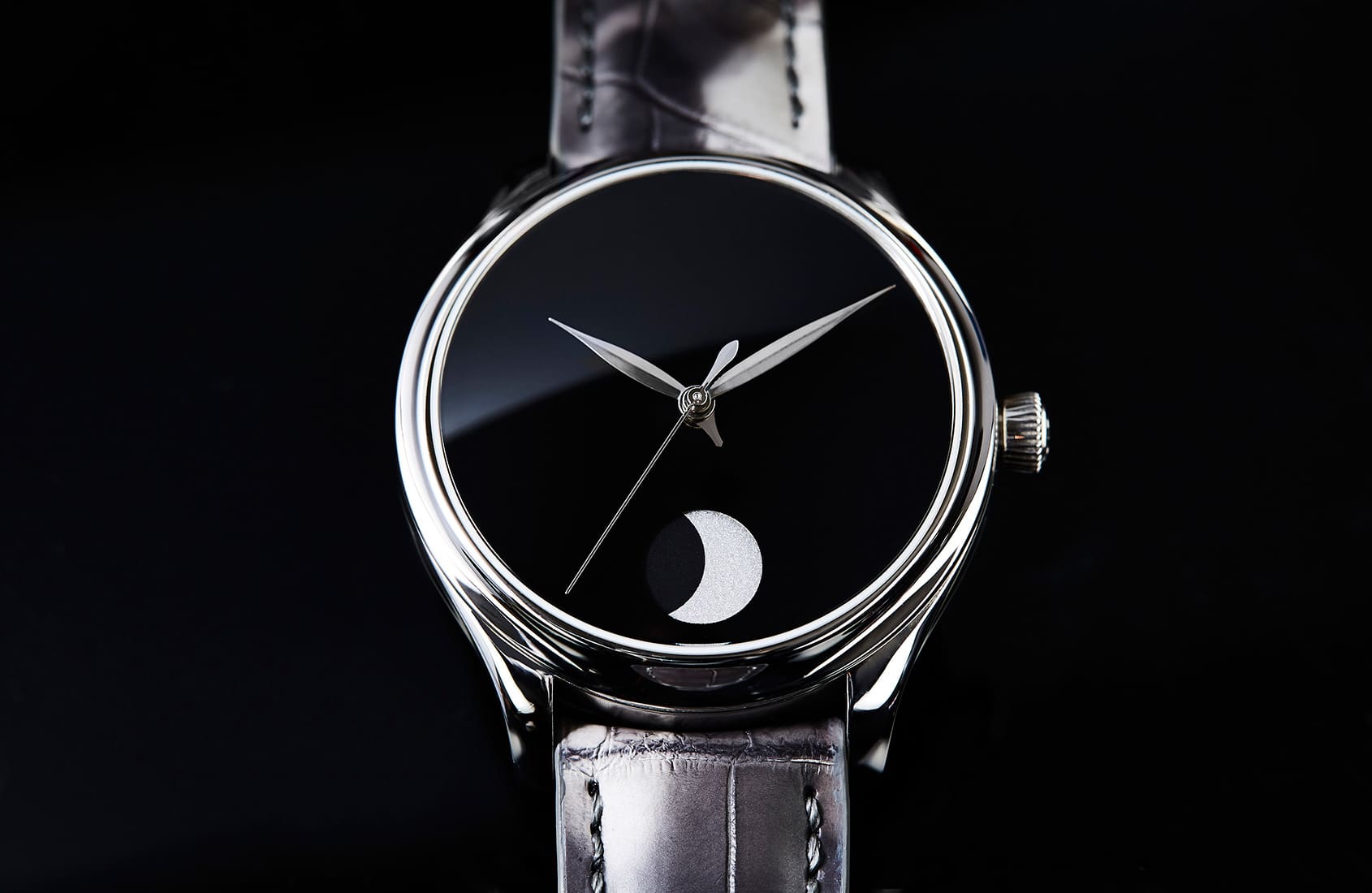
Editor’s note: Without doubt, the most popular dial colour for men’s watches is black. So, here’s the blackest, darkest dial we can think of - the H. Moser & Cie Endeavour Perpetual Moon Concept. To find out why this watch is so impossibly dark of dial, read on … Few colours have the symbolic weight … ContinuedThe post Unfathomably inky – Moser’s Endeavour Perpetual Moon Concept appeared first on Time+Tide Watches.
 Revolution
Delve into the history of dial design and the elements that make up some of the most famous watch faces of our time. In part 3: numerals.
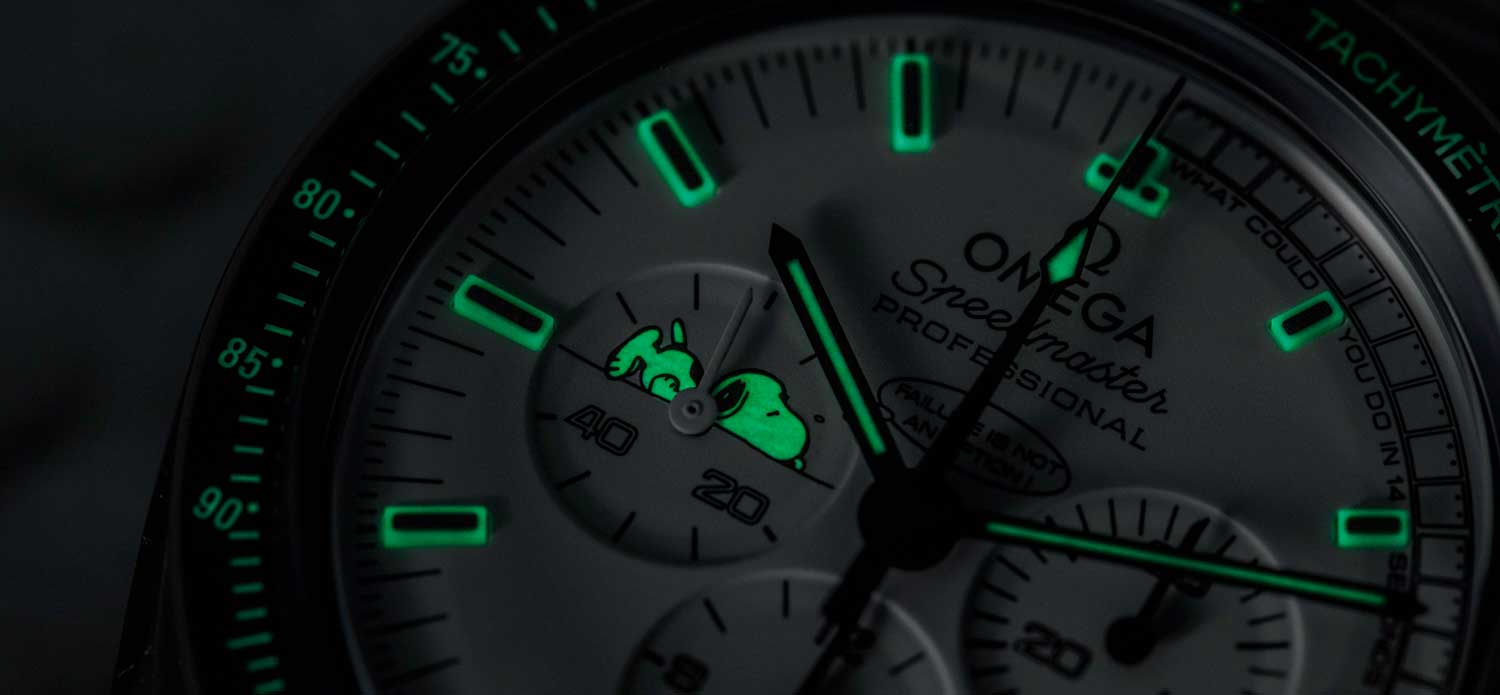 Revolution
Delve into the history of dial design and the elements that make up some of the most famous watch faces of our time. In part 2: Lume.
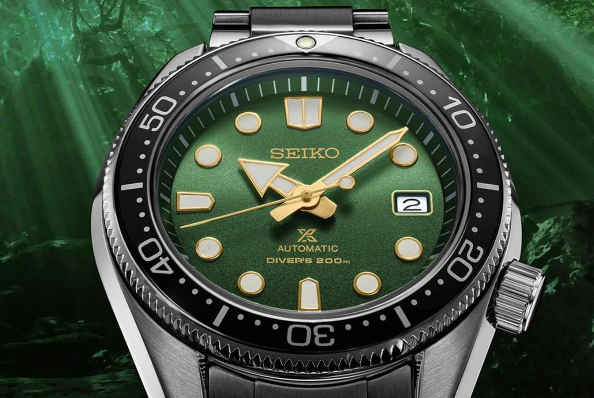 Two Broke Watch Snobs
A green dial variant of the 2018 modern reinterpretation of the famous Seiko 6159.
 Time+Tide
Editor’s note: Make no bones about it, skeleton watches are not to everyone’s taste. Legibility is sometimes less clear than a watch with a solid dial, but this is because time telling is almost ancillary to the stunning exposé that the watch offers. A skeleton dial offers a view typically reserved for a watchmaker in … ContinuedThe post Looking through Audemars Piguet’s Royal Oak Double Balance Wheel Openworked appeared first on Time+Tide Watches.
Question, suggestion, or just want to say hi? Drop a note.