 Deployant
New: Arnold & Son Perpetual Moon Year of the Rabbit
Arnold & Son joins the fray of Rabbit Year issues with a new watch on their Perpetual Moon collection, with the huge moon phase display.
767 articles · 25 videos found · page 20 of 27
Deployant
Arnold & Son joins the fray of Rabbit Year issues with a new watch on their Perpetual Moon collection, with the huge moon phase display.
 Worn & Wound
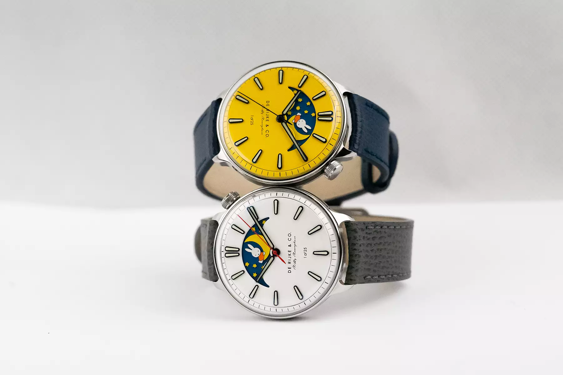
One year ago we showed you the delightful De Rijke Miffy Moonphase, a playful take on De Rijke’s distinctive design language honoring the iconic Dutch cartoon character created by Dick Bruna, Miffy. We remarked then about the watch’s universal appeal beyond the character thanks to the exquisite execution of the character etched into a brass plate alongside the moonphase display. This year, De Rijke returns to the concept with three new dial colors that once again breathe new life into Bruna’s uniquely Dutch creation. The Miffy character has been incorporated into the design of the moonphase disc rotating underneath the dial, which is visible through an oversized aperture that dominates the top half of the dial. The character, which is a bunny, appears within the moon itself, with a slew of stars trailing. The entire design has been laser etched out of brass, polished and black rhodium plated. The recesses are then filled with different colors of lume, creating not only a vibrant illustration, but also an impressive sight in the dark. We’ve talked about our feelings on cartoon characters within the confines of watches before in this editorial, and sadly I neglected to mention the original De Rijke x Miffy as an example that works. According to Laurens de Rijke, the brand’s founder, it’s a reminder that we needn’t always take ourselves too seriously, explaining: “ For me though, it makes a lot of sense, the world of watches is one that is often very serious...
 SJX Watches
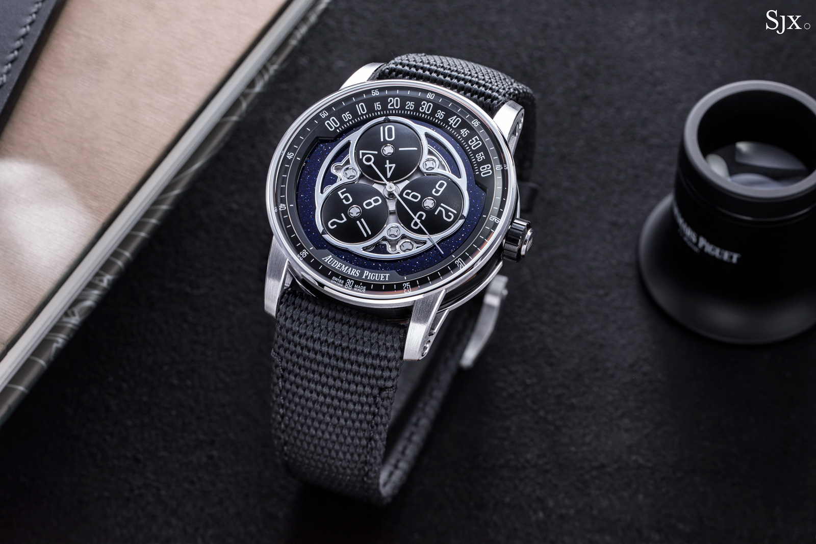
In an unexpected, end-of-year announcement, Audemars Piguet unveiled the Code 11.59 Starwheel, reviving the wandering hours complication that had been absent from its catalogue since 2003. Inspired by a 17th century clock, the wandering hours made its way into wristwatches thanks to Audemars Piguet (AP), which debuted the first wristwatch with the display in 1991. Retaining the familiar three-disc hour display, the new Starwheel is nonetheless an entirely different watch from the compact original. Powered by an in-house movement contained in the Code 11.59 case, the Starwheel has physical presence by virtue of its size, but also a surprising degree of refinement thanks to the excellent finishing of the dial and case. Initial thoughts With a modern look defined by dark colours and instrument-like numerals, the Code 11.59 Starwheel looks pretty much the same as it does in photos – but it is far more appealing than expected. In the metal the watch has an impressive degree of visual detail, particularly the polished bevels on the dial components, and a reassuringly solid feel, all of which give it a great deal of tactile appeal. The refinement in terms of visual detail also translates into the movement, which is in-house both in terms of the base and module. Although it functions identically to the original Star Wheel, the Code 11.59 model has an improved display mechanism. Instead of the periodic rotation found in the original model, the discs rotate continually throughout ...
 Time+Tide
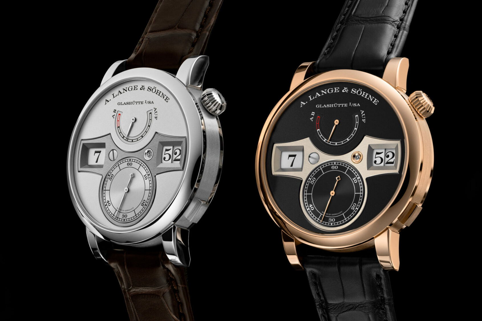
When I think of digital watches, my mind immediately goes to a display carousel stocked with black plastic quartz watches priced at $9.99 at a discount superstore. What I don’t think of is the upper echelons of high horology, where the crafting of mechanical masterpieces is akin to religion. Yet here is where the breathtaking … ContinuedThe post The A. Lange & Söhne Zeitwerk is a truly high-end digital watch appeared first on Time+Tide Watches.
 Quill & Pad
The De Witt Academia Mathematical of 2015 has a digital time display with jumping hours, tens of minutes, and minutes. And although its full numeral carousels are just barely visible under a smoked sapphire crystal dial, Tim Mosso was willing and able to take a closer look.
 Quill & Pad
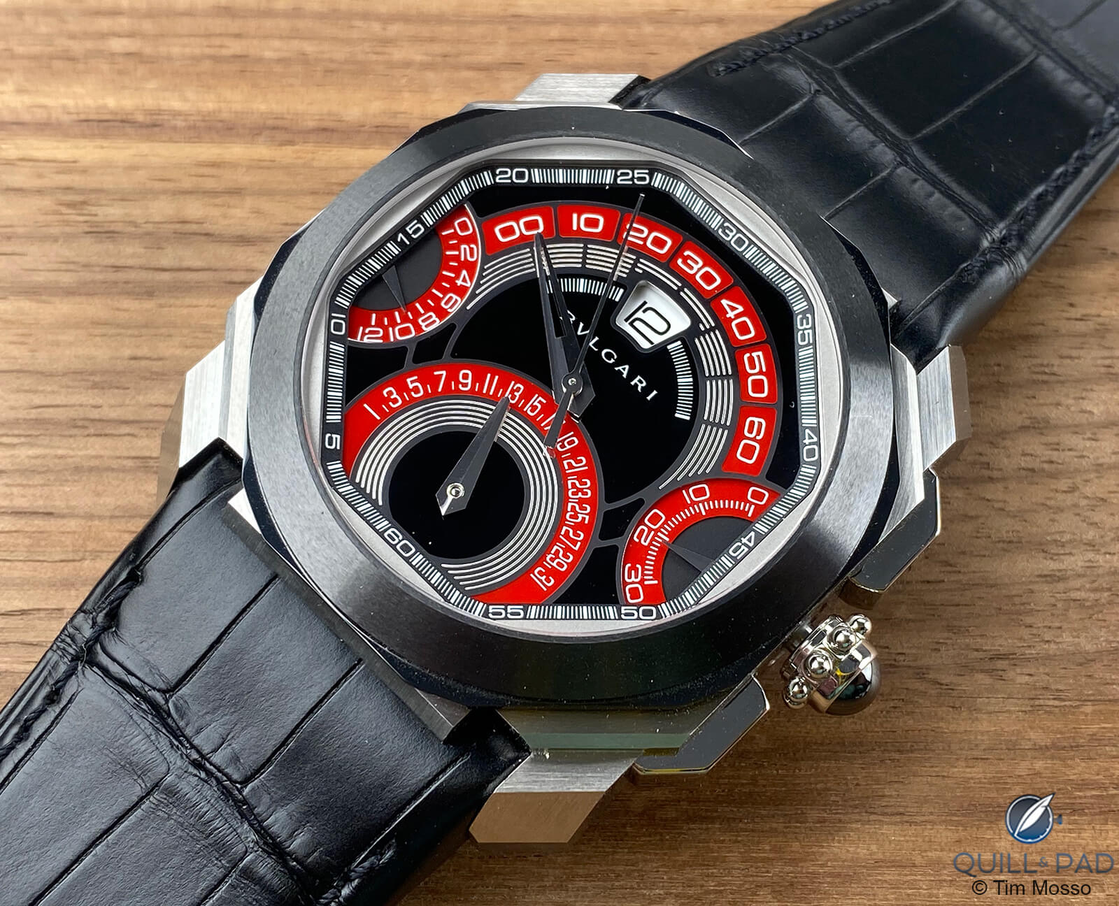
The Bulgari by Gérald Genta Octo Quadri-Retro Chronograph features four retrograde displays and a jumping hour. Even more than its distinctive shape, the Octo Quadri-Retro’s strongest link to its Genta past is the crossfire of snapdragon displays on its sectored face. Tim Mosso dissects the history of this brand using the quirks of this uber-interesting timepiece.
 Quill & Pad
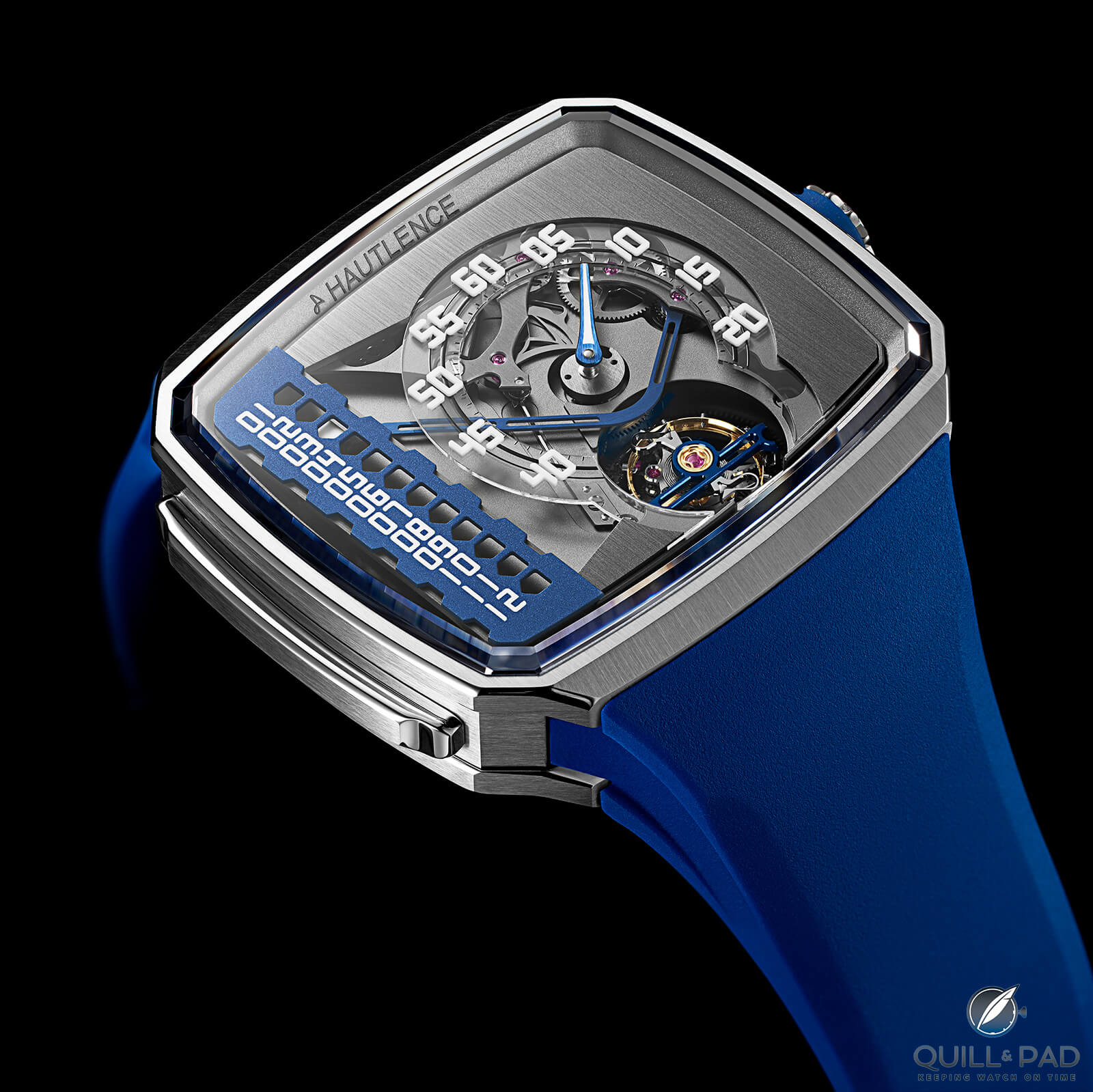
Hautlence is a brand that has always done things a little differently. And its latest model, the Linear Series 1, is no exception: it features a normal minute display with a jumping hour indication that appears to move in a straight (linear) line. Joshua Munchow dives in for a closer look.
 Hodinkee
This watch ups the mouse-related ante with a bi-retrograde movement providing both minutes and date functionality.
 SJX Watches
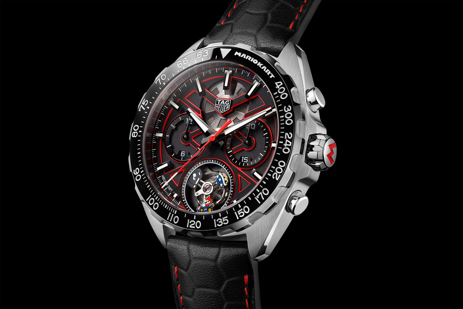
With a near-unparalleled history in auto racing, TAG Heuer’s latest is a light-hearted take on its storied past. Inspired by the famous plumber now driving a go-kart, the Formula 1 X Mario Kart pair are both limited-edition chronographs, each opposing ends of the price spectrum. The base model is the Formula 1 X Mario Kart Chronograph with an “Easter egg” date display, while the top-of-the-line model is a variant of TAG Heuer’s tourbillon-chronograph with the COSC-certified Calibre Heuer 02T movement. Initial thoughts Pop culture adds levity to mechanical watchmaking and usually enhances the appeal, which is why the approach is a familiar one. Gerald Genta did it, and more recently RJ-Romain Jerome. TAG Heuer did it for the first time last year with the Connected × Super Mario that sold out swiftly, proving the appeal of the Italian plumber. But the Connected was a smartwatch, while the pair of new releases are both mechanical, so they have appeal for watch enthusiasts. The Formula 1 Chronograph is basic but affordable, and livened up by subtle-but-clever Mario elements, like a date display with symbols from the game instead of numerals. The Formula 1 chronograph The tourbillon, on the other hand, is essentially an amusingly whimsical iteration of TAG Heuer’s standard tourbillon-chronograph, while not costing that much more, making it a more compelling proposition than the somewhat plain regular-production model. Mario around the track Inspired by the Nintendo...
 Time+Tide
During the early hours of Monday morning, there was a brazen smash-and-grab raid at the Swatch store in Amsterdam. After forcing entry, a hooded man broke into a glass cabinet and made off with the window-display suitcase containing the entire BIOCERAMIC MoonSwatch collection. Police were called to the crime scene but, at the time of … ContinuedThe post VIDEO: Smash and grab theft of MoonSwatch suitcase the latest symptom of watch crime epidemic appeared first on Time+Tide Watches.
 SJX Watches
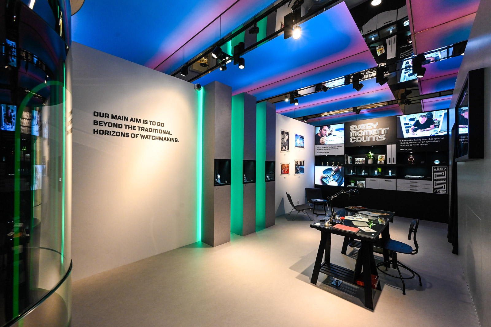
Coinciding with the launch of the UR-120 with its novel, split-cube display, Urwerk is documenting its journey from the very beginning with an exhibition in Singapore that’s part of the brand’s 25th anniversary celebration. Organised in collaboration with its Asian retailer The Hour Glass, Every Moment Counts offers a look at the brand’s history through its historical products as well as intriguing archival photographs, all straight out of the brand’s museum. Other items on show include sketches, trophies, and memorabilia that offer a full picture of the brand and its two founders, Felix Baumgartner and Martin Frei. At bottom right is a sketch of one of the brand’s foundational models, the UR-101 Reflecting the brand’s philosophy and house style, the exhibition has a futuristic aesthetic, such as the neon green and black display for the historical timepieces that brings to mind the luminous time display found on many of the brand’s watches. But the exhibition is also about nostalgia and includes a “Watchmaker’s Studio” with soft lighting that showcases photos from the founders’ childhood, which played a major role in shaping their avant-garde approach to watchmaking. The exhibition includes landmark watches like the UR-103 and UR-201 For technically-minded enthusiasts, the “Immersive Room” displays the exploded movement of the UR-111C on the wall, revealing in detail the workings of the intriguing cylindrical drum display. The UR-111C Every Mom...
 SJX Watches
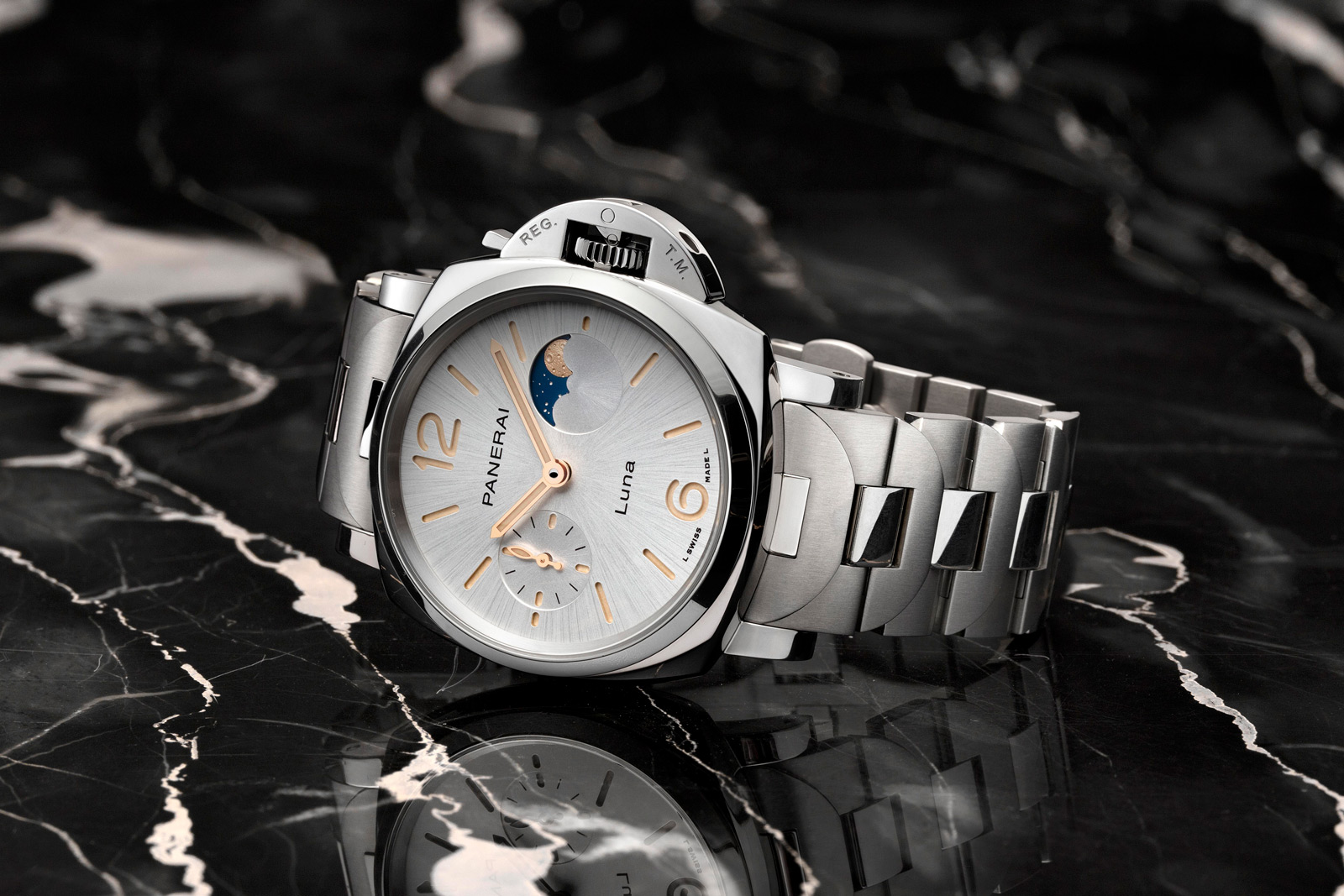
A compact take on the signature Panerai watch that made its debut in 2016, the Luminor Due is essentially a scaled-down version of the military-inspired original, which allows it to wear easily on smaller wrists. To date, the Luminor Due has remained minimalist, making do without complications save for a date display. But now Panerai gone for something slightly more elaborate with the Luminor Due Luna that has a small seconds and moon phase display featuring a solid-gold moon disc. Initial thoughts I like the compact size of the Due, as well as its more formal styling that allows it to double as a dress watch. Although the original, full-size Luminor is a clean, almost elegant design, its massive size and stark aesthetics means it can only be a military-style watch. The Due, on the other hand, manages to preserve the outline of the original Luminor while being modestly elegant. For that reason, the new Luna is an appealing watch. At just 38 mm wide, it is clearly more wearable, while the engraved, solid-gold moon gives it a bit of sparkle. And the all-gold model comes along with a mother of pearl dial, making it even more luxe. Interestingly, the Luminor Due is largely targeted at female clientele, but models have a masculine aesthetic. That continues with the Luna, which is available in steel with a metallic blue dial, a combination leaves it looking very much like a conventional men’s watch. The dial design is largely classical Panerai, although the proportions seem a...
 Quill & Pad
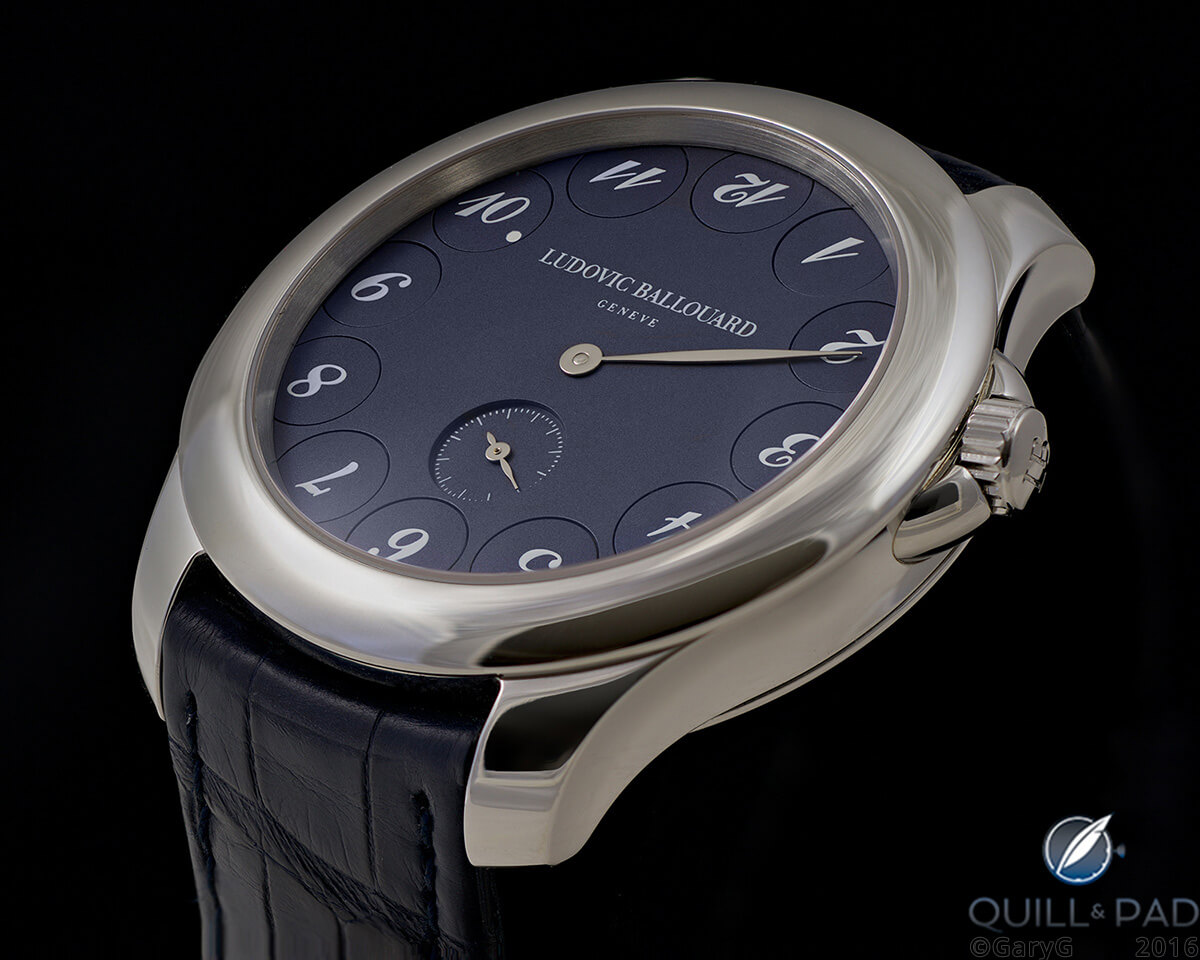
Is it possible to make a watch providing a novel and entertaining display of time that is wearable in a variety of settings and will be respected years from now? GaryG believes that he owns such a piece: the Upside Down made by independent watchmaker Ludovic Ballouard.
 SJX Watches
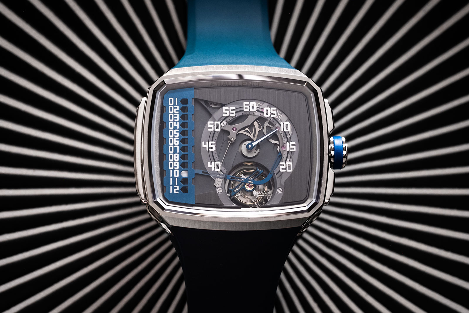
The sister company of H. Moser & Cie., Hautlence is a maker of highly contemporary watches that’s been on ice for several years as its owners completed Moser’s resurrection. Now Hautlence is making a comeback with a trio of watches led by the Linear Series 1. Adopting the TV-shaped case that’s historically the brand’s signature – but now matched with an integrated rubber strap – the Linear Series 1 features a retrograde hours on a straight-line scale along with a flying tourbillon at six o’clock. Initial thoughts Hautlence was founded in 2004 and found success during the subsequent boom in the luxury watch industry. Its fortunes faded together with that era of good times, so it is perhaps fitting that the brand is now being revived in the midst of another boom. The Linear Series 1 smartly returns to the TV-screen case that defined the brand since its inception. When combined with the open dial it is distinctive at a distance and recognisable as a Hautlence. Naturally the case design has been tweaked for today’s tastes, so it gets an integrated rubber strap. The sporty stance of the new look is appealing, although the integrated strap and folding clasp means it won’t fit perfectly on all wrists. Mechanically the Linear Series 1 is the result of a Moser base movement and an Agenhor module (that was originally developed for RJ-Romain Jerome), so it has solid technical credentials. Besides a retrograde hours, the movement also have a flying tourbillon with do...
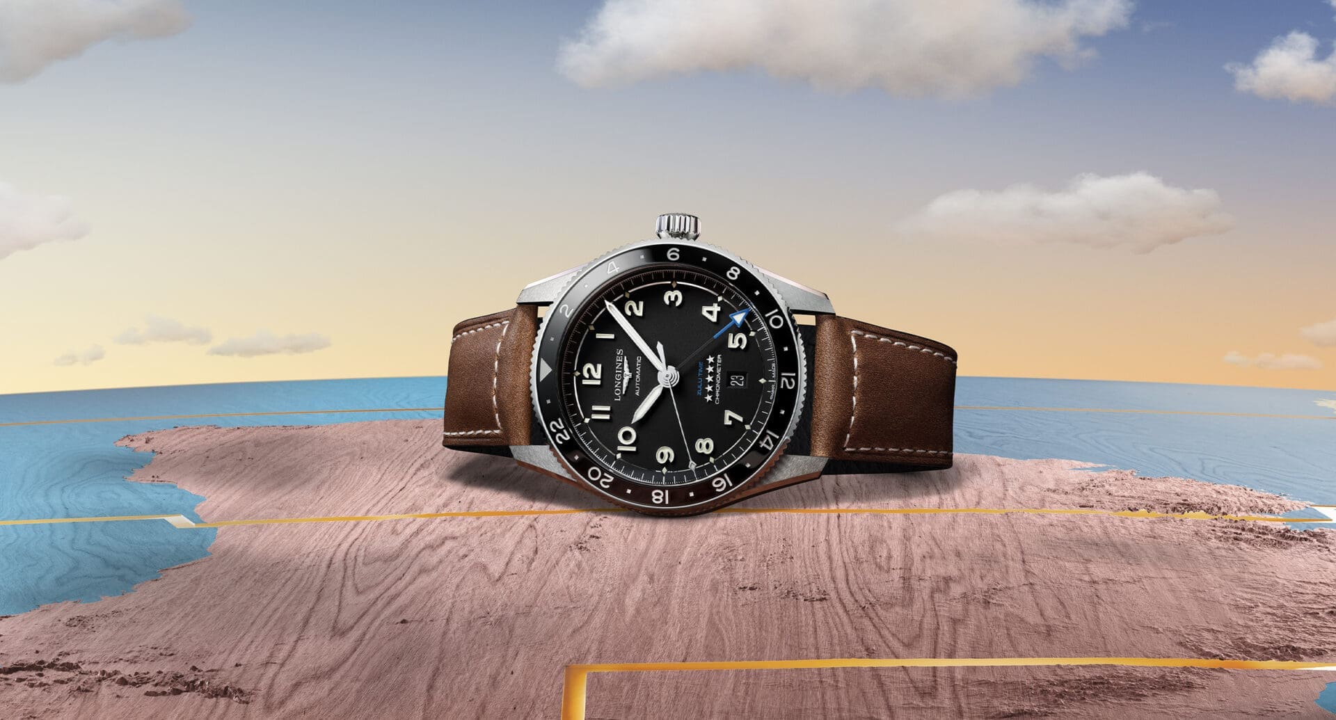 Time+Tide
The ability to display two time zones on a single dial has cropped up quite a lot over the course of history, but it was rarely more than a niche curiosity before the advent of flying. Now, the idea of a pilot’s watch without a GMT complication feels somewhat incomplete, and that’s why the new … ContinuedThe post IN-DEPTH: The Longines Spirit Zulu Time Collection appeared first on Time+Tide Watches.
 Revolution
Wei and Jeremiah discuss Roger Dubuis, the man and his watches, and how they are a clear reflection of his incredible watchmaking journey. The latest offering by Revolution Curates is a Roger Dubuis Sympathie Bi-Retrograde Perpetual Calendar that rightfully deserves the attention of collectors for the significance of its place in watchmaking history and technical […]
 Time+Tide
Hello one and all, it’s Borna once again, delivering event news from Melbourne! With the coldest months upon us, a crowd gathered at the warm Monards boutique on Melbourne’s Collins Street to check out their display of rare Breguet pieces, among many other wonderful watches. The attendees also had a chance to win some wonderful … ContinuedThe post FRIDAY WIND DOWN: An exhibition of Breguet masterpieces appeared first on Time+Tide Watches.
 Time+Tide
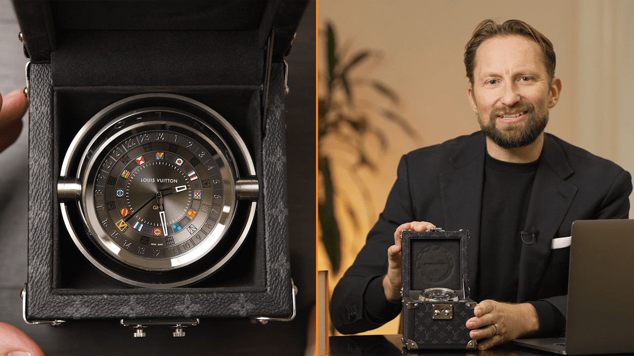
People often conflate wristwatches and horology as being the same thing. But the latter, in fact, encompasses hundreds more years of history and tradition . The art of luxury clocks, whether for travel or for display on a mantlepiece or desk, is often reserved for lofty Swiss brands who have made significant advancements in clock … ContinuedThe post VIDEO: Louis Vuitton’s travel clock comes with its own tailor-made trunk appeared first on Time+Tide Watches.
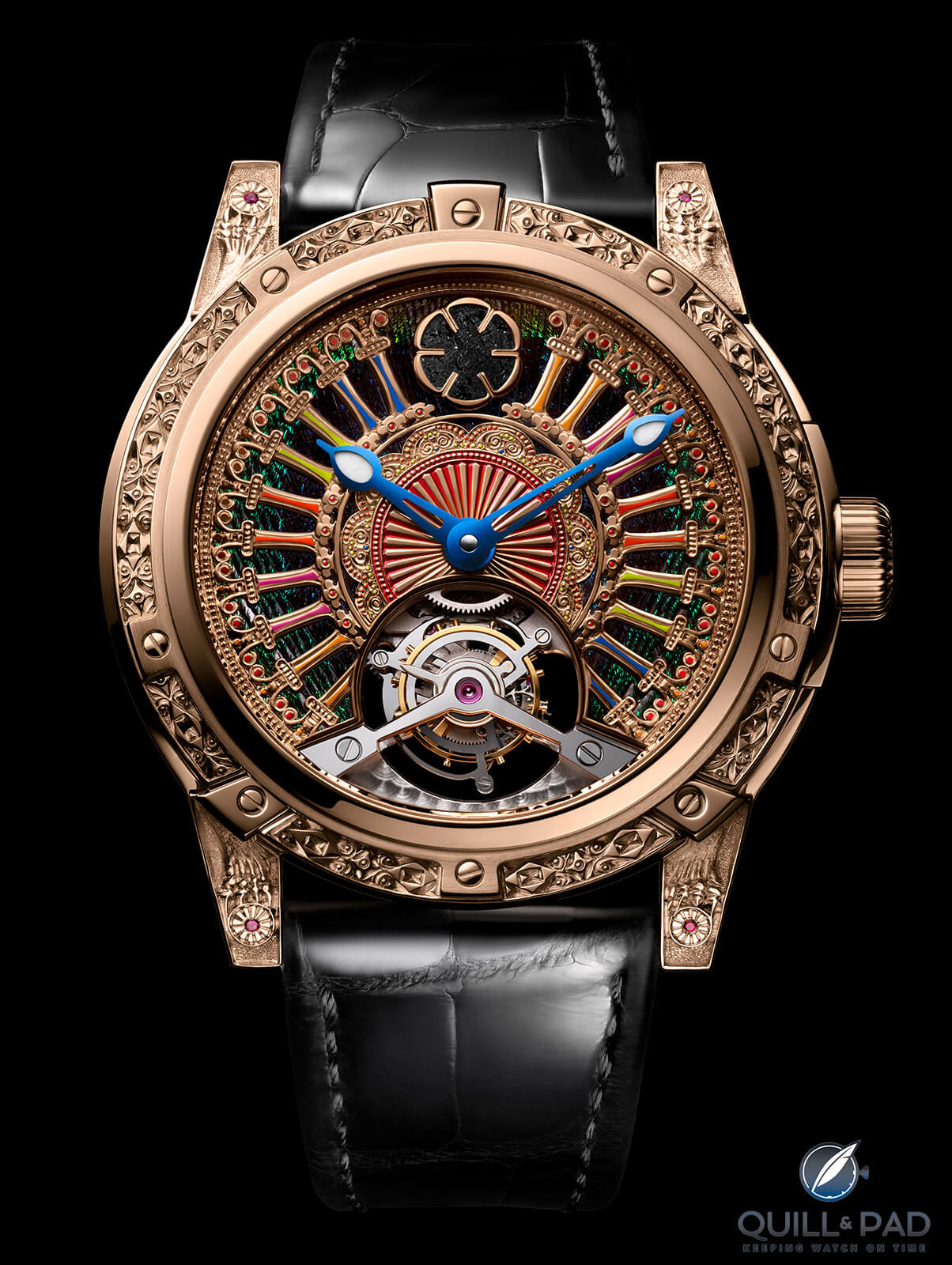 Quill & Pad
The Louis Moinet Only India is an intricate and colorful display of craftsmanship with a celestial hook that Joshua Munchow can’t ignore: a small fragment of the original Shergotty meteorite used as a centerpiece for the dial honoring aspects of Indian culture.
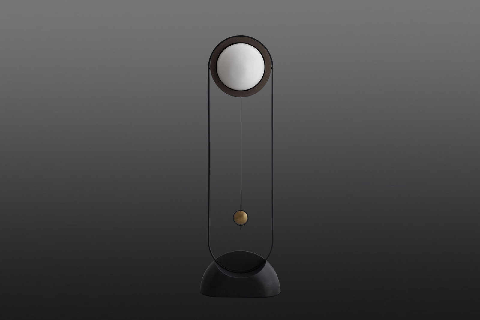 SJX Watches
The result of a collaboration between a Danish clockmaker and design studio , the Moonwork is a tall, sculptural clock that stands almost two meters high. It’s an old-school pendulum clock in function but entirely contemporary in expression, from the thin, minimalist frame to the clever time display without hands. Danish clockmaker Rune Bakkendorff worked together with fellow Danes of design studio Ahm&Lund; to create the clock, which made its debut late last year at the Cabinetmakers Autumn Exhibit 2021, a Scandinavian furniture fair that took place in Copenhagen. The Moonwork at the furniture exhibition. Photo – Scandinaviandesign.com Initial thoughts A thoughtfully designed object, the Moonwork is attractive on several levels. At first glance, it is slender, simplistic, and hardly resembling a clock save for the pendulum. But paradoxically it is a clock, making the featureless time display is immediately intriguing. It is a clock, but not quite. The Moonwork does away with the conventional telling of the time and instead displays the lunar cycle – the moon phase is projected onto the white porcelain dome that forms the dial. An impractical but beautiful solution, this makes the Moonwork more of a sculpture that indicates the passing of the time. Remove the white porcelain dome and the entirely mechanical workings of the clock are revealed, although moon phase projection relies hundreds of LED bulbs that are hidden behind a silver sphere that rotates slowly to ca...
 SJX Watches
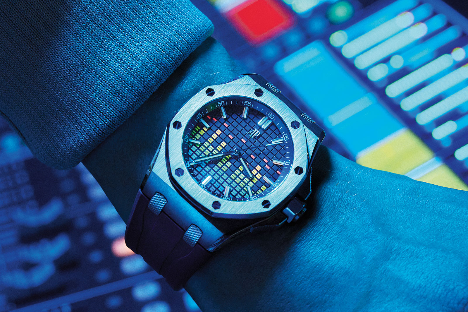
A watchmaker with many a musician as brand ambassadors, Audemars Piguet has just unveiled a quintet of sports watches sporting a motif inspired by the digital display of a graphic equaliser, a piece of audio equipment used to vary the volume of frequency bands. Taking its inspiration quite literally, the Royal Oak Offshore Selfwinding Music Edition has the familiar tapisserie dial pattern but dressed up with the vertical lines of the display on a graphic equaliser. And in its fanciest form, the latest model renders the equaliser motif in colour gemstones that continue onto the bezel. Initial thoughts As with many of the brand’s more extravagant releases, the Music Edition is almost tacky but manages to pull it off. Decidedly modern and very much over the top, the colourful chequerboard is a fun, striking look that distinguishes the watch from every other Royal Oak, which is an accomplishment given the strength of the octagonal design. Traditionalists will sure disprove of the way the tapisserie dial has been reinvented, but it is certainly in keeping with the bold and adventurous style of the Le Brassus watchmaker. And that has its appeal in moderate doses. The secret to such over-the-top watches is to do it infrequently and as long as AP doesn’t repeat this often or regularly, the Music Edition is different and cool. The dial of the gem-set model is blue aventurine glass, adding another layer of sparkle to the watch Between the two dials available, the gem-set versi...
 Time+Tide
Following last week’s review of the Grand Seiko SBGP017, and your comments on Instagram regarding the exhibition of quartz movements, we were inspired to find other quartz watches with equally beautiful movements that also chose to put them on display. It’s always been a rare sight to see a quartz watch with a display caseback, … ContinuedThe post Here are the most beautiful quartz movements with open casebacks, with some hidden honourable mentions appeared first on Time+Tide Watches.
 Time+Tide
It was the end of last year at the Time+Tide Club party. Drinks were poured and Santa hats were circulated. Watches were admired and discussed. There were further drinks. Impressed by the horological range on display, Andrew suddenly decided we should shoot some video of different people discussing their watches and unpacking the personal stories … ContinuedThe post Every Watch Tells a Story: “How long will it take you to namedrop Hugh Jackman?” appeared first on Time+Tide Watches.
 Time+Tide
It was the end of last year at the Time+Tide Club party. Drinks were poured and Santa hats were circulated. Watches were admired and discussed. There were further drinks. Impressed by the horological range on display, Andrew suddenly decided we should shoot some video of different people discussing their watches and unpacking the personal stories … ContinuedThe post Every Watch Tells A Story: How Borna got lucky with his Universal Genève Polerouter appeared first on Time+Tide Watches.
 Time+Tide
EDITOR’S PICK: I recently streamed Guy Ritchie’s The Gentlemen that delivered a welcome return to the director’s gangster comedy roots. Amid a stellar cast that includes Matthew McConaughey, Charlie Hunnam and Colin Farrell, Hugh Grant puts in a scene-stealing display as a cockney-accented private investigator. But I was distracted less by his beard than what Grant had on his … ContinuedThe post EDITOR’S PICK: From Panerai to Piaget, Hugh Grant’s watches are a whole lot more alpha-male than you’d think appeared first on Time+Tide Watches.
 Quill & Pad
Trilobe's Une Folle Journée expands upward and outward to expose the mechanical ingenuity behind the dial with a three-dimensional display reminiscent of an exploded view of a movement. Joshua Munchow is a fan and explains why here.
 SJX Watches
One of the most unusual amongst F.P. Journe’s offerings, the Vagabondage I was the first of a trio that combined a tortue case with an unconventional time display, along with dials that feature no branding at all. Launched in 2004 and long gone from the brand’s catalogue, the Vagabondage I now makes a return with a new case, dial, and movement – all of which are improved over the original. Initial thoughts The original Vagabondage I was interesting because of its wandering, jumping hour display, along with the central balance wheel visible on the dial. Eighteen years later the new Vagabondage I is interesting for the same reason, because it is essentially the same watch. While the new Vagabondage I has been updated in several ways, ranging from a larger case to a new movement, it retains the familiar look. That also means it looks like a watch from the early 2000s with a slightly dated air compared to most wandering hours on the market today. But that’s exactly what makes it cool. It is an old idea but one that has been improved in just the right ways. Most important amongst them is the case, which wider and longer than the original, giving it dimensions almost identical to the Vagabondage II and III. It still remains elegant and wearable, but the new case size is more appealing than that of the original, which is a little too small. Inching forward Fans of the brand will be familiar with the story of the Vagabondage, but here’s a quick recap: it start with a on...
 Hodinkee
The Tonda PF line expands with a sleek and subtle second time-zone display.
 SJX Watches
A maker of affordable watches with unconventional styling, SevenFriday is now a decade old. To commemorate the milestone, the brand has unveiled the Free-D. To put it mildly, the Free-B adds three-dimensionality to the brand’s trademark time display comprised of rotating discs. And in a first for the brand, which has historically relied on Miyota, the Free-D is powered by a Swiss-made movement, Sellita to be exact. Initial thoughts While SevenFriday has increasingly felt like a “fashion” brand with its endless iterations of the same design, the brand has produced timepieces that are genuinely compelling. The Free-D is certainly one of the more interesting examples of its unorthodox design, though the over-the-top style is an acquired taste to say the least. Bold, extra large, and definitely peculiar, the Free-D is actually based on the brand’s signature “squircle” case but dressed up with a 3D-printed external shell and lugs. The added parts do exactly what they are meant to, which is to elaborate on the brand’s traditional case style to distinguish it for the anniversary. And they give the watch a decidedly alien aesthetic – it looks like a prop from a sci-fi film. At the same time, the external cladding on the case is essentially plastic. Granted, plastic of various types is widely used in high-end watchmaking – Richard Mille and Hublot are proponents of its use – but it is certainly not for everyone. In contrast, the time display is simple but easy...
 SJX Watches
The latest from Ressence dials back on technical complexity, but preserves the brand’s trademark aesthetic centred on a planetary time display. As a result, the Type 8 is substantially more affordable, while instantly recognisable as a Ressence wristwatch. By doing away with a seconds indicator as well as simplifying the case construction, the Type 8 is priced at CHF12,500, or about US$13,500, making it the most affordable watch in the brand’s catalogue. The next most affordable model, the Type 1, costs about 30% more. Initial thoughts Ressence founder Benoît Mintiens once said to me that he wished he could make his watches more accessible, but that was impossible without more economies of scale. Ressence has evidently inched closer to Benoît’s vision, since the Type 8 looks to be an excellent product in both design and execution, while being affordable, at least relative to the brand’s other watches. It sacrifices nothing in terms of aesthetics – the missing seconds but isn’t overly obvious – while still managing to be a Ressence. In fact, the Type 8 case is entirely different from the brand’s other watches, bringing a new form to the brand’s design language. But it fits right into the catalogue and feels no different from the other watches, illustrating the coherence of the design. Type 8C The inaugural version of the model is the Type 8C, which has a grained blue dial. Minutes are indicated on the full dial, while the hours are shown on an “orbita...
Question, suggestion, or just want to say hi? Drop a note.