Worn & Wound
Farer Introduces the Stratton II Moonphase
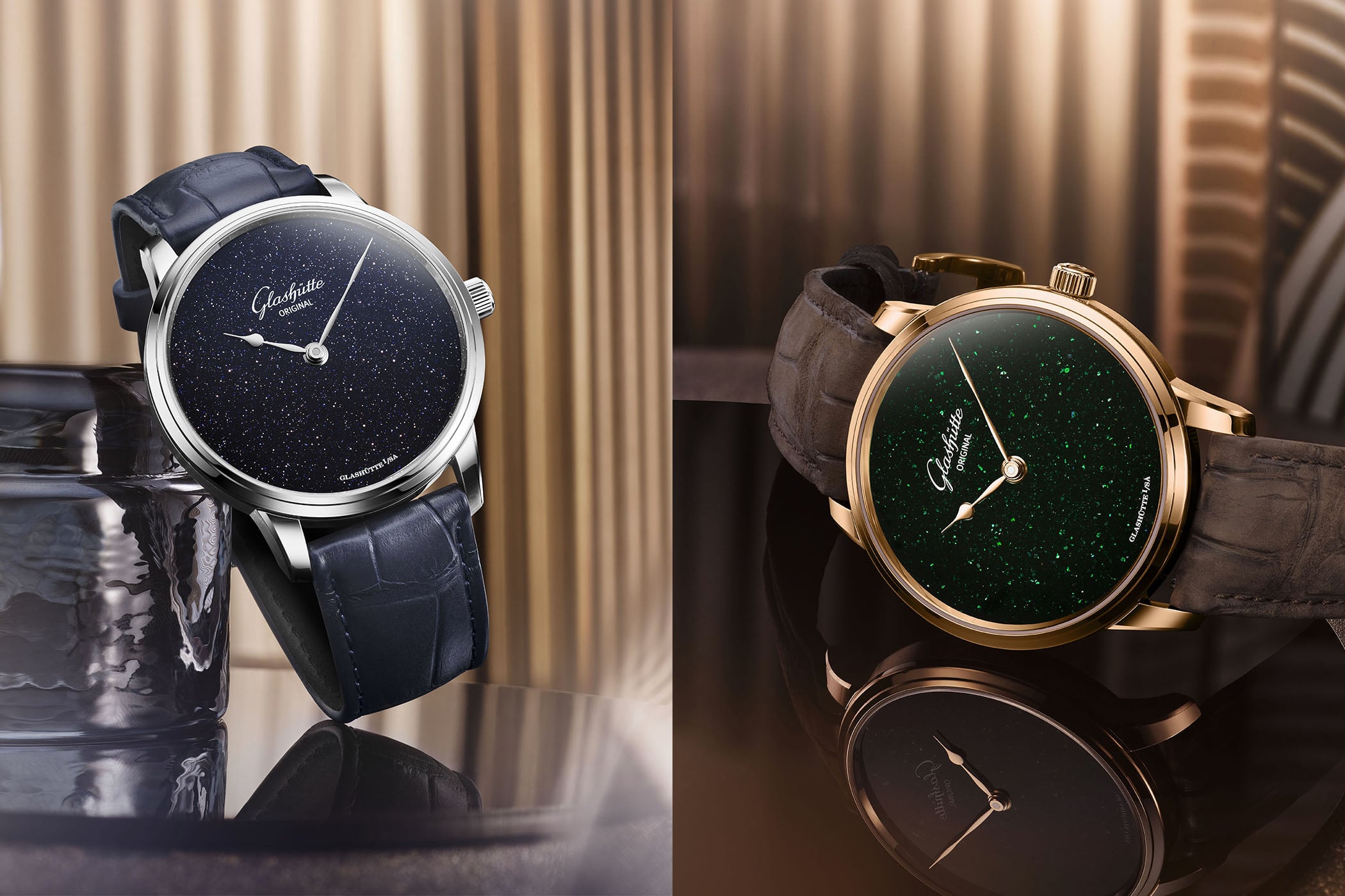
Maybe “trend” was always the wrong way to frame the watch industry’s collective obsession with stone dials? I don’t know about you, but I certainly feel like we might have reached a point where the stone dial is essentially just another colorway. Just as brands are expected to offer dials in blue, black, and white, perhaps we’ve reached that point where it should just be expected that they’ll offer an option (or several) in stone as well. I like the look of a stone dial, but I admit I’m getting quite bored of seeing them invade my inbox on a daily basis. This is the perspective of a guy with a very particular view on all the stone dial action. I’m not a casual observer. I work in the industry and I see, at least to some extent, how the nuts and bolts of the business works, and at the moment brands are simply cashing in on an unprecedented interest in stone (and mother of pearl) dials. Stone dials were never actually “rare” but they felt special before this boom because they were so infrequently used. Access to these dials is now virtually unlimited and, presumably, pretty affordable. So the rush continues, to the point I think where it’s just a static part of our ecosystem. And it’s that environment in which the newest member of the Farer Moonphase collection arrives. This is the Stratton II, the latest edition of what Farer says is their most popular moonphase model. The centerpiece (literally) of the Stratton II is a new moonphase disc made ...