Watch brandsWatch wikiWatch videosVariousWatch calendarSaved articles
PopularRolexOmegaPatek PhilippeAudemars PiguetTudorGrand SeikoCartierSeikoIWCTAG HeuerBreitlingJaeger-LeCoultreA. Lange & SohneZenith

Results for Regulator Dial

5,505 articles · 31 videos found · page 69 of 185

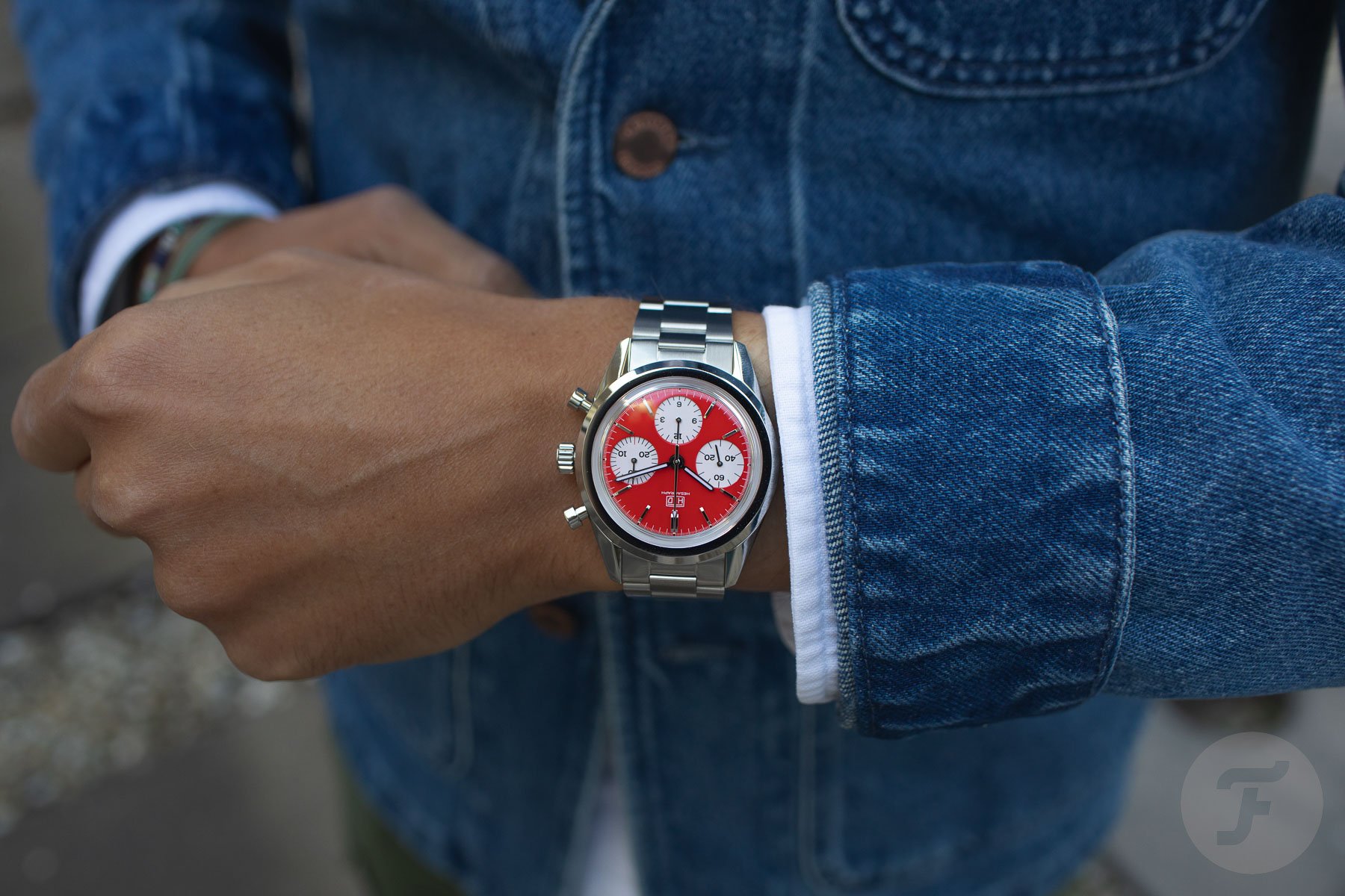
Hands-On: The Raring-To-Race HTD Hesagraph RitmoCorsa Fratello
3 days ago

Hands-On: The Raring-To-Race HTD Hesagraph RitmoCorsa

Some watches make you want to get out and race. That’s exactly what I felt when I saw the HTD Hesagraph RitmoCorsa with its bright red dial. This limited edition of 99 pieces celebrates HTD’s five-year partnership with the Italian Scuderia HTD RitmoCorsa racing team. Its enameled red dial echoes the freshly waxed body of […] Visit Hands-On: The Raring-To-Race HTD Hesagraph RitmoCorsa to read the full article.

Hands-On: Can The Zenith Chronomaster Solo Sport Preserve The Collection’s Identity Without A Chronograph? WatchAdvice
Zenith Chronomaster Solo Sport Preserve 3 days ago

Hands-On: Can The Zenith Chronomaster Solo Sport Preserve The Collection’s Identity Without A Chronograph?

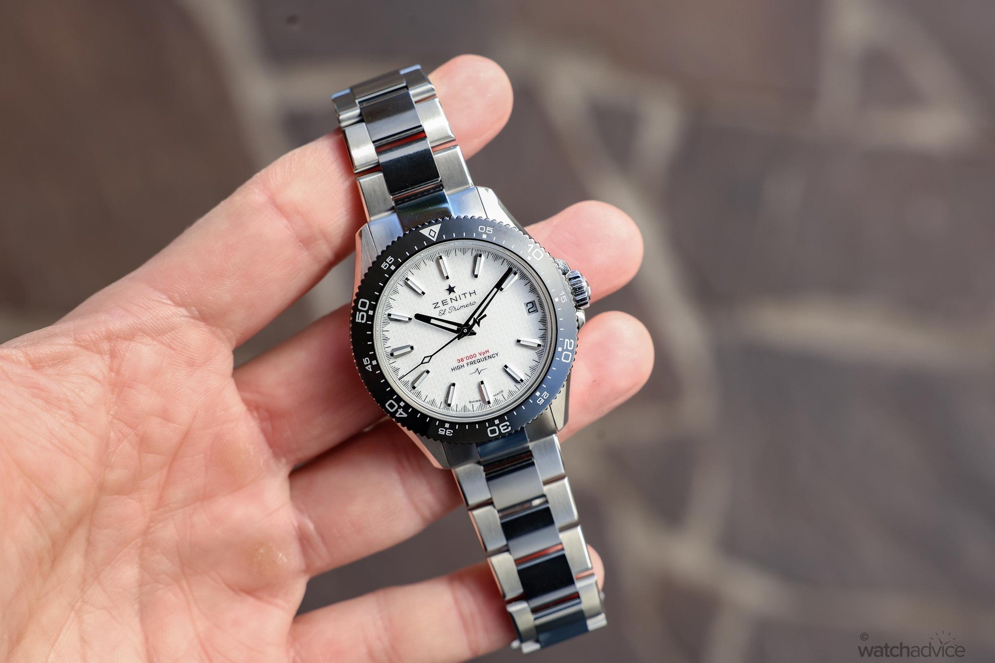
The new Zenith Chronomaster Solo Sport removes the collection’s defining chronograph complication, but retains its high-frequency El Primero heart. I take the collection hands-on to see whether it can establish its own identity while still remaining a true Chronomaster! What We Love: Retains the Chronomaster identity Meaningful high-frequency dial pattern Well-proportioned for everyday wear What We Don’t: No alternative strap options Limited dial-and-bezel combinations Shark-tooth track feels busy on darker dials Overall Rating: 8.75/10 Value for Money: 8.5/10 Wearability: 8.8/10 Design: 9/10 Build Quality: 8.8/10 What happens when a brand introduces a model that removes one of the defining elements from an already established collection? Well, that is exactly what Zenith has done with the latest addition to one of the brand’s most refined collections to house the El Primero movement: the Chronomaster. While we were initially expecting a different take on the signature chronograph model, the release of a simple three-hand edition was not something we anticipated, but it is certainly welcome. View this post on Instagram A post shared by Watch Advice (@watchadvice) The story behind Zenith’s Chronomaster Sport begins much earlier than the collection itself, tracing back to the launch of the El Primero in 1969. As the world’s first automatic integrated high-frequency chronograph calibre, the El Primero quickly established the technical foundation that would later ...

Remember You Must Die: 12 Skull Watches to Keep Your Mortality in Check Worn & Wound
Bell & Ross Laughing Skull Bell & 4 days ago

Remember You Must Die: 12 Skull Watches to Keep Your Mortality in Check

While the idea of a skull watch might sound like a kitschy Halloween-themed novelty, they actually run deep in horological history, dating back to pocket watches of the 17th century in the memento mori tradition of reminding you of your own mortality. However, these were not the skull dial timepieces we think of today but instead “form” watches that, like the name states, take a shape beyond a traditional round timekeeper. In the case of the skull form, they typically shared a similar blueprint with the jaw unhinged, exposing the dial on the underside or roof of the mouth. Today, we see many watchmakers continuing in this tradition, shifting away from form watches and extending the imagery to dial designs, some of which are achieved by simple painting while others more closely echo the form watches with sculptural elements – here are a dozen of them. Bell & Ross Laughing Skull Bell & Ross steps out of its aviation roots with a series of skull watches adopting the skull and crossbones motif also known as the Jolly Roger. Here, the brand takes its signature square watch case to lay the foundation for the design, which extends across the dial and bezel. The piece comes to life thanks to a mechanical jaw automaton that moves up and down to mimic laughter when you wind the watch. Bomberg Edge Skulls Mosaic For Bomberg, the skull motif is not just a one off for a special edition collection – its core imagery featured prominently across several of the brand’s major line...

Hands On: Louis Erard x Vianney Halter Futur Antérieur SJX Watches
Louis Erard x Vianney Halter Futur 4 days ago

Hands On: Louis Erard x Vianney Halter Futur Antérieur

Louis Erard has become adept at translating the design language of pricey independent watchmaking into affordable watches, and the best proof of that is the Louis Erard x Vianney Halter Futur Antérieur. Modelled on the Vianney Halter Antiqua perpetual calendar, the Futur Anterieur is a regulator-style watch powered by two separate automatic movements. Named after Vianney Halter’s collection of steampunk watches, Futur Antérieur is Louis Erard’s third outing with the independent watchmaker, and is arguably a more sophisticated version of the preceding collaboration. While both share the same inspiration, the Futur Antérieur tangibly embodies the Antiqua, reproducing the feel of the original at a fraction of the price. Initial thoughts The Futur Antérieur is clearly an affordable watch that is not an Antiqua, but it is appealing. It captures the ambience of the Antiqua well. The shape is similar, and even the feel on the wrist. In this price segment this stands out as one of the more interesting offerings. Though this costs more than preceding collaboration editions, this is arguably better value. More broadly, the Futur Antérieur illustrates the growing sophistication of Louis Erard’s collaborations. They started as stock models with a new dial superimposed, while the Futur Anterieur is a new model conceived from the ground up. It’s also worth noting the details that replicate the Antiqua, like the chamfered edges on the case and bezel, and the stepped, two-to...

Farer Introduces the Stratton II Moonphase Worn & Wound
Farer Introduces 5 days ago

Farer Introduces the Stratton II Moonphase

Maybe “trend” was always the wrong way to frame the watch industry’s collective obsession with stone dials? I don’t know about you, but I certainly feel like we might have reached a point where the stone dial is essentially just another colorway. Just as brands are expected to offer dials in blue, black, and white, perhaps we’ve reached that point where it should just be expected that they’ll offer an option (or several) in stone as well.  I like the look of a stone dial, but I admit I’m getting quite bored of seeing them invade my inbox on a daily basis. This is the perspective of a guy with a very particular view on all the stone dial action. I’m not a casual observer. I work in the industry and I see, at least to some extent, how the nuts and bolts of the business works, and at the moment brands are simply cashing in on an unprecedented interest in stone (and mother of pearl) dials. Stone dials were never actually “rare” but they felt special before this boom because they were so infrequently used. Access to these dials is now virtually unlimited and, presumably, pretty affordable. So the rush continues, to the point I think where it’s just a static part of our ecosystem.  And it’s that environment in which the newest member of the Farer Moonphase collection arrives. This is the Stratton II, the latest edition of what Farer says is their most popular moonphase model.  The centerpiece (literally) of the Stratton II is a new moonphase disc made ...

Introducing: WM Brown x Timex Hodinkee
Timex What We Know Matt Oct 27, 2026

Introducing: WM Brown x Timex

What We Know Matt Hranek, founder of WM Brown and author of A Man & His Watch, has collaborated with Timex for the first time on a dress watch. Designed exclusively for WM Brown, it is a tank-shaped steel watch with a light grey dial and a quartz movement. The stainless steel case measures 26.5 x 41.3mm with a 20mm lug width. The top is vertically brushed, the sides are horizontally brushed, with a polished diamond-cut edge and sharply inclined lugs. The light grey dial has a two-hand layout with small seconds at six o'clock (with a subtle WM Brown logo) and full Arabic numerals. The WM Brown wordmark sits at the bottom of the dial alongside the Timex branding. It is powered by a Miyota 1L40 quartz movement and has a mineral glass lens, a customized case back and 50 meters of water resistance. The watch comes as a gift set with two options: a brown leather strap with a stainless steel buckle and a stainless steel bracelet with a butterfly deployant clasp. The WM Brown x Timex gift set costs $349 and includes both the bracelet and strap. It is available now through Timex and WM Brown. What We Think A WM Brown and Timex collaboration feels so right. Hranek and Timex went with something a little more refined and dressy, and I think it works. The color scheme typically used in the WM Brown logo has been replaced with a monochromatic logo that integrates subtly into the dial. The dress-watch foundation suits the partnership, and the design feels as seamless as the collaboration...

Reviewing The Rado Captain Cook x Cameron Green Limited Edition WatchAdvice
Rado Captain Cook x Cameron Oct 27, 2026

Reviewing The Rado Captain Cook x Cameron Green Limited Edition

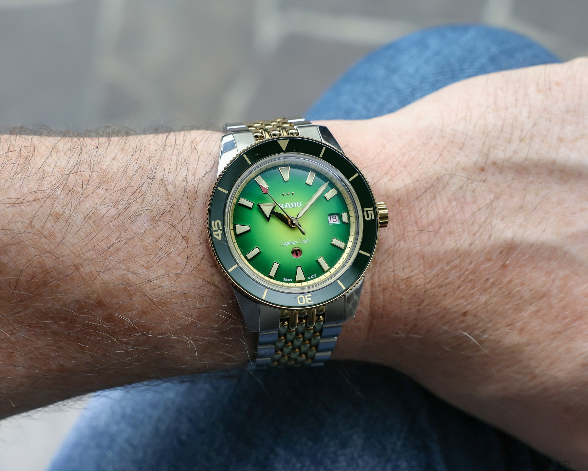
Has Rado hit it for six with the new Captain Cook x Cameron Green limited edition? We find out in this review! What We Love The green gradient dial gives the watch plenty of character The 42mm case wears well, and seems smaller than the specs suggest The cricket-inspired details bring the watch to life really well What We Don’t A colour-matched date window would have looked better, although it would have been tricky Swapping straps can be a little fiddly at first, especially the rubber While the bracelet adds versatility, there is no micro-adjustment or quick adjustment at all on the clasp Overall Rating: 8.4 / 10 Value for Money: 8.5/10 Wearability: 9/10 Design: 8/10 Build Quality: 8/10 By now, most people will be familiar with the Rado Captain Cook. First introduced in 1962, the Captain Cook was Rado’s take on the dive watch, with a design that included a rotating bezel and the brand’s now-famous moving anchor logo on the dial. The original models were produced between 1962 and 1968, before Rado brought the collection back in 2017 with a modern interpretation that stayed true to the original 37mm design. In 2019, the collection expanded with 42mm models, followed by versions in different materials, including bronze and Rado’s high-tech ceramic. If you’re interested in the Captain Cook’s journey, the article below may be of interest. A Deep Dive Into The Rado Captain Cook & The Materials That Helped Chart Its Path More recently, we saw the introduction of t...

A. Lange & Söhne Upgrades the Datograph Perpetual SJX Watches
A. Lange & Sohne Oct 24, 2026

A. Lange & Söhne Upgrades the Datograph Perpetual

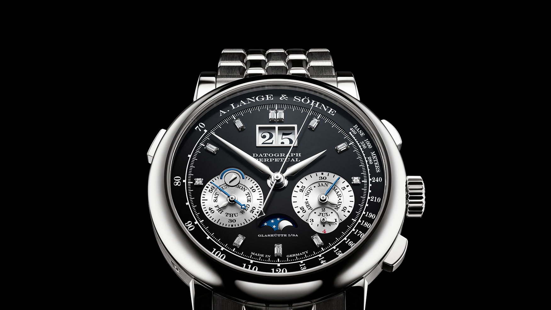
A. Lange & Söhne is closing the year in style with the Datograph Perpetual (ref. 410.136E), but now with baguette-cut diamonds for the hours and a five-link platinum bracelet in a style that will definitely please enthusiasts. A compilation of greatest hits that is spot-on for today’s tastes, the new Datograph Perpetual adopts the classic Datograph dial but with a bit of bling. Likewise the bracelet takes after the now-popular Wellendorf bracelets of the 2000s – but with a refined and solid modern construction that allows for easy sizing. Initial thoughts Like some other recent Lange limited editions, this upgraded Datograph Perpetual is easy to like. The makeover is a cosmetic rather than technical one, but it is as good as it gets as facelifts go. The movement inside is the still the L952.1 that’s based on the first-generation Datograph movement. Given how it looks, I would not complain. Notably, the bracelet enjoys the biggest technical upgrade. Though it resembles the bracelets made by Wellendorf for Lange way back, this is actually an Odysseus bracelet in disguise. It has the same modern-day construction and amenities, meaning a robust construction with buttons for convenient link removal. Wellendorf bracelets, in contrast, are pretty but essentially jewellery bracelets on a paired with a very heavy watch, and I doubt they will have the longevity of this one. An example of the first-generation Datograph on Wellendorf bracelet Visually, the dial takes after the ...

Hands On: Louis Vuitton Monterey Ceramic SJX Watches
Louis Vuitton Monterey Ceramic Louis Vuitton’s Oct 23, 2026

Hands On: Louis Vuitton Monterey Ceramic

Louis Vuitton’s second instalment of its 1980s revival model is the Monterey Ceramic. Styled like its predecessor – both share a similar inspiration – the new Monterey is simpler in execution and consequently more accessible, if not quite affordable. Instead of 18k gold, the case is now ceramic, in either black or green, with a steel case back. That’s matched with a white lacquer dial that replaces the fired enamel of the gold model. A regular production model, the Monterey Ceramic nonetheless retains the proprietary movement from La Fabrique du Temps (LFT) that is a good example of high-quality industrial-haute horlogerie. Initial thoughts The original Monterey, or more accurately, montre, which is French for “watch”, was a distinctive and surprisingly timeless design by Italian architect Gae Aulenti. But it was not exactly a high-end watch. Today’s recreation, in contrast, is just that. While last year’s Monterey in 18k gold was pricey, the new Monterey dials back on the fancy materials, which reduces the retail price by about half. Considering the high-end Geneva-made calibre inside, this makes the Monterey competitive with traditional watchmakers. The look of the Monterey, however, is not traditional. The style was unorthodox when Aulenti penned it in 1988, and continues to be so now. The unusual case construction gives it a bulbous appearance. Though the case is only 11 mm high, it looks and feels taller, but that is arguably part of the charm. The Mon...
Oris Introduces The Aquis Date Kelp Forest Limited Edition Fratello
Oris Introduces Oct 20, 2026

Oris Introduces The Aquis Date Kelp Forest Limited Edition

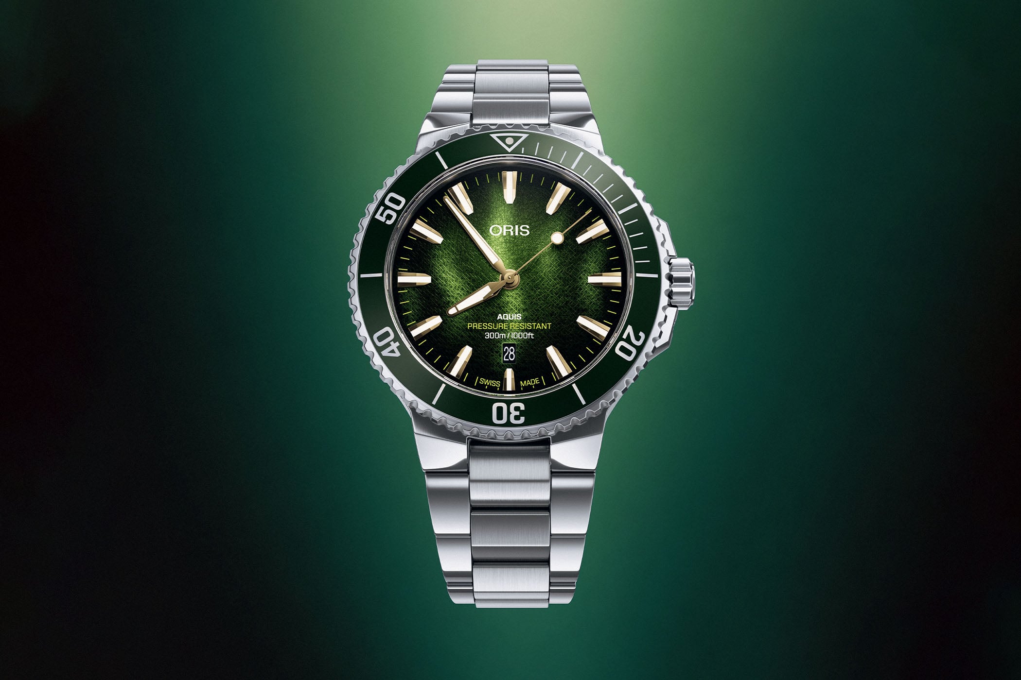
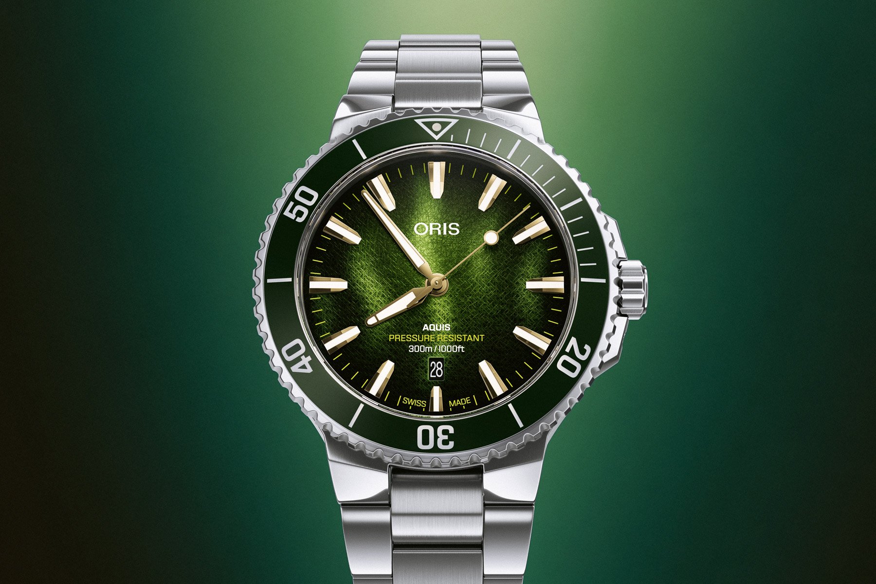
Oris returns to ocean conservation with the Aquis Date Kelp Forest Limited Edition. This new 41.5mm dive watch draws inspiration from underwater kelp forests and their role in marine ecosystems. Limited to 1,000 pieces, it combines the familiar Aquis Date design with a textured green dial that evokes the colors and textures of swaying kelp. […] Visit Oris Introduces The Aquis Date Kelp Forest Limited Edition to read the full article.

Introducing: The Oris Kelp Forest Limited Edition Hodinkee
Oris Kelp Forest Limited Edition Oct 20, 2026

Introducing: The Oris Kelp Forest Limited Edition

What We Know The idea of a 'Seaweed' dive watch isn't new—in fact, I used to own a diver that carried that nickname from collectors. But today, Oris offers a much more literal take on that idea with the Aquis Date Kelp Forest Limited Edition. No, Oris did not make a dial out of literal kelp. But the overall aesthetic is strongly inspired by underwater nature, thanks to an idea from Francis Pérez, an award-winning underwater photographer and Oris ambassador. © Francis Pérez It's another of Oris's sustainability-focused designs, as the brand continues to raise awareness for various environmental efforts. Think Oris' Bracenet Aquis, with a dial made from melted recycled fishing nets, or its Yangtze Jiangtun Limited Edition introduced this spring. Some of these editions will see a contribution of proceeds to a specific organization. Others, like this Kelp Forest edition, are meant to be conversation starters, giving purpose and meaning to a design beyond purely aesthetic goals. It's something Oris has done for many years, and this one continues that trend. Specifically, the story of this watch focuses on raising awareness of the deforestation of underwater kelp forests—which absorb carbon and provide shelter and food for a wide range of marine wildlife. While most people have probably thought about global overfishing and rising sea temperatures at some point in their lives, I think this issue gets much less talked about, if at all. This marketing story leads to an unsur...