Watch brandsWatch wikiWatch videosVariousWatch calendarSaved articles
PopularRolexOmegaPatek PhilippeAudemars PiguetTudorGrand SeikoCartierSeikoIWCTAG HeuerBreitlingJaeger-LeCoultreA. Lange & SohneZenith

Results for The Heuer Carrera (1963)

42,672 articles · 256 videos found · page 1000 of 1431

Related pages

Wiki · Guide
The Heuer Carrera (1963) TAG Heuer

Jack Heuer\'s 1963 motorsport chronograph named after the Carrera Panamericana road race. Reference 2447, Valjoux 72 manual.

Seiko Doesn’t Rest On Its Laurels: Introducing Two Seiko Presage Classic Series “Craftsmanship” Watches Fratello
Seiko Doesn’t Rest 1h ago

Seiko Doesn’t Rest On Its Laurels: Introducing Two Seiko Presage Classic Series “Craftsmanship” Watches

Seiko’s and Japan’s very first wristwatch, the 1913 Laurel, is one of the prettiest watches I have ever seen. More than a century after its conception, it still looks fresh. It’s also, as you can imagine, a rather important watch. To underline that and make it possible to wear a watch that honors the beginning […] Visit Seiko Doesn’t Rest On Its Laurels: Introducing Two Seiko Presage Classic Series “Craftsmanship” Watches to read the full article.

Seiko’s Latest Presage is a Handsome Surprise SJX Watches
Breguet style numerals 2h ago

Seiko’s Latest Presage is a Handsome Surprise

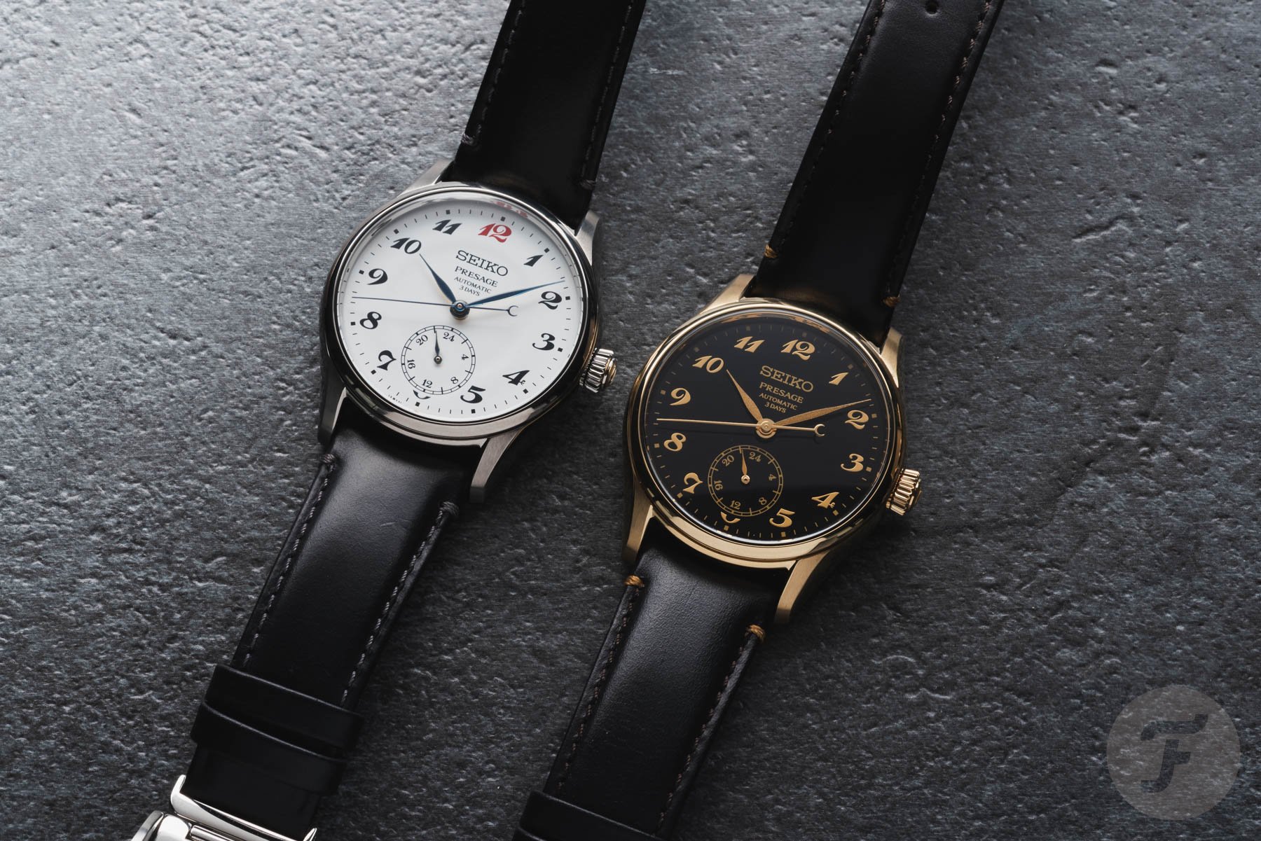
The Presage is Seiko’s line of affordable dress watches that boasts impressive diversity, but there can be too much of a good thing; sometimes it’s difficult to distinguish one Presage model from another. The fresh-off-the-press Presage Classic Series “Craftsmanship” Enamel (HCC005) and Urushi (HCC006) are a pair of appealing watches, especially the striking HCC006 with its black and gold livery, which might be one of the best looking Presage watches ever. The HCC005 in enamel Initial thoughts The HCC006 caught my eye as soon as I saw it; the high-contrast colours set it apart from all other Presage models. It’s a strong proposition for anyone looking for an affordable dress watch that isn’t in the typical, conservative pale colours. Moreover, the Breguet-style numerals in gold powder lacquer add a degree of refinement rarely found in watches at this price. The only downside of the HCC006 is the gold plated case. Though it adds to the look, I generally dislike plated cases since they feel inexpensive. That said, given the accessible price, it’s forgivable. The HCC005 with an enamel dial is similarly good value, but less interesting visually as it’s similar to past Presage models. It is, however, a good, low-key alternative to the black and gold of the HCC006. The HCC006 with an urushi dial Artisanal craft for less The new pair stick to the familiar template of the Presage Craftsmanship series – making traditional artisanal crafts affordable. As is conven...

Hands On: Breguet Classique Tourbillon 7357 SJX Watches
Breguet Classique Tourbillon 7357 As 5h ago

Hands On: Breguet Classique Tourbillon 7357

As it undergoes a late-in-life rejuvenation, Breguet has been steadily updating models long in its catalogue, including its range of tourbillon watches. The Classique Tourbillon 7357 is the long overdue evolution of the 3350/3357 that was introduced way back in 1989. Upgraded inside and out, the 7357 is the new entry-level offering amongst Breguet’s tourbillon watches, but it is now more obviously haute horlogerie with a new look and a new(ish) movement. The details and finishing of the 7357 illustrate Breguet’s manufacturing quality, despite being based on a model from three decades ago. The 7357 is available in Breguet gold or platinum (pictured here) Initial thoughts The 7357 is essentially the 3357, upgraded in every respect. Even though the watch pictured is a prototype, and not perfectly clean, the improvements in finishing, materials, and construction are obvious. Compared to the competition, the 3357 was arguably out of date even 20 years ago; in contrast, the 7357 is competitive. The decoration has jumped several steps upwards, which is most visible on the front with a refined tourbillon bridge. While the movement architecture is based on the Lemania cal. 387 of the 3350/3357, it now boasts a longer power reserve and non-magnetic hairspring amongst other upgrades. Like many of the other facelifted Breguet models, the 7357 adopts a new look but one that’s still recognisably Breguet – a gentle diversification away from the established Breguet wristwatch styl...

Hands On: Greubel Forsey Balancier 3 Titanium SJX Watches
Greubel Forsey Balancier 3 Titanium Yesterday

Hands On: Greubel Forsey Balancier 3 Titanium

The Greubel Forsey (GF) Balancier 3 topped our summer watch wish list thanks to its uncompromising craftsmanship and ergonomic form factor. Though not an altogether new watch — the model debuted in 2023 — the “baby blue” edition updates the formula with a dimpled finish on the prominent Y-shaped bridge that spans the dial. Initial thoughts Greubel Forsey is one of the few artisanal independent brands that has managed to create a distinctive and compelling sports watch. While the style of the Balancier 3 might be an acquired taste for some — especially those who prefer more of a dial — the quality of make is obvious and the finishing is almost clinical in its perfection. This helps justify the steep cost of entry, even for an ‘entry level’ model like the Balancier 3. The Convexe line grew significantly during former CEO Antonio Calce’s tenure, from late 2020 to early 2024, as the brand prepared to scale. Fortunately, the brand pulled the plug on its growth plan and has subsequently reverted to a more balanced line-up, no pun intended. Beyond the blue colour, the primary element that distinguishes this edition is the dimpled finish of the titanium bridge that supports the hand stack. More than just a finish applied for its own sake, the matte treatment helps break up the monotony of mirror-polished elements on the “dial” and provides enhanced contrast with its own mirror-polished bevels. To achieve this look on titanium, the GF developed a new technique...

Hands On: Grand Seiko “Hisen” SBGZ011 SJX Watches
Grand Seiko Hisen” SBGZ011 Grand Seiko’s 2 days ago

Hands On: Grand Seiko “Hisen” SBGZ011

Grand Seiko’s excellent dive watches may have stolen the show Watches & Wonders, but the waterfall-inspired Masterpiece Collection “Hisen” SBGZ011 proves the brand hasn’t let its next-generation Spring Drive rollout outshine its fine watchmaking project — the Micro Artist Studio. While best known for the Credor Eichi II, and some of the finest chiming wristwatches yet made, the Micro Artist Studio’s work for Grand Seiko is perhaps even better, and though its resplendent movements can be found in more subtle watches, the “Hisen” is just as decadently decorated outside as it is within. Initial thoughts Last year, Grand Seiko kicked off a streak of hits, launching the compact and precise Spring Drive SLGB003, on a quick-adjust bracelet. This year the brand launched an even deadlier duo of mid-sized Spring Drive divers, and probably has another commercial success on deck for next year. But in the background, the Shinshu Watch Studio, where all Spring Drive watches are made, continues its fine watchmaking efforts with the stunning diamond and Mozambique garnet set “Red Lion” ref. SBGD228, and the “Hisen” SBGZ011 reviewed here. Aesthetically, it is my least favorite of the four engraved-case models the brand has produced in recent memory — my favourites being the SBGZ001 “Snowflake” the astral SBGZ007 — due to the dial being too busy. However, the engraved 44GS case is almost magical, reminding me of the Quartz VFA ref. 3823-7030 and 3820-6000. L...

Hands On: Patek Philippe Calatrava Ref. 5227G-015 “Rose Gilt” SJX Watches
Patek Philippe Calatrava Ref 5227G-015 “Rose 2 days ago

Hands On: Patek Philippe Calatrava Ref. 5227G-015 “Rose Gilt”

Patek Philippe’s headline launches this year included the surprising Celestial ref. 6105G and Nautilus 50th anniversary editions, but also more classical, yet under-the-radar, watches, like the Calatrava ref. 5227G-015 with a “rose-gilt” dial and hinged case back. Though the Calatrava ref. 5227 with its distinctive “officer’s case” has been in the catalogue for well over a decade, the latest iteration is the best yet. The combination is somewhat formulaic – “salmon” dial and white gold case – but it is good looking and evocative of old-school Patek Philippe dress watches. At the same time, this new variant of the ref. 5227 contains a latest-generation automatic movement. Initial thoughts Ironically two of the standout launches by Patek Philippe during Watches & Wonders were fairly basic, essentially facelifts of references that have been in the catalogue for decades. One was the ref. 5396R-016 Annual Calendar, and the other is this, the Calatrava ref. 5227G-015. Though both are entirely different in function and price, they are similar in style. The designs are both restrained and evocative of vintage Patek Philippe watches; both also have dials in popular shades. “Salmon” is definitely overdone as a dial colour, but it doesn’t stop this Calatrava from being really appealing. The ref. 5227 is typical Patek Philippe in form. Even though it’s at the larger end of the range for Calatrava models, it still feels elegant. The case is thin and sits fla...

Arcanaut Introduces Fordite 2.0, Now Fully Customizable Worn & Wound
Ming 2 days ago

Arcanaut Introduces Fordite 2.0, Now Fully Customizable

Arcanaut, the Scandinavian indie known for their innovation with and unusual use of uncommon dial materials, has announced a major update to their signature watch. The Arc II Fordite, a personal favorite of mine and a watch I’ve proudly owned for a number of years, has been rethought as a bespoke piece, customized by each individual owner in a number of ways. Some of the options available feel like natural evolutions for the line based on a number of things we’ve seen from the brand in recent years across other projects, but a few are genuinely surprising.  When purchasing an Arc II Fordite from Arcanaut directly, the customer is brought to their Fordite Configurator, which first asks for their choice in dial. This, of course, is the heart of a Fordite watch as every dial is inherently unique (they are made from paint drippings from American auto factories). Prospective owners have always been able to choose their dial of course, but the watches have been sold as finished products. The new process centers the dials and the surprising ways they vary in appearance, and asks customers to think about how best to complement it.  The most welcome new development in the new Fordite process is the ability to pick from multiple cases. A total of four options are available, in “Standard” and “Skeleton” varieties, coming in at 40.5mm (the original size) or a new 37mm diameter. A smaller size should be exciting news to many as the 40.5mm case can wear quite a bit larger ...

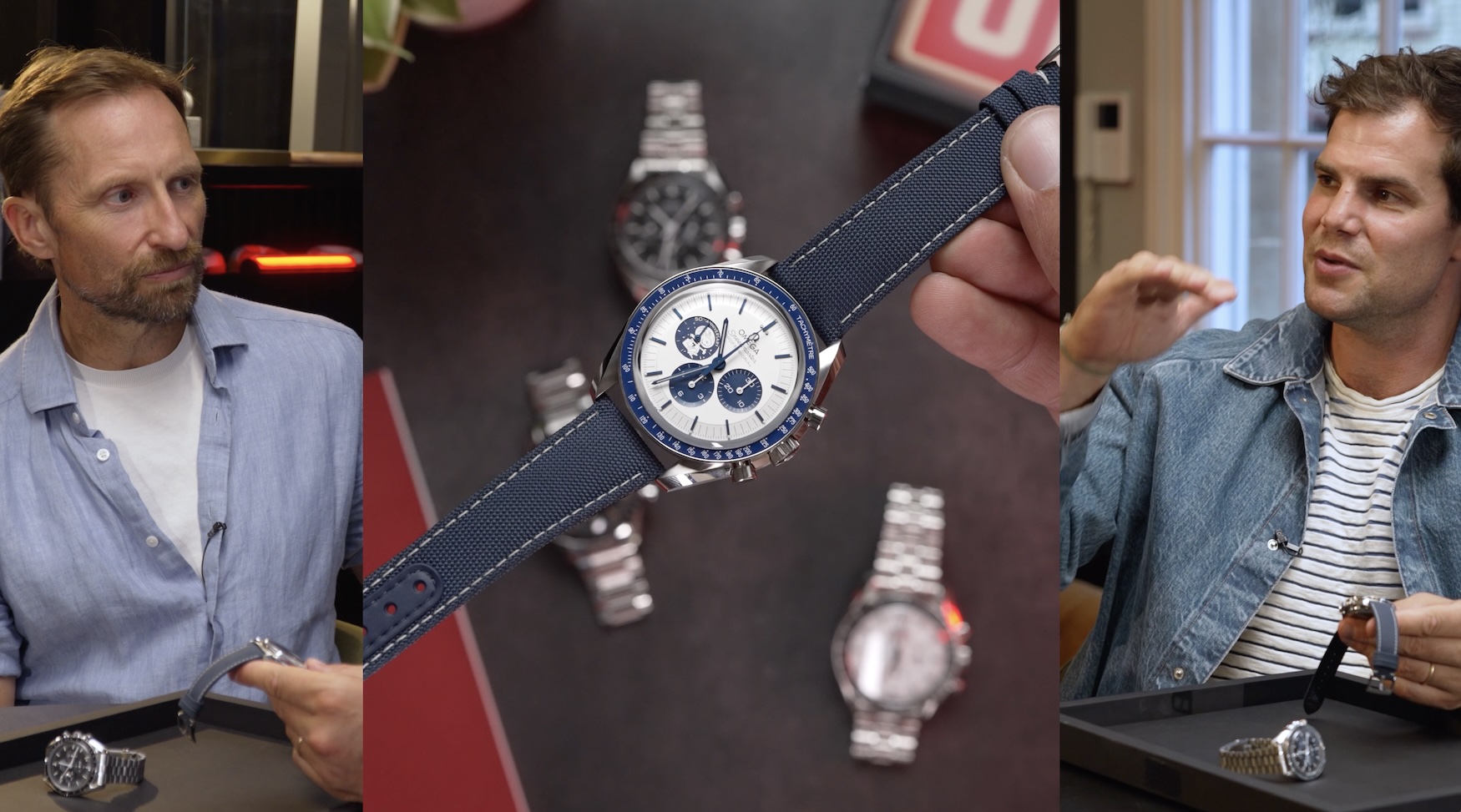
Moonwatch or Snoopy? Omega Speedmaster head-to-head (feat. Fratello’s R.J. Broer) Time+Tide
Omega Speedmaster head-to-head feat Fratello’s 2 days ago

Moonwatch or Snoopy? Omega Speedmaster head-to-head (feat. Fratello’s R.J. Broer)

Episode 3 of Four New Ways to Fly to the Moon — and this one took a detour we didn’t plan. Andrew and Justin were set to go head-to-head on the classic Omega Speedmaster Professional Moonwatch versus the blue Snoopy Speedmaster — the unimpeachable just-means-business OG versus the playful, sadly not so easy to score … Continued

SJX Podcast: Independent Watchmaking Retrospective SJX Watches
Franck Muller 3 days ago

SJX Podcast: Independent Watchmaking Retrospective

Ahead of Geneva Watch Days — which will feature 71 brands, many of them independent — episode 49 of the SJX Podcast looks back at how independent watchmaking became the phenomenon it is today. SJX and Brandon trace its evolution from 1970s pioneers like George Daniels and François-Paul Journe through the arrival of Daniel Roth, Philippe Dufour, and Franck Muller. The conversation also examines the avant-garde boom of the 2000s, the renewed emphasis on traditional finishing, and the role of digital photography and social media in transforming a solitary pursuit into a global collecting community. Listen now on Apple Podcasts, Spotify, and YouTube.  

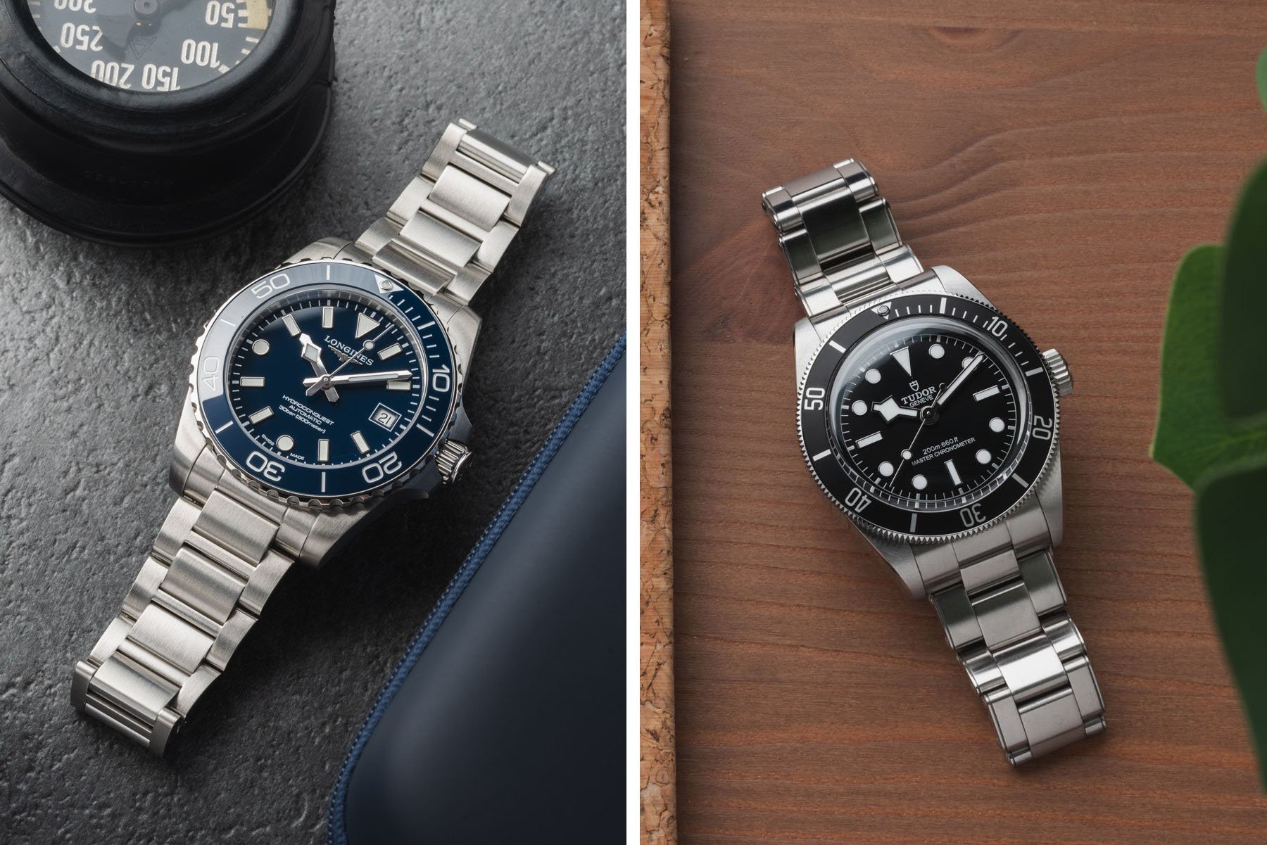
Sunday Morning Showdown: Longines Hydroconquest Vs. Tudor Black Bay “Monochrome” Fratello
Longines Hydroconquest Vs Tudor Black 4 days ago

Sunday Morning Showdown: Longines Hydroconquest Vs. Tudor Black Bay “Monochrome”

Good morning and welcome to another Sunday Morning Showdown. Grab yourself a nice cup of coffee and take a seat for a battle between two very popular divers. Last week, it was a fight between two Swatch group divers; this week, we pit Longines against Tudor. Both the updated Hydroconquest and the Black Bay “Monochrome” […] Visit Sunday Morning Showdown: Longines Hydroconquest Vs. Tudor Black Bay “Monochrome” to read the full article.

Seiko Celebrates Honda’s Quirky Bike with 5 Sports Motocompo SJX Watches
Seiko Celebrates Honda’s Quirky Bike 5 days ago

Seiko Celebrates Honda’s Quirky Bike with 5 Sports Motocompo

Compact, affordable Japanese icons collide in the Seiko 5 Sports Motocompo Limited Edition ref. HDB010, a collaboration with Honda that celebrates a collectable and compact 1980s motorbike. It recreates the Motocompo’s Daisy Yellow paint, retro typography, and even its packaging. And at 36.4 mm in diameter, it too can fit in the back of the Honda Jazz. Initial thoughts The Honda Motocompo was an adorable folding scooter briefly offered as an option on the Honda Jazz/City during the early 1980s. When folded up, it was small enough to squeeze into the back of a subcompact car, or even an Acura NSX. Its retro styling is back in fashion, and low production numbers — due to weak sales — make it quite collectable today. Honda offered the Motocompo in three colors: Caribbean Red, Shetland White, and the Daisy Yellow you see here. Image – Honda Motor Company I find the colour choice odd, as to me Honda means red — from the NSX to the brand’s motorcycles. “Honda Red” is the brand’s corporate colour, after all. If this colourway makes me think of anything, it’s Kill Bill: Volume 1. The case back crystal, however, is classic Honda red, concealing the industrially finished workhorse cal. 4R36. Colour aside, the Honda wordmark is appealingly subtle, and the stylised “automatic” text at six, which echoes the original Motocompo branding, turns an otherwise unnecessary label into a defining element of the design. Bluntly speaking, Seiko typography fell off a cliff ...