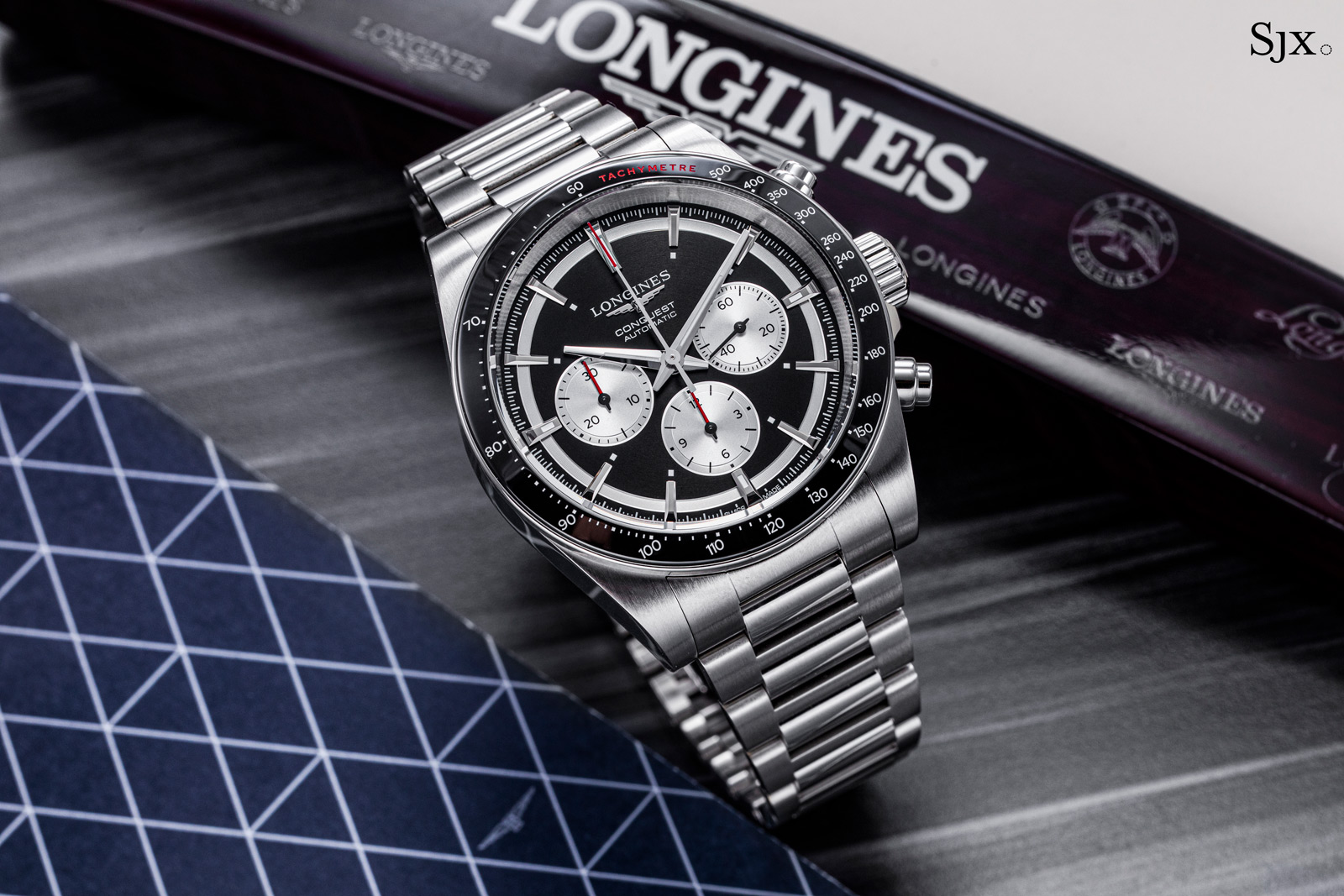
Hands On: The Longines Conquest Chronograph 42 mm
Longines facelifted the Conquest Chronograph last year, giving it more vintage flavour while retaining the sporty style of its predecessor and also the slightly-too-big case. The new look is reminiscent of a more famous sports chronograph, but compared to its predecessor, the new Conquest is more coherent. Initial thoughts At a distance, the Conquest Chronograph bears a striking resemblance to the modern Rolex Daytona, which is unsurprising given the commercial success of the Cosmograph (hence Zenith’s Chronomaster Sport as well). But in the hand it is clearly a larger, chunkier watch than its famous rival, and upon closer inspection, the dial design is also distinct with several interesting details. The previous Conquest tried to be different and ended up being too much. That design was characterised by an oversized “12” that was recognisable but not sophisticated. Although the resemblance to the modern Daytona is apparent at a distance, the dial gets more interesting up close (and also gives off some Paul Newman vibes). The new Conquest has a cleaner dial design with a slightly retro style thanks to a sector-like chapter ring. It does without a date, something purists will approve of. Although all four dial colours share the same design, two stand out. The champagne dial is a unique colour for a sports chronograph in this price segment, while the silver dial has just the right amount of red accents, with the red-outlined luminous squares being particularly interest...
 Monochrome