 Hodinkee
Hands-On: Vacheron Constantin's Pièce Unique Homage To Peter Paul Rubens
Back in 2020 Vacheron and the Louvre offered a chance for a watch based on any piece of art. This is the amazing result.
40,915 articles · 5,900 videos found · page 478 of 1561
Hodinkee
Back in 2020 Vacheron and the Louvre offered a chance for a watch based on any piece of art. This is the amazing result.
 Worn & Wound
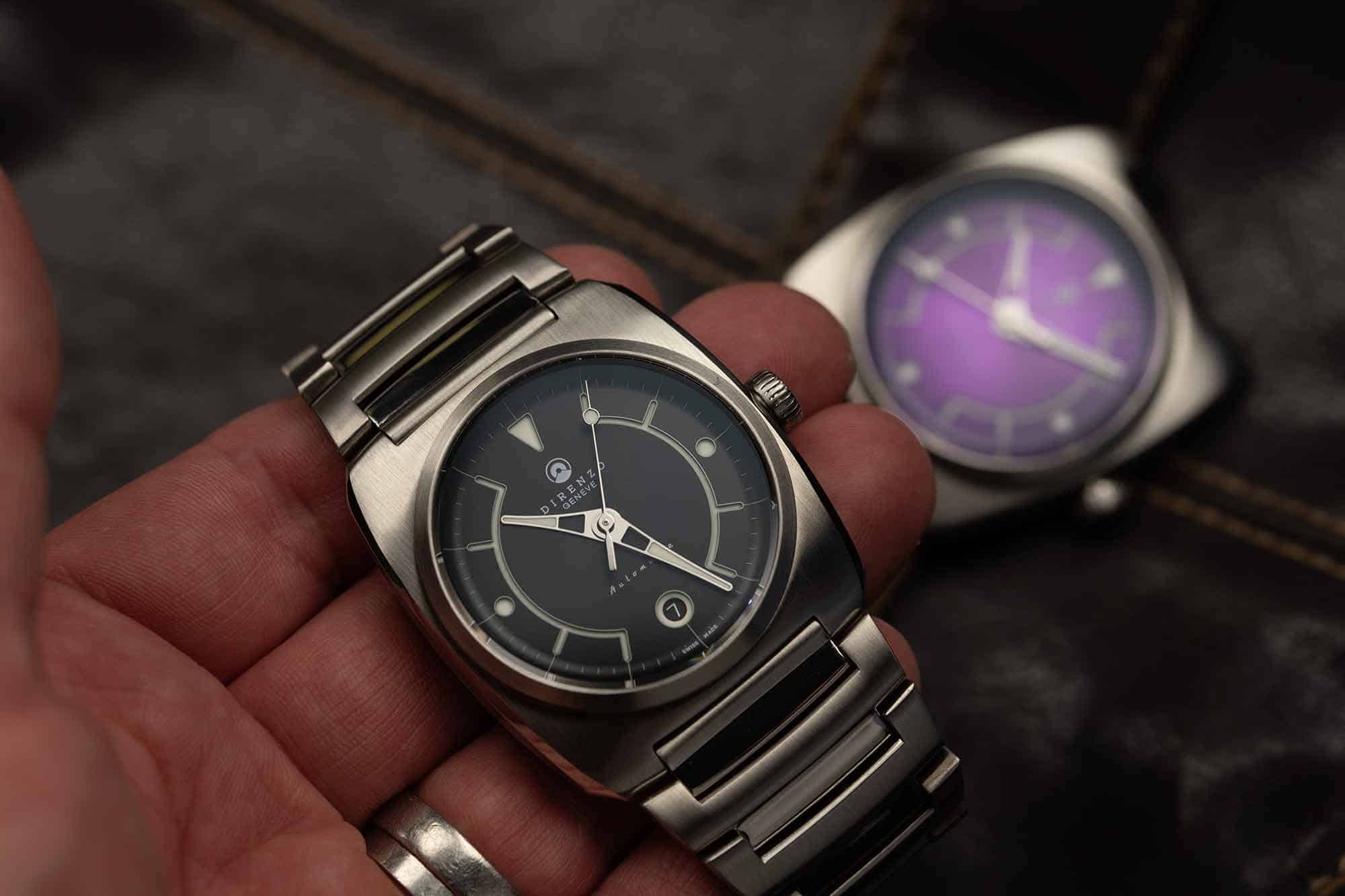
Direnzo is a brand that I’m fortunate enough to have followed closely over the last few years, first taking a look at the DRZ03 ‘Eclipse’ and following that up with hands-on reviews of the DRZ 04 ‘Mondial’ and DRZ 05 ‘Solaris’. It has been fun to see the early stages of the evolution of the brand while it remains resolutely faithful to its design language. The next stage of this evolution is to revisit and rework an early, but important, model for the brand – the DRZ 02. That happens to be the release before I truly became aware of the brand, so isn’t a reference that I’ve had the pleasure of going hands-on with before. While the DRZ 02R ‘Aerolite’ may be similar to its predecessor in case outline and dial layout, the ‘R’ in the model name stands for ‘Reduced’, which gives a hint to one significant change. It could equally stand for ‘Refined’ as Direnzo founder and designer Sergio Godoy continues to hone his design skills and pursue quality. Another major update is the presence of a stainless steel bracelet to complete the package. I couldn’t fit this in with the ‘R’ theme, but if you have a suggestion, drop it in the comments! $750 Hands-On: the Direnzo DRZ 02R Aerolite Case Stainless steel Movement Sellita SW-200-1 Elaboré Dial Black, Purple, Gray, Blue, Burnt Orange Lume BGW9 SuperLuminova Lens Sapphire with anti-reflective coating Strap Steel bracelet Water Resistance 100 meters Dimensions 39mm x 44mmmm Thickness 10.8mm Lug Wi...
 Worn & Wound
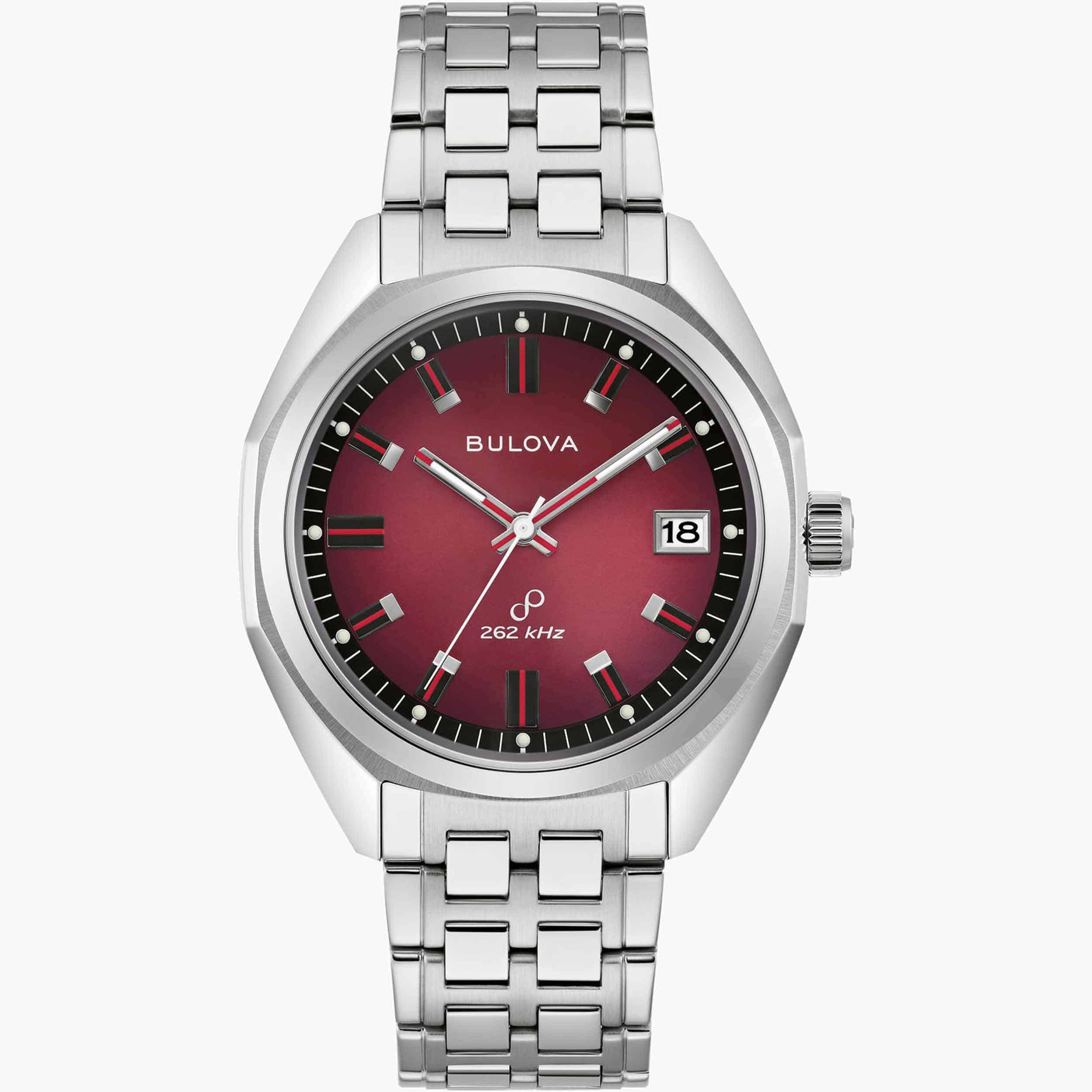
Good design always comes back in cycles. Whether it’s the revival of midcentury furniture or Neoclassical architecture, there’s an undeniable truth when it comes to design: if it ain’t broke, don’t fix it. Watch brands are surprisingly good at acknowledging – even celebrating – past designs, only making small updates for better performance or tweaking the finer details to refine the overall product. Bulova’s release of their reimagined Jet Star is one such example of this. Taking inspiration from the archival 1970’s Jet Star, the new Bulova 1973 Jet Star has made incremental updates to the overall design, preserving what works and making small improvements along the way. The stainless steel case remains as angular and interesting to the eye as the original, but has since been updated with a trio of colorways for a variety of options. Customers can now choose between a sporty steel timepiece with red and blue accents, a gold-toned Jet Star with rich brown and gold tones, or a not-so-subtle red and steel model. While the aesthetic of the watch could be right out of the 70’s, the internals of this watch are anything but retro. Utilizing a Precisionist movement, this quartz caliber vibrates at a remarkable 262kHz, making for a gorgeously smooth second hand that sweeps across the dial, similar to a mechanical watch. This unparalleled accuracy punches well above the weight class and price point of the Jet Star. Each of the three references in this collection ...
 Worn & Wound
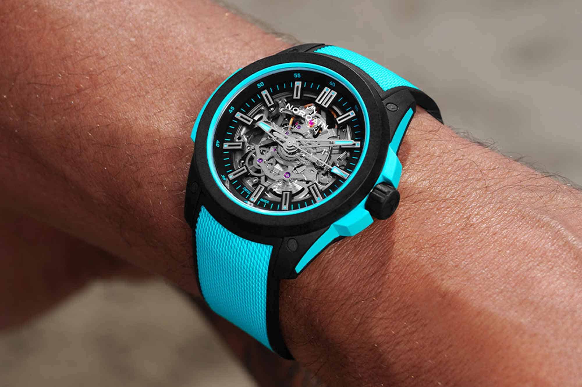
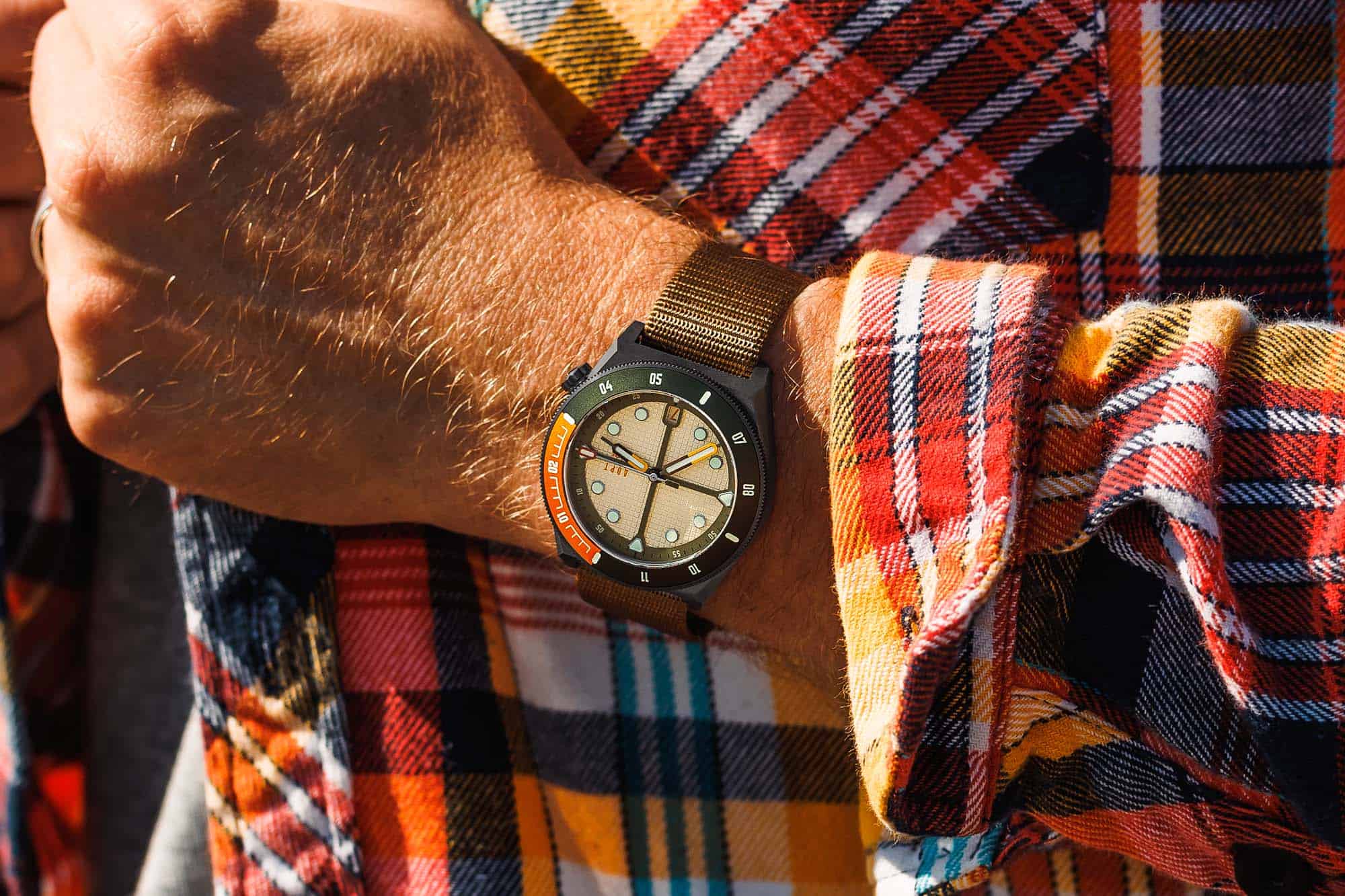
This one seems like it was bound to happen. When Norqain unveiled the Wild ONE last year and hailed it as a next-gen, materials focused sports watch, it seemed clear that we’d get some ultra modern dial executions down the line to match the tech in the case. I was a pretty big fan of the first batch of Wild ONEs, but if there was an element that seemed a little “off” to me it was the dial. The repeating Norqain logo motif just didn’t seem to match the visual tone and vibe of the rest of the watch. I couldn’t quite put my finger on what would make it better, but with the new skeletonized version that was recently unveiled, I think they have the Wild ONE heading in the right direction. Right off the bat, I realize this might be a somewhat controversial take. When Blake went hands-on with the Wild ONE earlier this year, one of his chief gripes was legibility. That concern is not likely to be abated with a dial that’s perhaps even more of an eye-chart, but in my opinion it “fits” the spirit of the watch a little better. While Norqain is ostensibly selling these as adventure watches for all manner of outdoor activities, to me they feel more in line with stylish, contemporary headturners like the Zenith Defy, or even watches in the Royal Oak Offshore line. Capable, yes, but designed to be gawked at more than anything. The new Wild ONE Skeleton comes in two variants. One with a burgundy NORTEQ case with gold dial accents, and the other with a black NORTEQ case...
 Revolution
In this three-part series, we explore the Bvlgari Octo Finissimo with three esteemed guests, all amazing and respectable in their own rights. Wei sits down with Ahmed Rahman to talk about his passion and admiration for the Bvlgari Octo Finissimo series. Ahmed Rahman, widely known as Shary, is a highly regarded figure in the world […]
 Video
Video
 Time+Tide
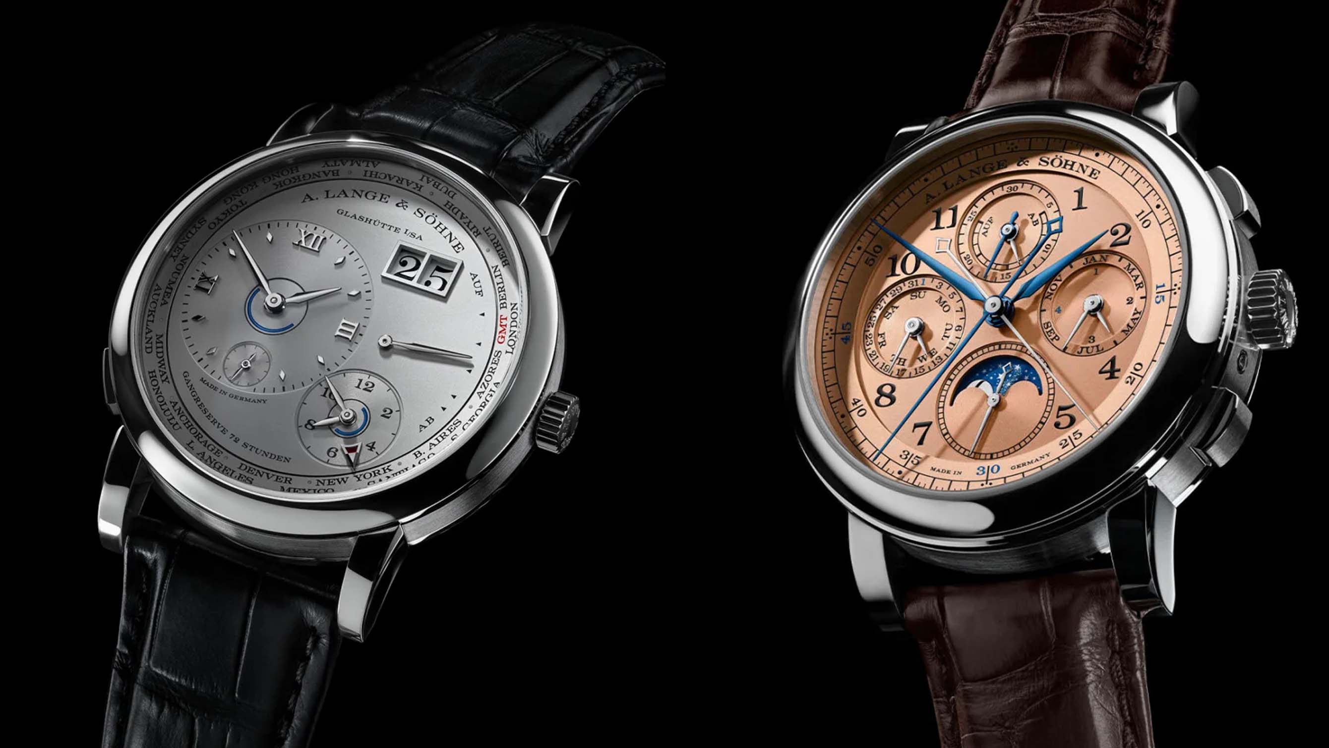
Two modern classics of A. Lange & Söhne designs have been given fresh case materials. The 1815 Rattrapante Perpetual Calendar is cased in 18k white gold with a pink gold dial. The Lange 1 Time Zone is cased in 950 platinum with a rhodium dial. It’s well established by now that the Swiss aren’t the … ContinuedThe post The new A. Lange & Söhne 1815 Rattrapante Perpetual Calendar and Lange 1 Time Zone appeared first on Time+Tide Watches.
 Worn & Wound
Today, we’re starting off a new series here in the shop where we pick 3 of our favorite watches under a certain budget. We find quite often that watch folks like to have all the bases covered when it comes to their collections and we’re here to help! Whether you’re just getting into the watches, or maybe you’re buying for friends, or even if you’re a seasoned collector, we hope you enjoy our picks! Today, we’re starting off a new series here in the shop where we pick 3 of our favorite watches under a certain budget. We find quite often that watch folks like to have all the bases covered when it comes to their collections and we’re here to help! Whether you’re just getting into the watches, or maybe you’re buying for friends, or even if you’re a seasoned collector, we hope you enjoy our picks! The post Pick 3: The Ultimate $1500 Collection appeared first on Worn & Wound.
 Hodinkee
The son of one of the most important dealers is carving his own collecting style with nods to the past.
 Time+Tide
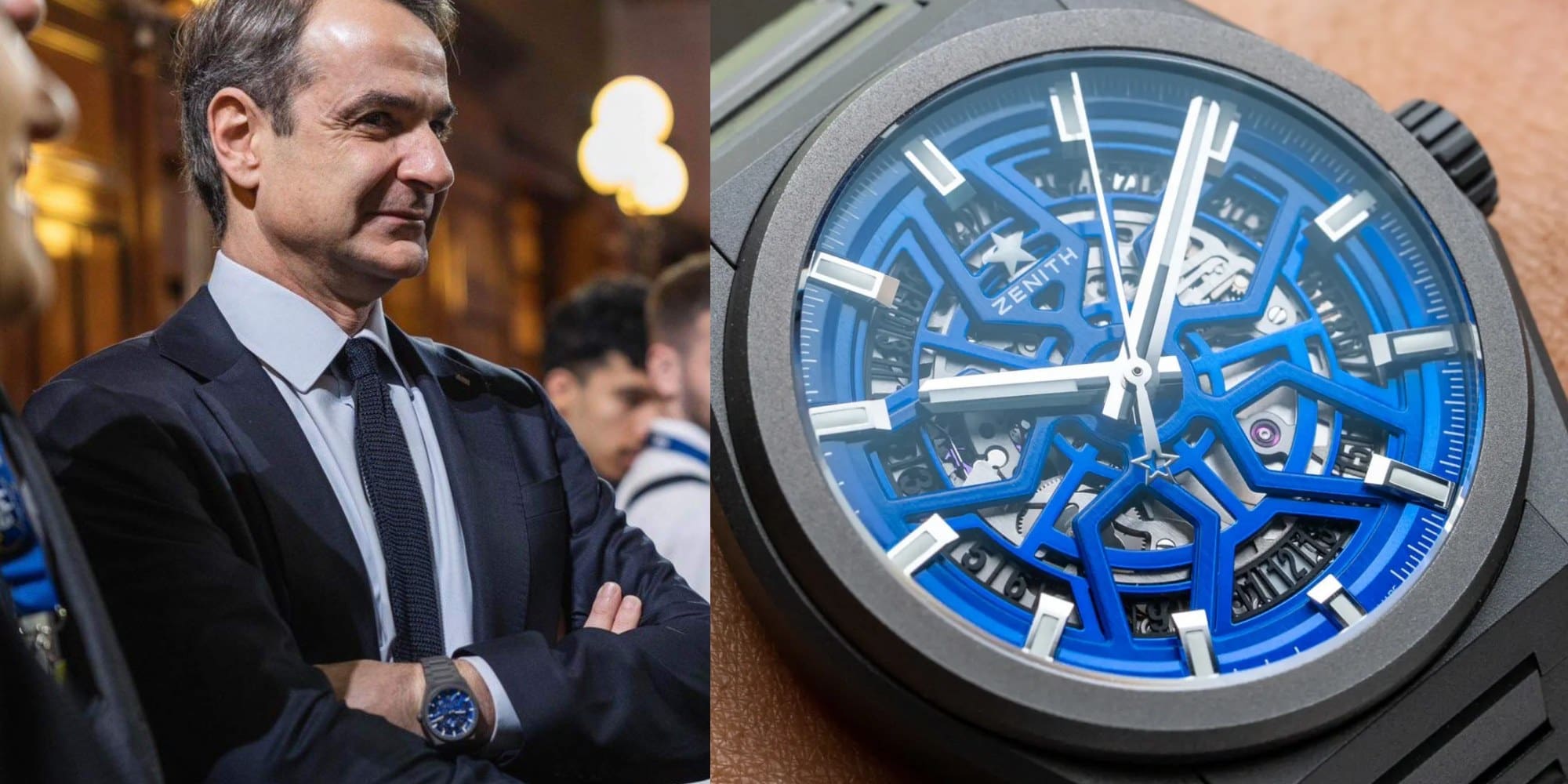
Kyriakos Mitsotakis has enjoyed a great run of late. The Greek Prime Minister recently surged to a landslide victory in his country’s general election with his right-of-centre New Democracy party taking 40.6% of the vote to win a second four-year term. The result delivered Mitsotakis an overall majority of eight seats in the 300-member parliament, … ContinuedThe post Greek Prime Minister Kyriakos Mitsotakis wears the Zenith Defy Classic Skeleton “Night Surfer” Time+Tide Edition appeared first on Time+Tide Watches.
 Hodinkee
A follow-up to the famed "Skipperera," this Autavia-based Skipper is just too good to not dive deeper on.
 Video
Video
 SJX Watches
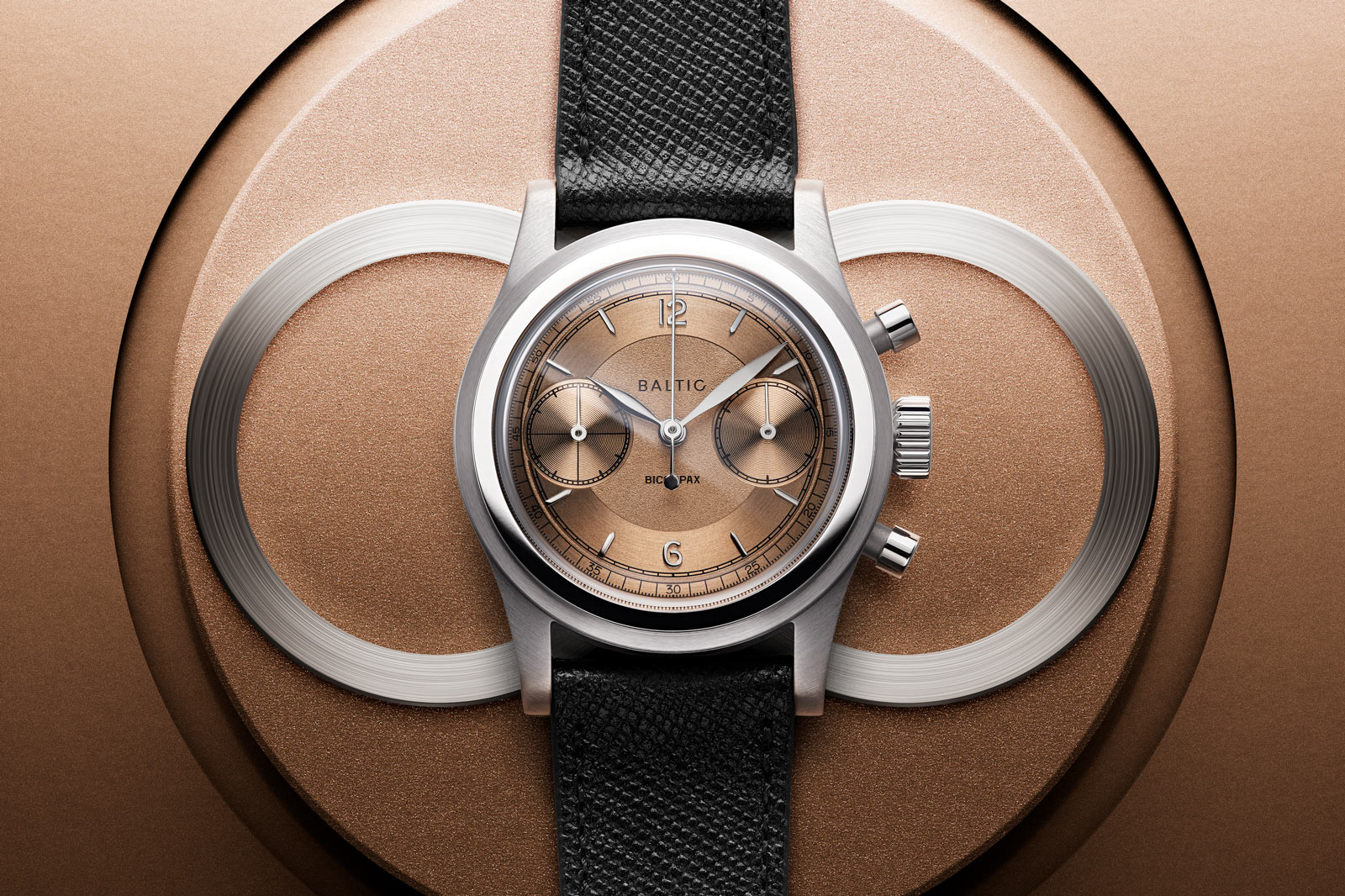
French microbrand Baltic has sharpened the styling of its signature models with the HMS 003 and Bicompax 003. While maintaining their 1940s-inspired styling and affordable pricing, the new duo feature subtle enhancements to the design, most notably on the dial and a small case diameter. Initial thoughts Baltic found success with its formula of retro style and accessible pricing – most of its watches are in the US$500 to US$1,000 range – with the Micro-Rotor MR01 being a recent bestseller. It is a nice surprise to see the brand’s debut models rebooted to gain a smaller case similar in size to the MR01. The dials of the 003 series offer a lively aesthetic with textured surfaces and applied indices that create a pleasing contrast. This is an upgrade from from the 002 models, which felt a bit flat due to the printed markings on the dial. And the reduced case size of 36.5 mm give the 003 series distinct, 1940s-inspired proportions that match the dial designs perfectly. However, the new dials are perhaps lacking one thing, an applied logo to match the applied indices. Of the three colours, the “salmon” versions are predictable and stand out as crowd pleasers that will probably sell out swiftly give the faddish nature of the colour. The blue dial with gold indices, however, is both unusual and attractive. As is typical for Baltic, the 003 watches are made inexpensively but smartly so they feel a bit nicer than they cost. The new models maintain the brand’s competiti...
 Worn & Wound
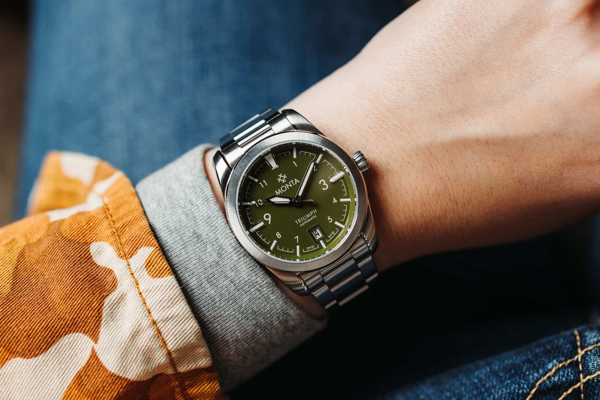
Monta surprised Windup Chicago attendees this weekend with the surprise unveiling of a new colorway for their popular Triumph model. The Triumph is the brand’s take on a classic military field watch, so the new green dial feels like a natural choice for the way it evokes uniforms and other military iconography, and brings an even more tool-like feel to the Triumph. The Triumph has been around since 2017 and is one of the longest standing Monta references. When it was introduced at Baselworld that year, a sunburst green dial was among the variants on display. This new version is a very different take on the color, however, with a more pronounced olive tone and a lacquer finish. Hands, hour markers, and Arabic numerals are all in a crisp, high contrast white, with the hands and markers at 12, 3, 6, and 9 given a rhodium plating for increased legibility. Aside from the new dial, this is the same Triumph that Monta fans have come to love over the years. It features the same top notch finishing that Monta has always been known for, which in the case of the Triumph means a case that’s entirely brushed, except for thin chamfers on the bracelet, bezel, and lugs. The case measures 38.5mm in diameter and is just 9.7mm thick, but still has a full 150 meters of water resistance thanks to its robust construction and screw down crown. The military green dialed Triumph is a limited edition of 95 pieces, and is now available for pre-order at a price of $1,700. It’s also worth ...
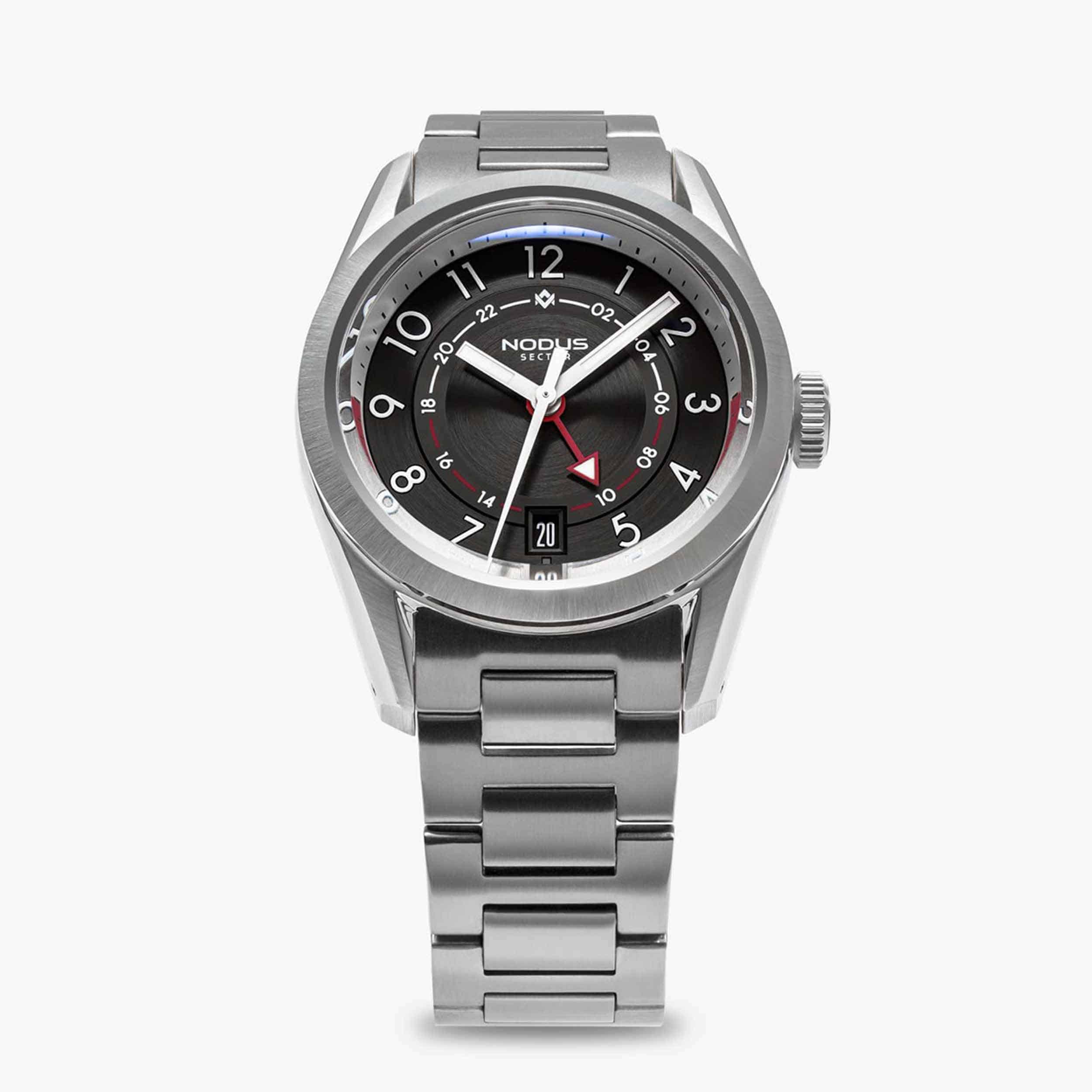 Worn & Wound
Nodus fans take note: a rare version of the Sector GMT is about to be sold at auction for a worthy cause, and you can bid on it until the auction closes tomorrow. This limited edition was created in partnership with RedBar’s Atlanta chapter, and features some distinctive details that make this version particularly rewarding for Atlanta residents, but it’s also just a nice looking execution of an already attractive watch, and we think it can be enjoyed just as easily north of the Mason-Dixon line. Or in Nodus’ hometown on the west coast. You get the idea. The dial is black with red accents, a nod to the colors of the Atlanta Falcons football franchise, and features an image of the Atlanta skyline on the caseback, along with the RedBar logo and limited edition number. This particular watch carries the “00/50” designation, and is the last remaining of the limited run (all 50 watches in the limited edition were claimed by Atlanta RedBar members when the watch was unveiled in April). The Sector GMT is a classically proportioned sports watch (it measures 38mm in diameter) filtered through the Nodus contemporary design language and point of view. Like other watches in the Sector collection, the GMT makes use of a multi piece dial with distinct layers, creating a unique sense of depth and calling attention to the finishing and materials Nodus is using. This collection has grown and matured a great deal in just a few years, with a total of six models spanning every vari...
![[VIDEO] Missed Review: The Seiko Alpinist SARB017](https://wornandwound.com/library/uploads/2023/07/Seiko_Prospex-Alpinist-SPB121_03.jpg) Worn & Wound
Worn & Wound
We all have unique origin stories about the watches that got us into the hobby, or the watches responsible for pulling us in deeper. As varied as those stories surely are, the overlap of appearances by a certain handful of watches is likely quite high. While not universal, I’d wager that the highest percentage of overlap is among Seiko watches, stuff like the SKX007, the 6139, and the Alpinist SARB017. Each of those references make appearances somewhere along the early stages of my own journey, and this Missed Review will focus specifically on that last one, the Alpinist SARB017, a watch that’s easy to take for granted these days. There was a time, however, when this watch had a near mythic appeal. In some ways, it still does. The Alpinist holds an interesting place in Seiko history, and while the name may no longer exist formally, it still holds a tremendous amount of equity when it comes to Seiko field watches and their enthusiasts. The name itself dates back to the early ‘60s with the Laurel Alpinist and Champion Alpinist, though it wouldn’t appear on a modern design until 1995 with the so-called ‘red Alpinist’ SCVF references designed by Shigeo Sakai. It is this design that would set the template for the 2006 SARB references, and the current Prospex Land watches which no longer employ the Alpinist nomenclature. $700 [VIDEO] Missed Review: The Seiko Alpinist SARB017 Case Stainless Steel Movement 6R15 Dial Almond Green Lume Super Luminova Lens Sapphire Stra...
 Hodinkee
A stealthy, platinum take on the Time Zone that stays true to Lange.
 Video
Video
 Worn & Wound
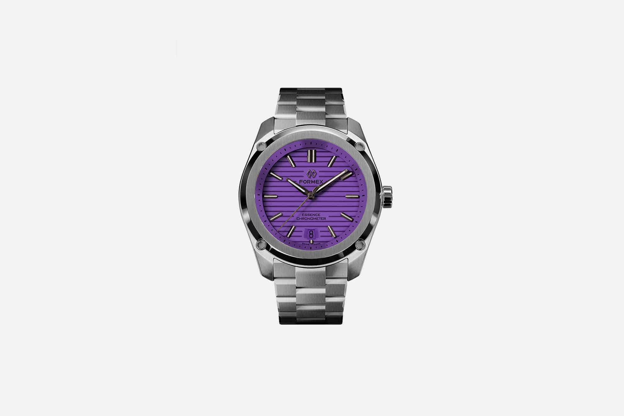
Windup Watch Fair Chicago is officially in the rearview mirror, and as we come up for air from another successful event in the Windy City, it’s time to take stock of some of the new releases that saw their debut at the show. Windup is increasingly becoming a venue for brands to unveil new releases to a captive audience, and this year’s Chicago show saw a handful of both completely new and iterative drops that had watch enthusiasts buzzing all weekend. Formex is just one example, bringing a new collection of Essence references in 39mm and 43mm case sizes with bold colors that make an already fun sports watch just a little more vibrant. The new Essence Splash Chronometer Limited Collection feature dials that are hand-sprayed with bright and bold colors in the brand’s Swiss dial manufacture. The colors range from pastel shades to bold neon, with the full lineup including Sunflower Yellow, Jungle Green, Sunset Orange, Baby Blue, and Lavender Purple. The distinctive feature of the Essence dial, the CNC machined horizontal lines that are run across it, remain in this collection. These dials have a matte finish, which makes the colors pop and appear more uniform, and stands in contrast to other Essence dials that are a bit more reflective. The Splash collection appears across both the 39mm Essence in stainless steel as well as the 43mm Essence Leggera with a case made from carbon and ceramic components. Seeing them in person at Windup, the larger Essence Leggera dials r...
 Time+Tide
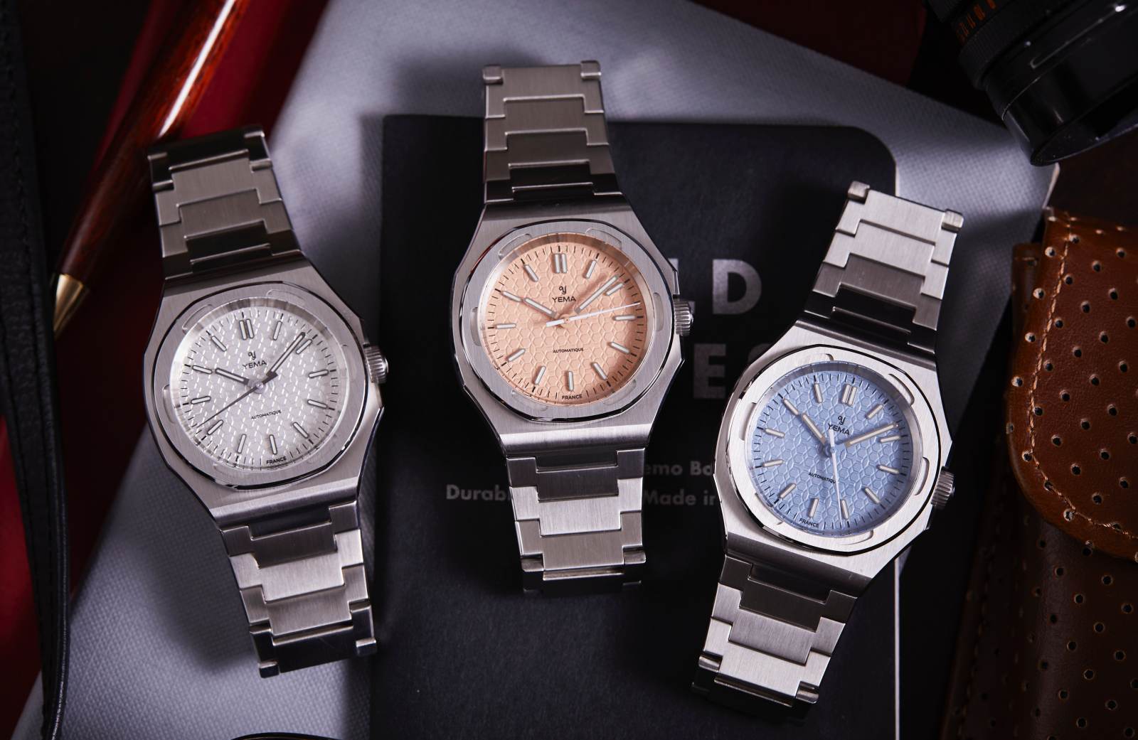
Earlier this year, Yema indicated their intentions to spice up their collections with the release of the Urban Field. With their Wristmaster Traveller Micro-Rotor being such a barnstorming hit last year too, it made perfect sense for the next experiment to evolve as the Yema Urban Traveller. Clinging to that 1970s retro swagger, this new … ContinuedThe post HANDS-ON: The Yema Urban Traveller delivers integrated-bracelet watches in a soft palette of summery dials appeared first on Time+Tide Watches.
 SJX Watches
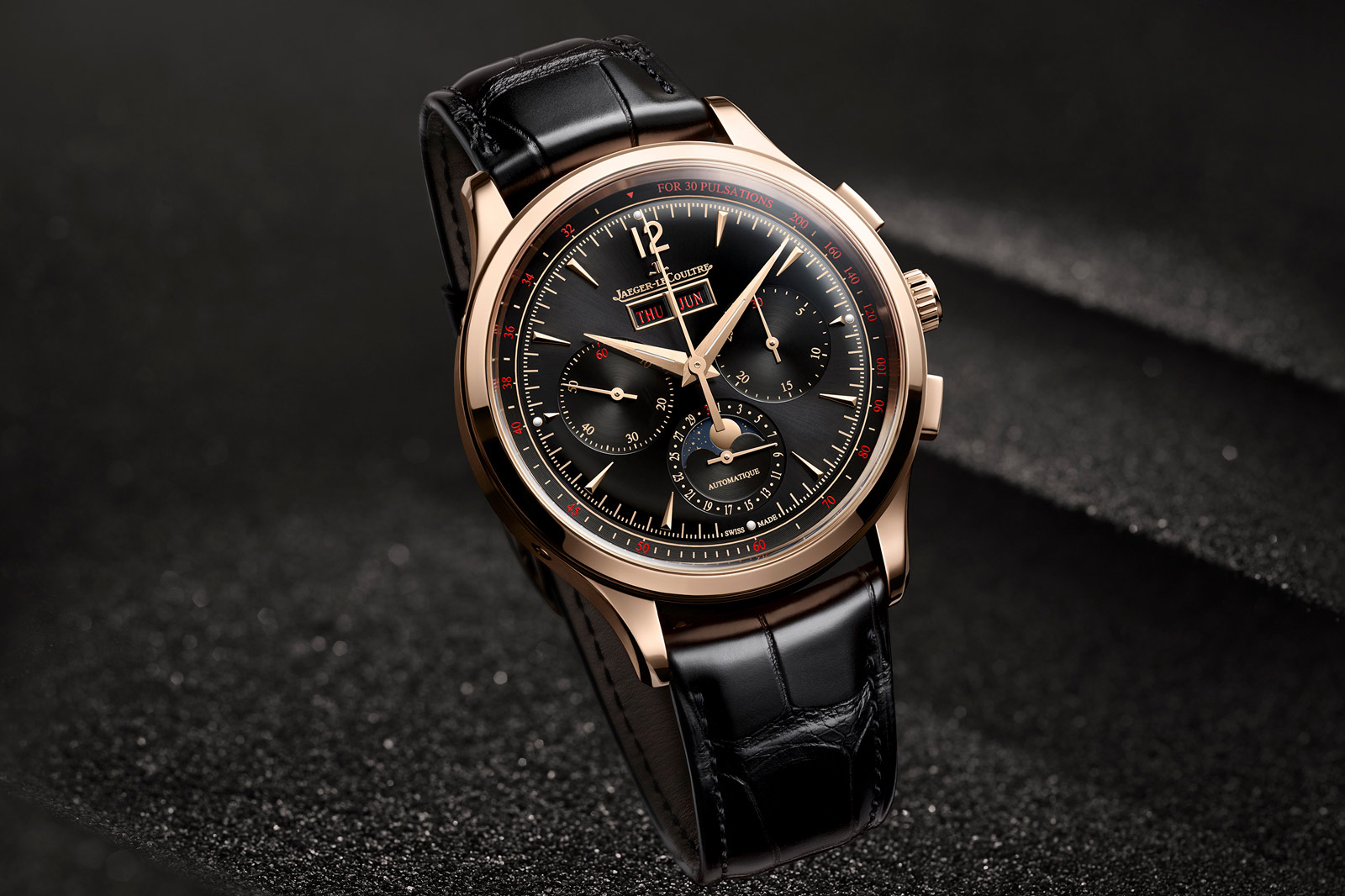
Jaeger-LeCoultre (JLC) has just unveiled a fresh colour option for the Master Control Chronograph Calendar. Sporting a black dial adorned with red and gold accents, the latest iteration is the chromatic opposite of the original model that featured a conservative silver dial. Initial thoughts The Master Control Chronograph Calendar was released two years ago with an unsurprising silver dial that fit well with the vintage-inspired design but lacked oomph. Fortunately, JLC has addressed this with a high contrast palette that is still suitably vintage inspired but much more striking. Vintage watches with black-and-red dials are uncommon, but they do exist. The combination is appealing, but not the most practical since red text on a black dial is hard to read due to the low contrast between the two colours. This is especially so for the calendar indications, while the pulsations scale on the periphery is probably unreadable in low light. But still, the appeal of the dial certainly makes it compelling despite the poor legality. Colours aside, the watch is identical to the original version, so it shares the same strengths, like the solid, old-school design, and weaknesses, like the mix of French and English on the dial. This costs the same as the earlier version in rose gold, which is US$32,500. The price parity is certainly fair and logical. However, the price is a bit higher than it should be. While not exorbitant, the price does not represent the sort of strong value propo...
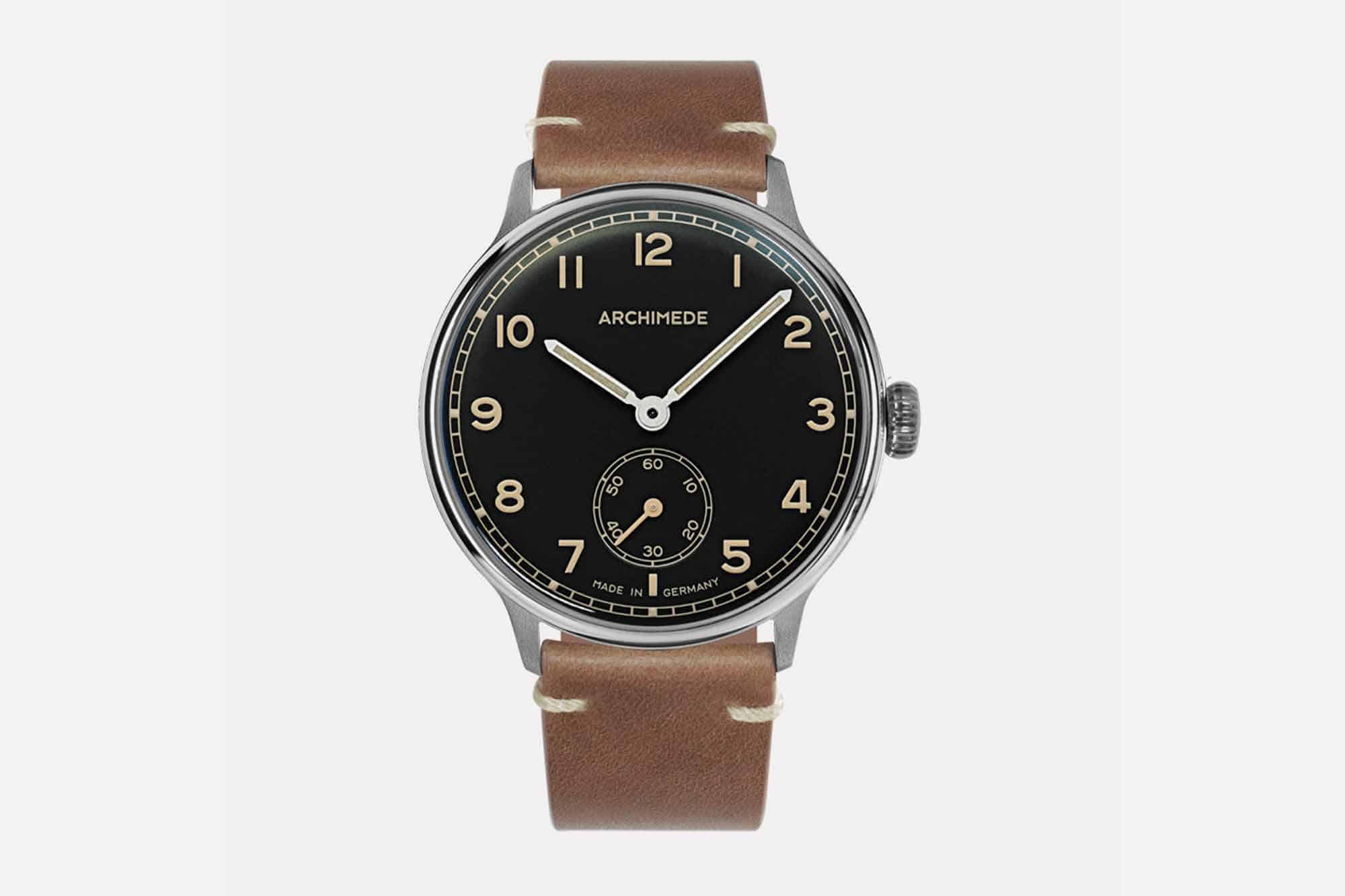 Worn & Wound
The 1950’s were a unique time in terms of both manufacturing and design. Post-war Europe and the United States were, in many ways, still reeling from the previous decade’s global conflict while also enjoying the benefits of a revitalized economy. This, in turn, created a boon of creativity and a sort of mid-century design renaissance that is still admired today. One company that has looked back to the archival design language of the 1950’s is German brand Archimede. The 1950’s collection nods to the design language of this decade with a visually flat dial and an array of small design details which shows a knowledge and respect for this time period. Their latest in the collection, the 1950-4, continues this study in mid-century excellence with new dial executions in green and black, with a variety of strap pairing options to choose from. While the new watches have a subtle charm to them at first glance, it’s the small details that really shine. For starters, each of the references is a 40mm stainless steel ICKLER case with a classic Arabic numeral dial layout and a subsidiary seconds scale at the 6 o’clock mark. A railroad track pattern circumvents the dial, adding just enough detail to be visually appealing without detracting from the overall clean visuals. Most interesting, perhaps, are the lumed hands, numerals, and indices which were inspired by the use of radium in vintage watches, and light up in a charming nod to the past (but don’t worry – it’s not...
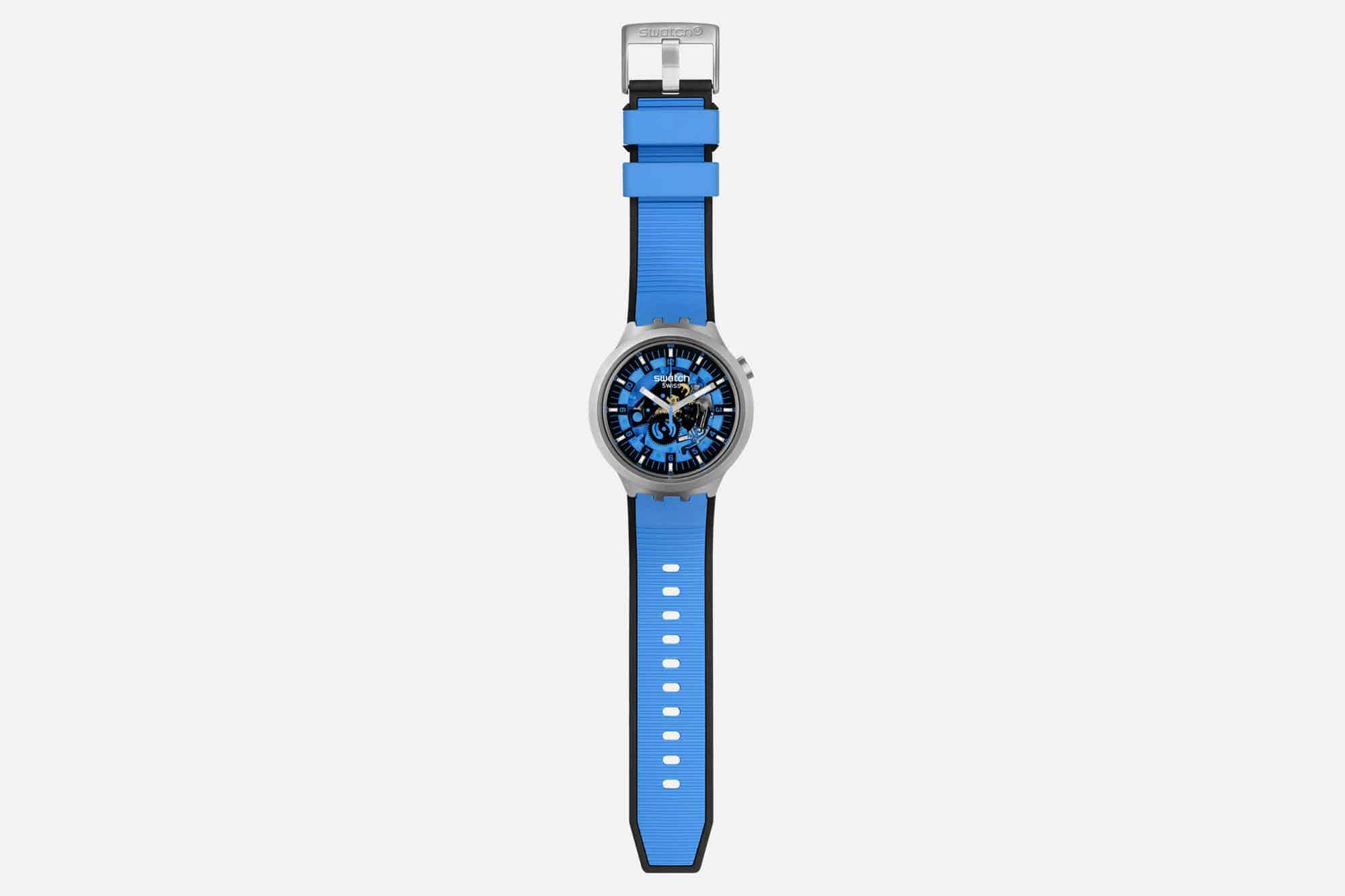 Worn & Wound
Summer is in full swing, cool and casual is the name of the game, and for Swatch that means bigger and bolder watches. Big Bold Irony, that is. For the first time, the brand is bringing its Irony treatment to the Big Bold lineup in the form of five new watches. The Irony collection was originally conceived in the 1990s as a premium offering featuring cases made from metal, and indeed, the new Big Bold Irony watches are fitted with stainless steel cases. They are also the first to combine steel with Swatch’s proprietary Bioceramic. There’s no getting around the fact that these watches truly live up to their namesake. At 47mm wide, they undoubtedly make a statement. Swatch has cleverly shaped the lugs, which start towards the underside of the case and curve sharply downwards, resulting in a case length of just 44.8mm. This is identical to the current Big Bold collection and is remarkably wearable for a wide audience. In fact, the only difference in dimension between these and the standard Big Bolds is thickness: the new Irony watches are 13.3mm thick as opposed to 11.75mm in plastic. Swatch’s design choice of keeping the crown at 2 o-clock ensures it will never dig into your wrist, and at 108 grams (with a quartz movement), these watches can easily be worn all day, every day, which is kind of the point. With five options of summery colors – Dark Irony (Black), Azure Blue Daze, Red Juicy, Mint Trim, and Bolden Yellow – you will have no trouble finding one that match...
 Video
Video
 Time+Tide
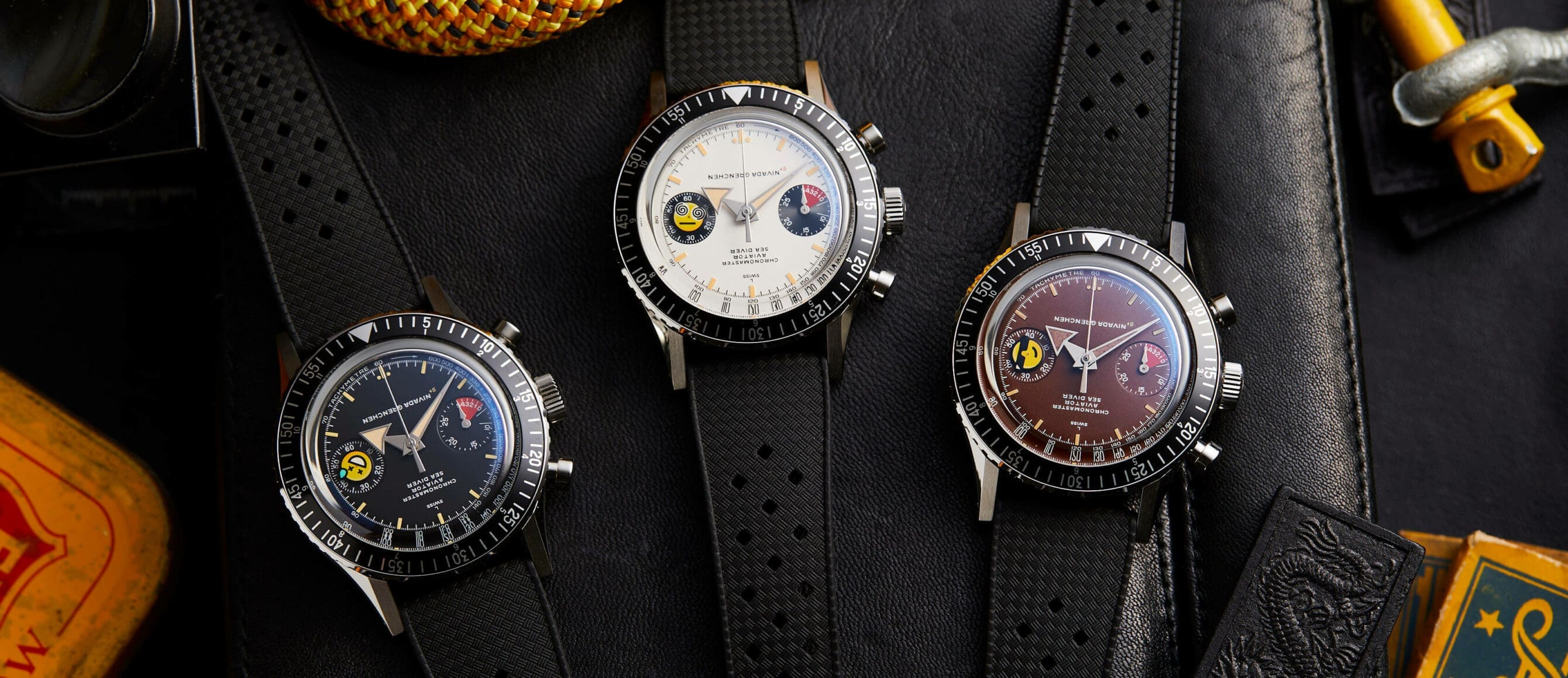
As you all no doubt know, it’s World Emoji Day 😵💫😎😅. That means two things. 1. Like me, you’re going, what? There’s a World Emoji Day? and 2. We have some pretty good news, that comes off the back of a difficult situation. You see, when we launched the ChaosMasters, back in November of last … ContinuedThe post The ChaosMasters return – this time with different colour dials, and as a box set trio appeared first on Time+Tide Watches.
 Revolution
Join Wei and Christian Selmoni, Style and Heritage Director of Vacheron Constantin, as they unveil Wei’s personal 222. In this engaging conversation, we’ll explore the fascinating history and design philosophy behind the Vacheron Constantin 222, which has earned its reputation as one of the most coveted sports watches in the watch world today and can […]
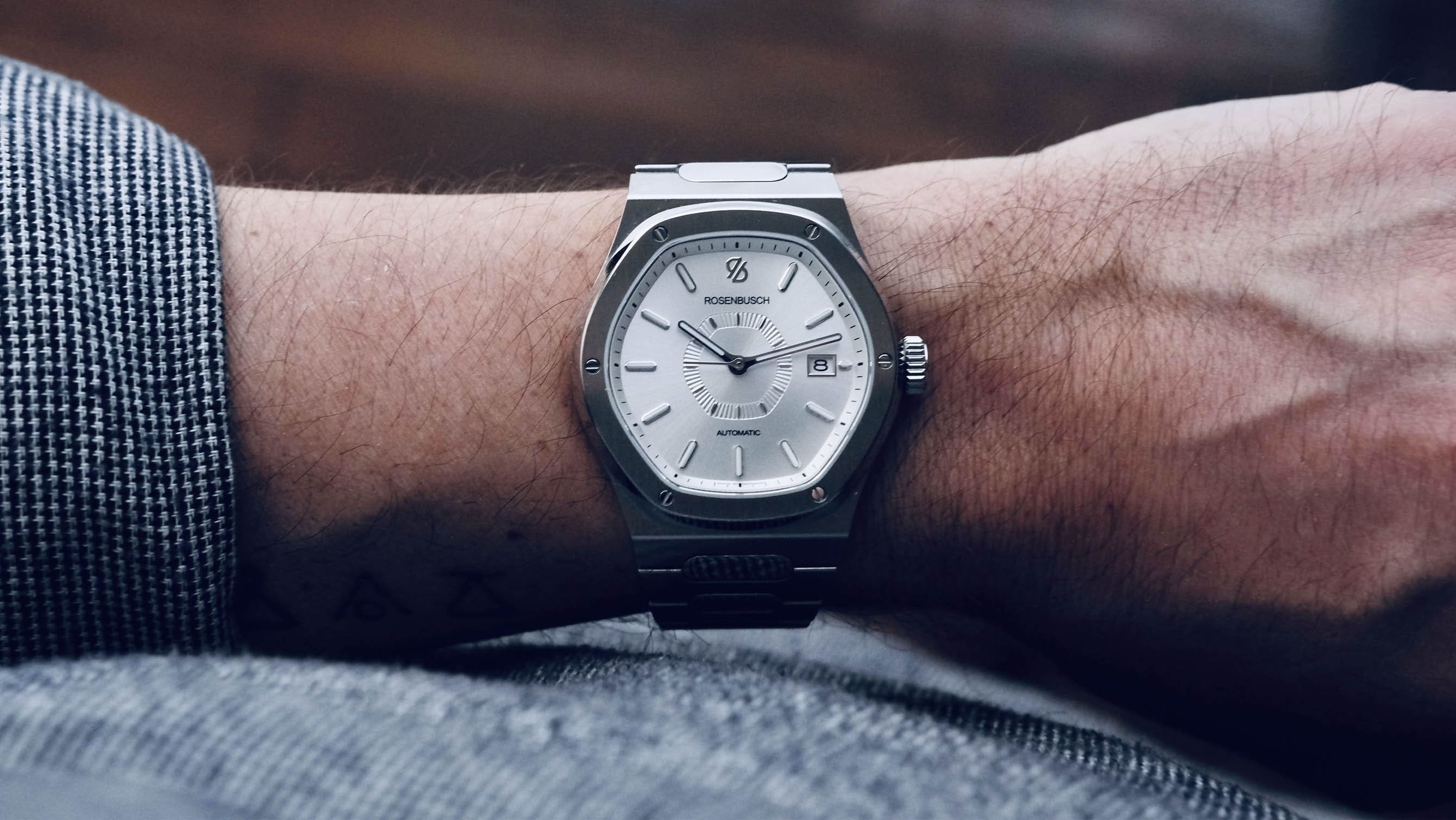 Time+Tide
We are bound to follow certain trends no matter which industry we look into. Whether it be fashion, cars, music and, for what concerns us the most, watches. In the past 10 years we went through an intense period during which micro and independent brands would release vintage-inspired dive watches. Then, more recently, GMTs and … ContinuedThe post MICRO MONDAYS: The Rosenbusch Quest is a truly accessible integrated-bracelet sports watch appeared first on Time+Tide Watches.
 Hodinkee
The one rule is, there are no rules.
 Deployant
For this week’s musings, we suggest six watches to help you survive the urban jungle. With watches from Bell & Ross, Chopard, Citizen, GO, Zenih and Piaget.
 Video
Video
Question, suggestion, or just want to say hi? Drop a note.