Watch brandsWatch wikiWatch videosVariousWatch calendarSaved articles
PopularRolexOmegaPatek PhilippeAudemars PiguetTudorGrand SeikoCartierSeikoIWCTAG HeuerBreitlingJaeger-LeCoultreA. Lange & SohneZenith

Results for The Heuer Carrera (1963)

42,694 articles · 255 videos found · page 486 of 1432

Related pages

Wiki · Guide
The Heuer Carrera (1963) TAG Heuer

Jack Heuer\'s 1963 motorsport chronograph named after the Carrera Panamericana road race. Reference 2447, Valjoux 72 manual.

The Omega Symbol: Where Does it Come From and What Does it Mean? Teddy Baldassarre
Omega Sep 21, 2023

The Omega Symbol: Where Does it Come From and What Does it Mean?

The Omega symbol that accompanies the brand’s classical logotype is one of the most recognizable emblems in the watch world, up there with Rolex’s hallmark coronet and Patek Philippe’s venerable Calatrava cross. But what exactly does Omega’s iconic hieroglyph actually symbolize, and what is its meaning in the context of the Swiss manufacture’s watchmaking history? Put simply, the symbol that has long been identified with the Omega brand is a stylized version of the 24th and final letter in the Greek alphabet, called Omega. (If you went to a college that had fraternities and sororities, this probably isn’t news to you.) Much like its counterpart at the beginning of the Greek alphabet, Alpha, the symbolism of the letter Omega has been interpreted various ways throughout history. As “the first” letter, Alpha has become associated with leadership and dominance, i.e., an “Alpha Male” or an “Alpha Dog.” Omega, as the final letter, has been known to connote greatness in its own way, representing the culmination or ultimate expression of a great effort or undertaking. The Biblical connotation of “I am the Alpha and the Omega” - i.e., the beginning and the end, as spoken by Jesus in the Book of Revelation (below) - has also lent weight to the concept of Omega as representing the end of an epoch or, in more ominous but perhaps more horologically relevant terms, the End of Time. So what does all this have to do with a watch brand? Let’s start at the...
Farer Debuts a New Chronograph Collection, the Chrono-Contempo Worn & Wound
Farer Debuts Sep 21, 2023

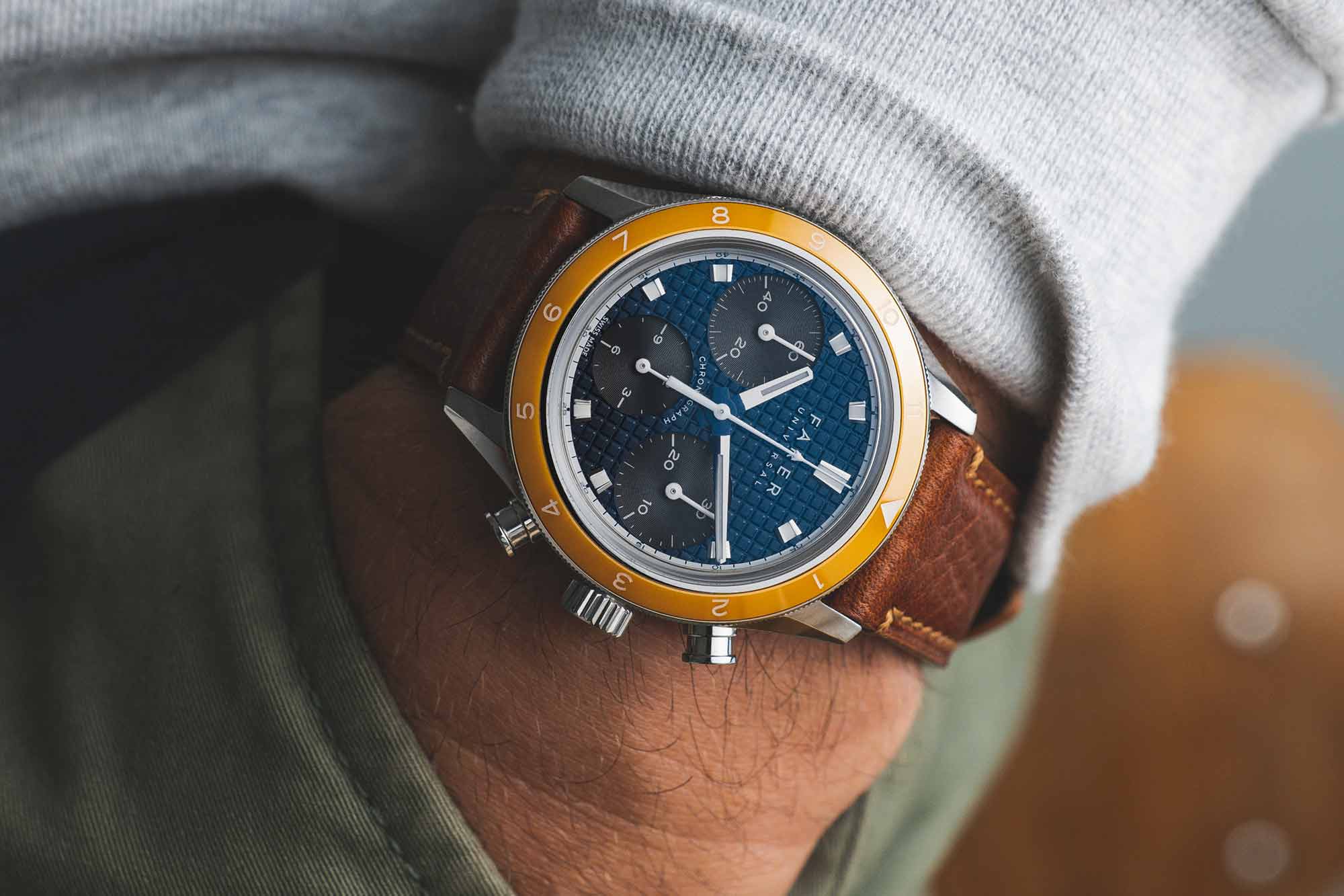
Farer Debuts a New Chronograph Collection, the Chrono-Contempo

Each new release from Farer seems to be made to combat the stereotype that British design is dull or humdrum. And with each reference comes an innate understanding of color combinations, setting it apart from similar brands in the market. Their latest collection, the Chrono-Contempo line, might just be the best yet from Farer to showcase the brand’s talents in action. The Chrono-Contempo collection, released today, has taken inspiration from Farer’s own backyard. The colorways in this collection are the aptly named Chalcot and Portobello, two nods to historic parts of London. Each with its own unique take on contemporary design, the two blend beautifully to create a broader landscape of Farer’s unique eye for color, encompassing vibrant orange, subtle navy, and a shock of mint green. Chalcot, named for the Square right next door to Farer’s HQ, balances big personality in a wearable design. Inspired by the “Big Eye” chronograph (named for the minute counter being larger than the other subdials), there’s a lot happening on the dial, without ever feeling overwhelming. This is due, in part, to the subtle way in which two of the subdials blend into the mint green backdrop, while the 3 o’clock subdial stands out in white. Further accented by a navy ceramic bezel and orange hands, this watch does Chalcot Square’s characteristic style justice. Second, there is Portobello. This stretch of London is a bustling, creative, and metropolitan hub and the watch mirrors t...

Minase and Fratello are Back with a New Version of the M-3, this Time in “Nori” Green Worn & Wound
Minase Sep 20, 2023

Minase and Fratello are Back with a New Version of the M-3, this Time in “Nori” Green

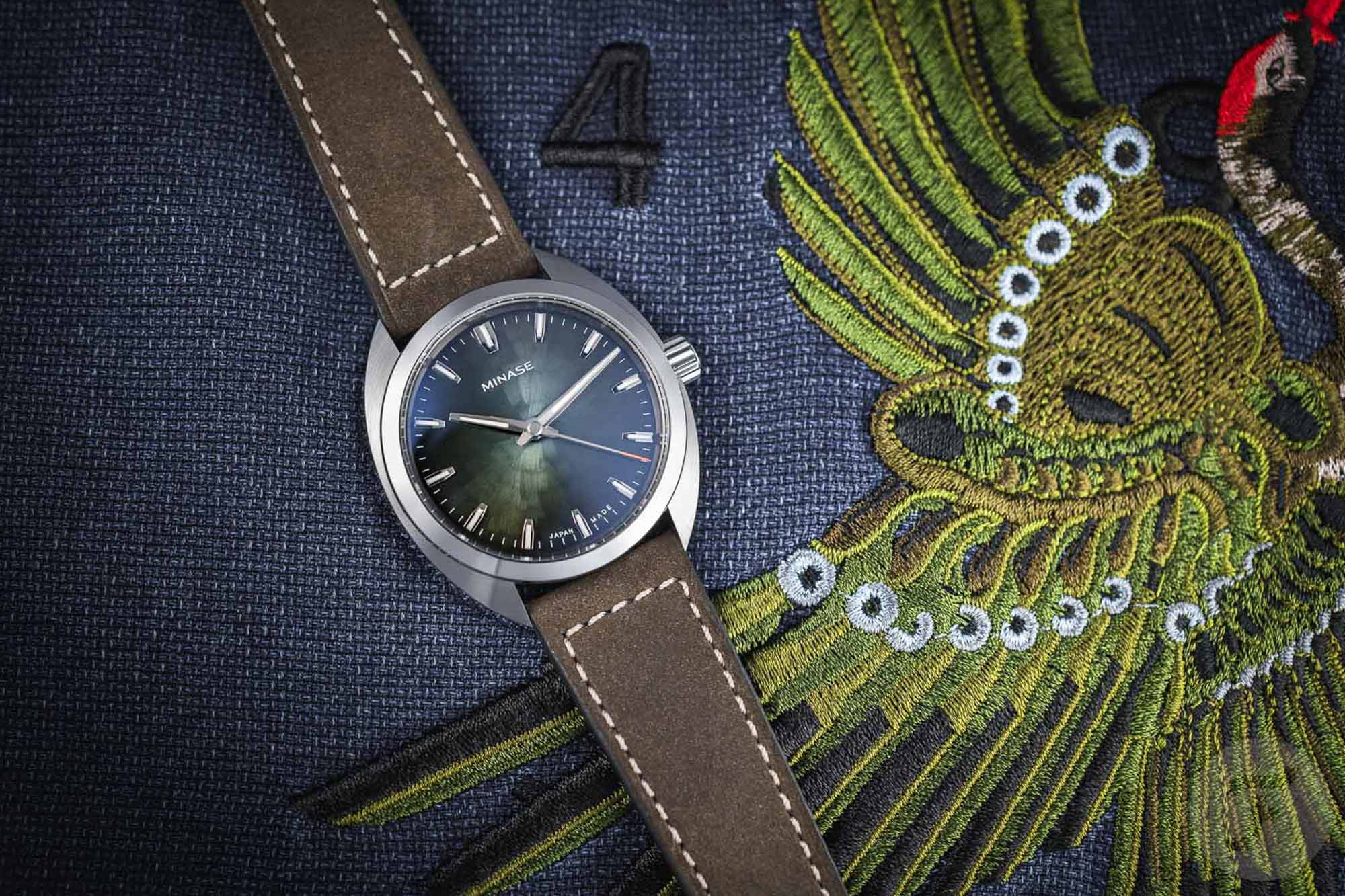
Our friends at Fratello have announced their latest limited edition collaboration, a follow up to last year’s release with Minase. That watch, the M-3 “Very Peri,” marked the first time Minase’s cushion shaped case was available outside of Japan. This year’s version borrows the same case profile, but lands on a very different dial execution. The Fratello x Minase M-3 “Nori” has a subtle green dial inspired by Japanese seaweed, making for a toned down and perhaps more under-the-radar version of the M-3 than last year’s brightly colored purple variant.  Minase, for the uninitiated, is a Japanese brand that produces about 500 pieces per year in the Akita Prefecture. They incorporate many traditional Japanese craft elements in their watchmaking, with a focus on hand-made components, but also incorporate plenty of modern manufacturing techniques. If you’ve handled any of their watches (we’ve been happy to have them at several recent Windup Watch Fairs, and they’ll be joining us once again in NYC next month), you know that they machined and finished immaculately. Zach wrote about Minase’s Divido here, which has an extremely complex case and bracelet construction, paired with a dial that’s made with a very traditional Japanese lacquering technique.   The M-3 has a simpler case, but it’s machined and finished to the same high standard as Minase’s more complex designs. The cushion style case measures 39mm in diameter, 46mm lug-to-lug, and is just 10...

Shinola Debuts the Latest Version of their Canfield Speedway Chronograph Worn & Wound
Shinola Sep 20, 2023

Shinola Debuts the Latest Version of their Canfield Speedway Chronograph

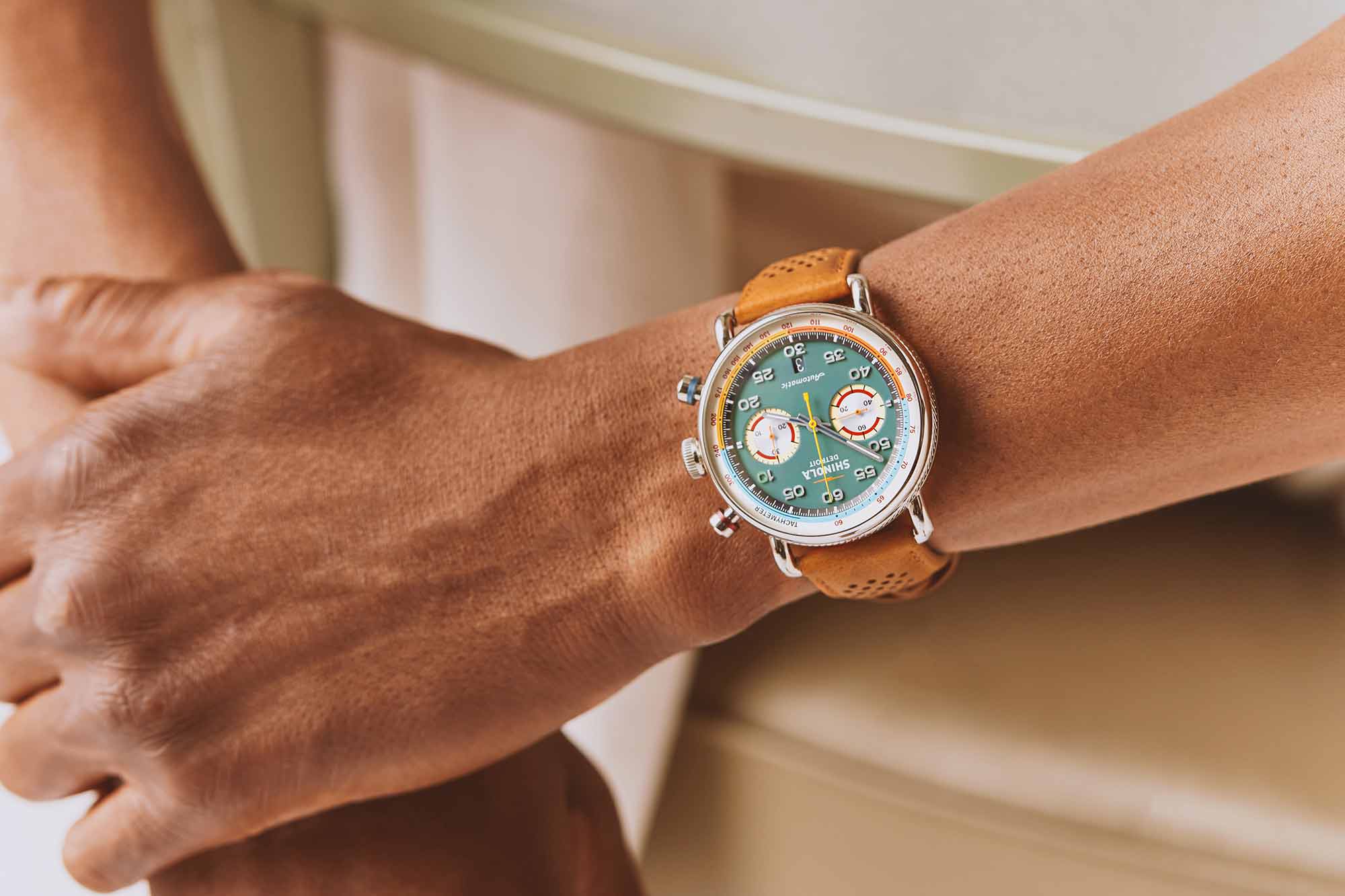
As Shinola masterfully puts it, “When it comes to excellence, there is no finish line. Only the next lap.” Now on their sixth lap, the Canfield Speedway Lap 06 chronograph is a testament to the growing sophistication of the Detroit-based brand. In this newest iteration of the Canfield model, Shinola remains inspired with racing heritage and the vintage colorways that define that era of automotive sportsmanship. The dial of the Lap 06 is an understated Pea Gravel Green with accents of blue, yellow, and orange on the surrounding tachymeter. These details are enhanced by the two subdials at the 3 and 9 o’clock marks, which are reminiscent of the two-tone wheel design of some of our favorite vintage cars.  The case itself is 44mm in stainless steel and complemented by a heavy coin edge and colorful anodized aluminum collars on the pushbuttons. The strap of the Lap 06 is modeled after perforated driving gloves in a bourbon-colored leather.  This is an automatic chronograph that runs on a Sellita Caliber SW510.BH.A movement, offering just over 60 hours of power. The Canfield Speedway is a culmination of small details and craftsmanship that have come to represent the Detroit brand as they head into their second decade. The Canfield Speedway Lap 06 is now available with a price tag of $2,995. Images from this post: The post Shinola Debuts the Latest Version of their Canfield Speedway Chronograph appeared first on Worn & Wound.

Seiko Remembers Bruce Lee with the Seiko 5 Sports SPRK39 SJX Watches
Seiko Remembers Bruce Lee Sep 20, 2023

Seiko Remembers Bruce Lee with the Seiko 5 Sports SPRK39

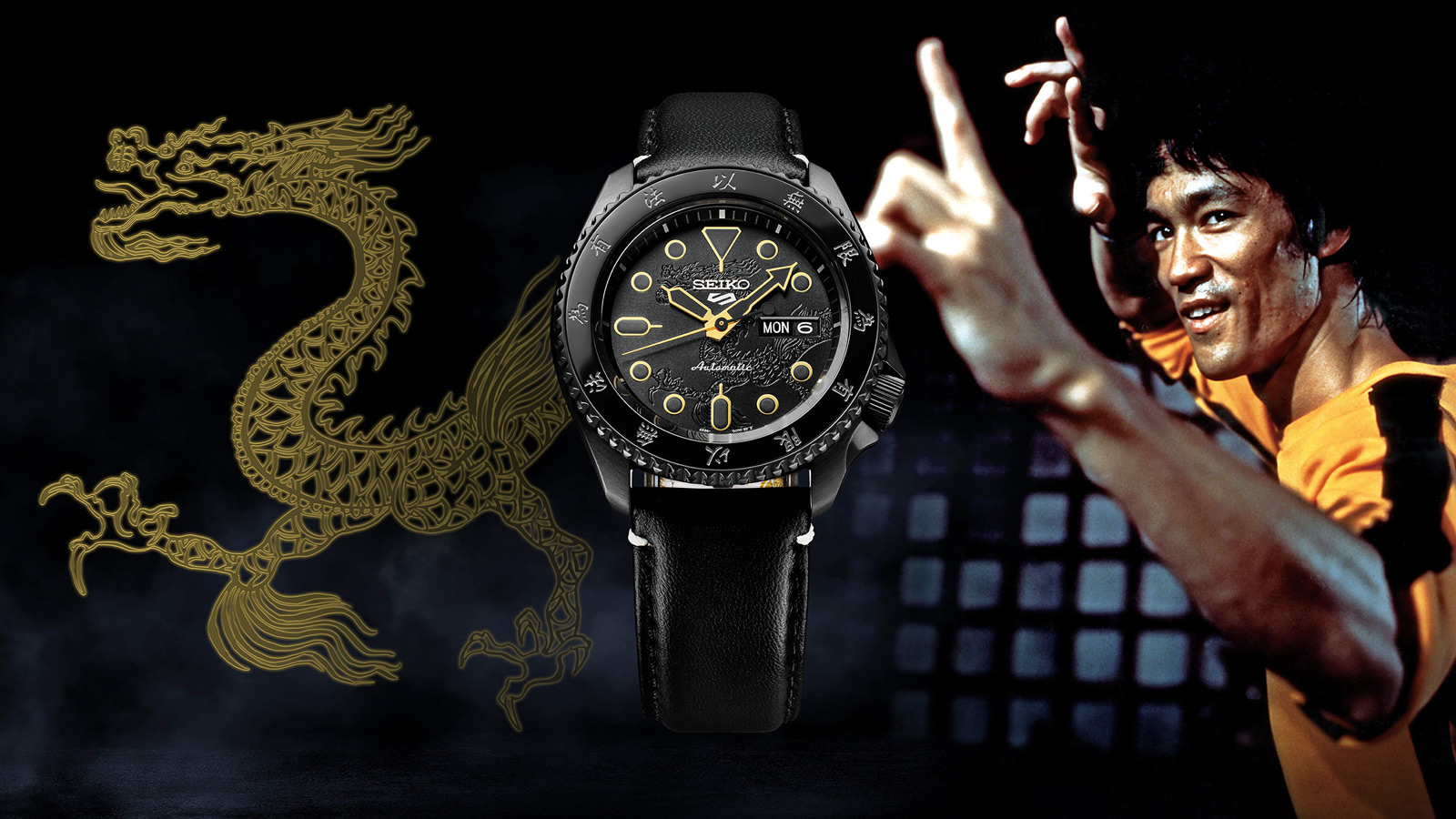
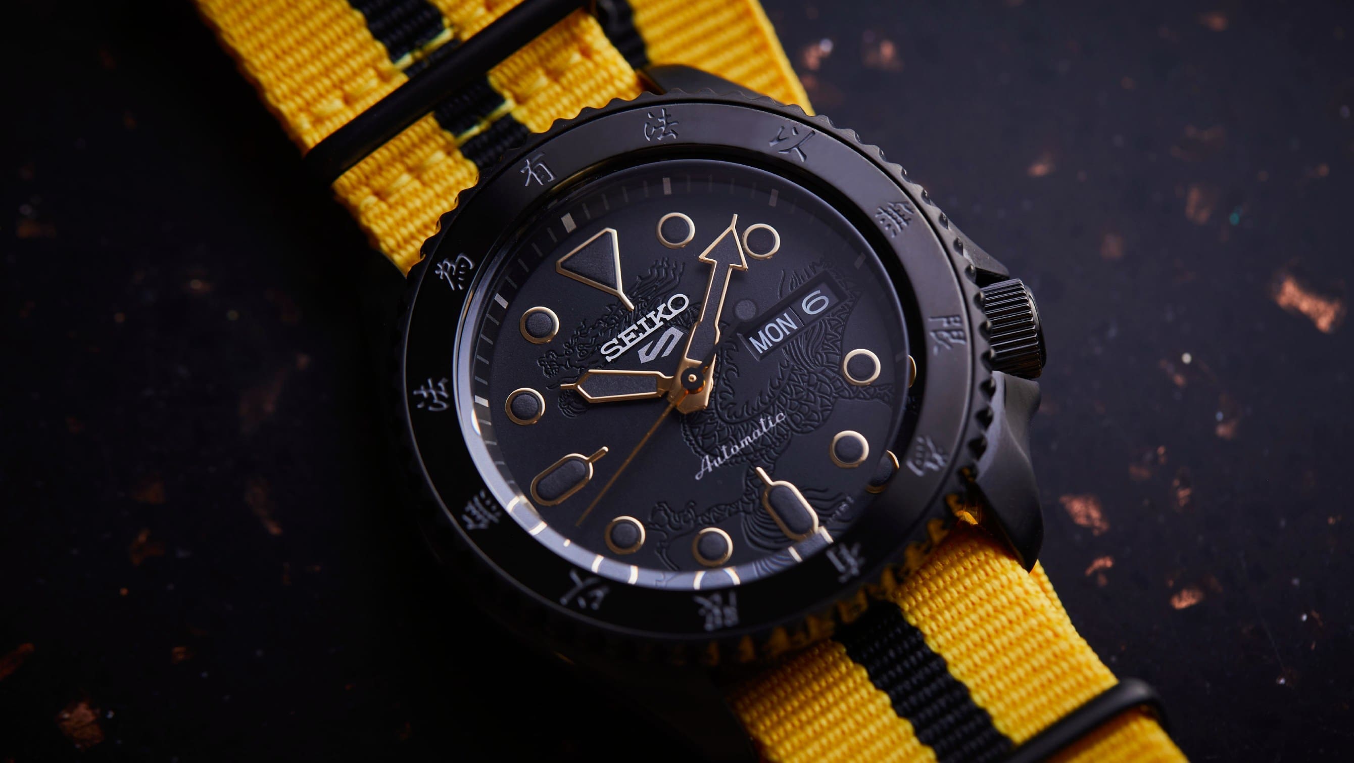
Twenty-twenty-three marks the 50th anniversary of the passing of the Hong Kong-American martial artist, actor, and cultural icon who tragically died at the age of 32. In honour of Bruce Lee’s legacy, Seiko has launched the Seiko 5 Sports Bruce Lee Limited Edition SPRK39, an affordable sports watch typical of Seiko but with an unusual all-black livery featuring subtle gold accents. Based on its entry-level sports watch, the edition’s launch also coincides with the 55th anniversary of the original Seiko 5 Sports. Retaining the same case and design as the regular production model, this limited edition incorporates Asian themes in its design as a homage to the iconic actor, including a dragon on the dial in a reference to Bruce Lee’s name. Initial thoughts It is perhaps long overdue that Seiko creates a timepiece to commemorate Bruce Lee, who was photographed on several occasions wearing a Seiko 5. The use of traditional Chinese elements are not groundbreaking, and might have even been kitschy, but fortunately an all-black look prevents this from resembling a gaudy souvenir. While this watch does evoke a certain nostalgia, it doesn’t quite have the vintage styling of the Seiko 5 model that Lee himself wore. I would have preferred an edition based the design on that or even other vintage models from the period. That would, however, probably result in a pricier watch that is a vintage remake. Priced at US$495, the Bruce Lee edition is US$135 more expensive than the stand...

Ulysse Nardin’s Freak X Gets the Green Treatment Worn & Wound
Ulysse Nardin s Freak X Gets Sep 19, 2023

Ulysse Nardin’s Freak X Gets the Green Treatment

There’s a narrative that has emerged around the Ulysse Nardin Freak over the years that its an extremely niche product, and something of a difficult watch to fully wrap your arms around. It’s strange, yes, even avant-garde, but as I’ve spent more time considering the Freak, I’ve come around to the other side of this story. I wonder, how can anyone not love the Freak? Even if it’s not to your specific taste, the Freak is an original, and one of a handful of truly important designs that would set the stage for a generation of interesting, independent watchmaking that we’re still living through today. The Freak might not be for everyone, but everyone should be able to agree that there’s something special about it.  The latest Freak, the Freak [X OPS] is part of the still relatively new Freak X lineup, a collection that aims to make the watch more approachable. Blake went hands-on with a Freak X here, and both the review and video (complete with commentary from a watchmaker) are worth a look if you’re new to the Freak universe. But the gist of the Freak X is relatively easy to understand: it’s smaller than a traditional Freak, and it has a crown. Historically, the Freak was marketed as a watch with “No Dial, No Hands, No Crown.” A curious rallying cry for sure, and a tough thing to picture. But when you see it, it all (kind of) makes sense. For me, the addition of a crown doesn’t feel like too much of a transgression. The visual impression of the Freak...

Rado Brings their Ongoing Work with the Foundation Le Corbusier to the True Square Line with Three New Limited Editions Worn & Wound
Rado Brings their Ongoing Work Sep 18, 2023

Rado Brings their Ongoing Work with the Foundation Le Corbusier to the True Square Line with Three New Limited Editions

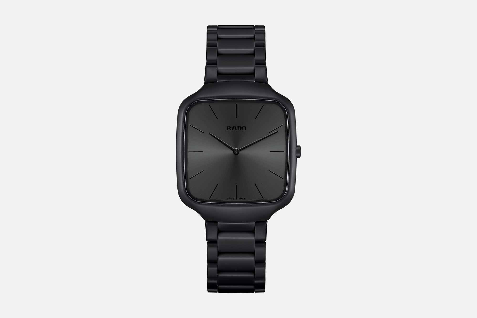
When two masters in their respective industry collide, something magic is sure to happen. That’s exactly the feeling one gets when looking at Rado, the Master of Materials, and Le Corbusier, the master of design, as the two legacies meld into a release of new references. Adding three new colorways selected from the 63-shade Architectural Polychromy palette to the distinct True Square collection, we’re seeing a heightened look at craftsmanship and design that shows the sum is often greater than its parts. Rado has long had a relationship with the Foundation Le Corbusier for their True Thinline set of watches, but these three new releases from the brand are the first to utilize the sportier design of the True Square silhouette. This design is marked by a high-tech ceramic case coming in at a comfortable and discreet 37 x 43.3 mm, perfect for nearly any wrist size. The real beauty of this watch is the balance of technical precision and everyday use, mixing a Rado caliber R420 quartz movement with high-tech innovative ceramic that Rado has become known for within the industry. For the three colorways themselves, each taken from the Architectural Polychromy, they’re a sleek and subtle scheme that fits perfectly against the backdrop of both Le Corbusier’s and Rado’s Swiss heritage. This collection includes Natural Umber, Iron Grey, and Ivory Black. The use of ceramic perfectly matches the tonal qualities of these three references, as Rado has perfected color blending w...

Cartier Reissues the First Tank Cintrée in Platinum SJX Watches
Jaeger-LeCoultre JLC calibre inside Initial Sep 18, 2023

Cartier Reissues the First Tank Cintrée in Platinum

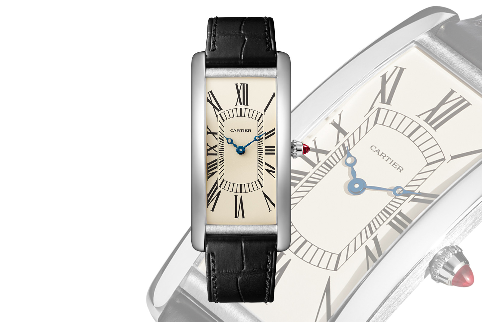
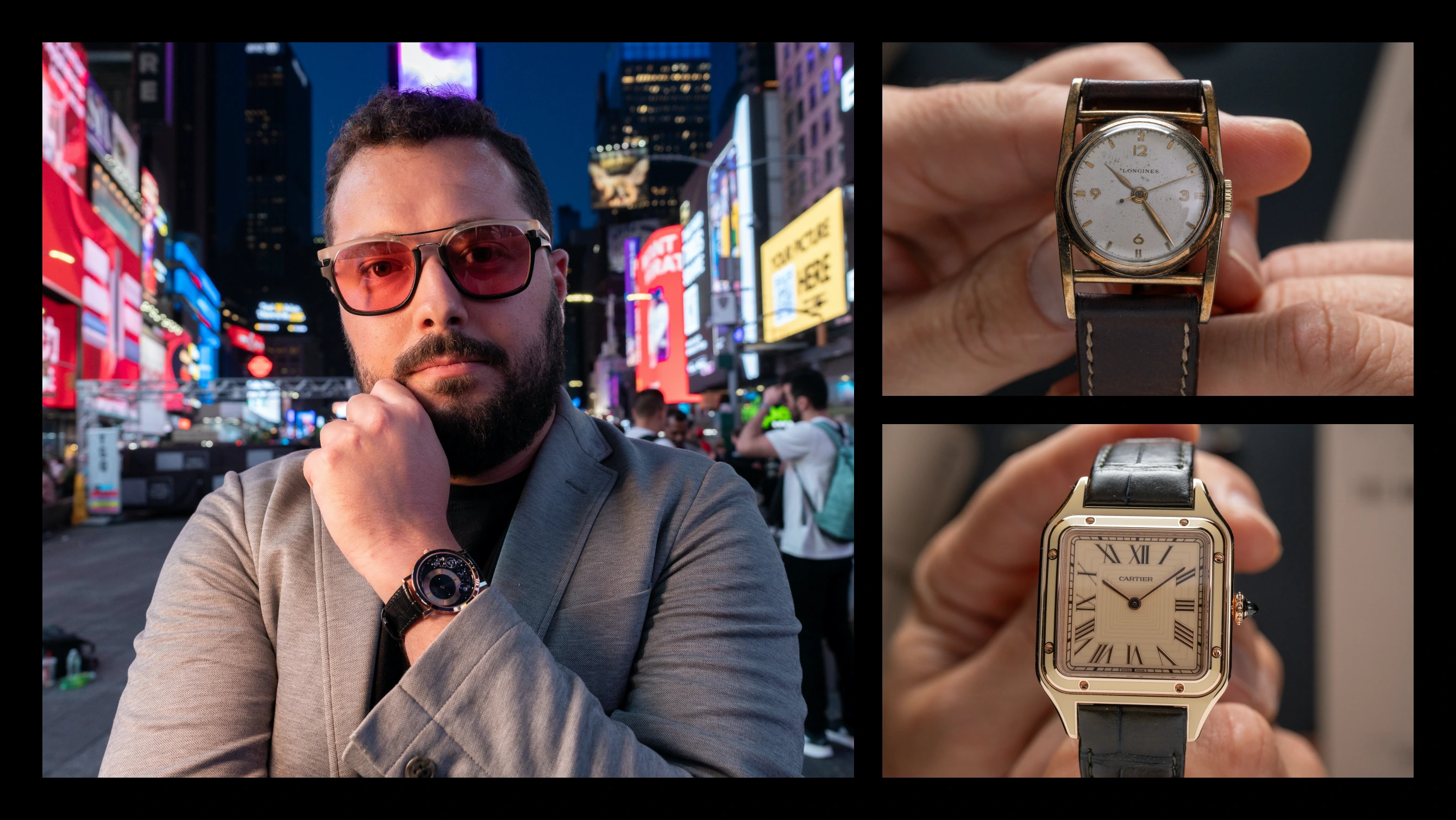
Following last year’s Pebble wristwatch, the latest instalment of the Les Rééditions de Cartier series of historical remakes is Tank Cintrée Platinum. Its launch marks the 100th anniversary of the first Tank Cintrée in platinum that debuted two years after the Tank Cintrée, which was in yellow gold.  Notably, the new platinum edition is slimmer than its predecessor in yellow gold launched, standing just 6.03 mm high thanks to a reworked case and ultra-thin Jaeger-LeCoultre (JLC) calibre inside. Initial thoughts  The recent popularity of Cartier’s classical designs have made reissues like this inevitable. Cartier does them on an annual basis, more or less, which spaces them well enough that each edition remains interesting, even if it is predictable. And in some ways Cartier’s limited editions are more appealing than its special orders, because the limited editions are a known quantity in a fixed form. Like Cartier’s past reissues, the new Tank Cintrée sticks closely to the original design, so much so it is almost indistinguishable from a distance, except for its new-watch sheen. Given the strength of the original design, this is a good thing. Interestingly, this is slimmer than the 2021 reissue in yellow gold. While the thinness is appealing, particularly for a formal-dress watch like this, one wonders if the reduction in thickness was to reduce the weight of precious metal. Besides allowing for a thinner case, the ultra-thin JLC movement is a historical r...

A Question of Time: 10 questions with the Time+Tide team - Zach Blass Time+Tide
Sep 17, 2023

A Question of Time: 10 questions with the Time+Tide team - Zach Blass

Editor’s note: What makes the Time+Tide team tick? That’s what we want to try and uncover in this new series that will turn the spotlight on the horological preference, quirks and prejudices of our teams of contributors and editors. This week, Time+Tide’s Editor Zach Blass takes the hot seat. When did you first become interested … ContinuedThe post A Question of Time: 10 questions with the Time+Tide team – Zach Blass appeared first on Time+Tide Watches.

REVIEW: Hands On With The New Jaeger-LeCoultre Polaris Chronograph WatchAdvice
Jaeger-LeCoultre Polaris Chronograph Jaeger-LeCoultre rel... Sep 17, 2023

REVIEW: Hands On With The New Jaeger-LeCoultre Polaris Chronograph

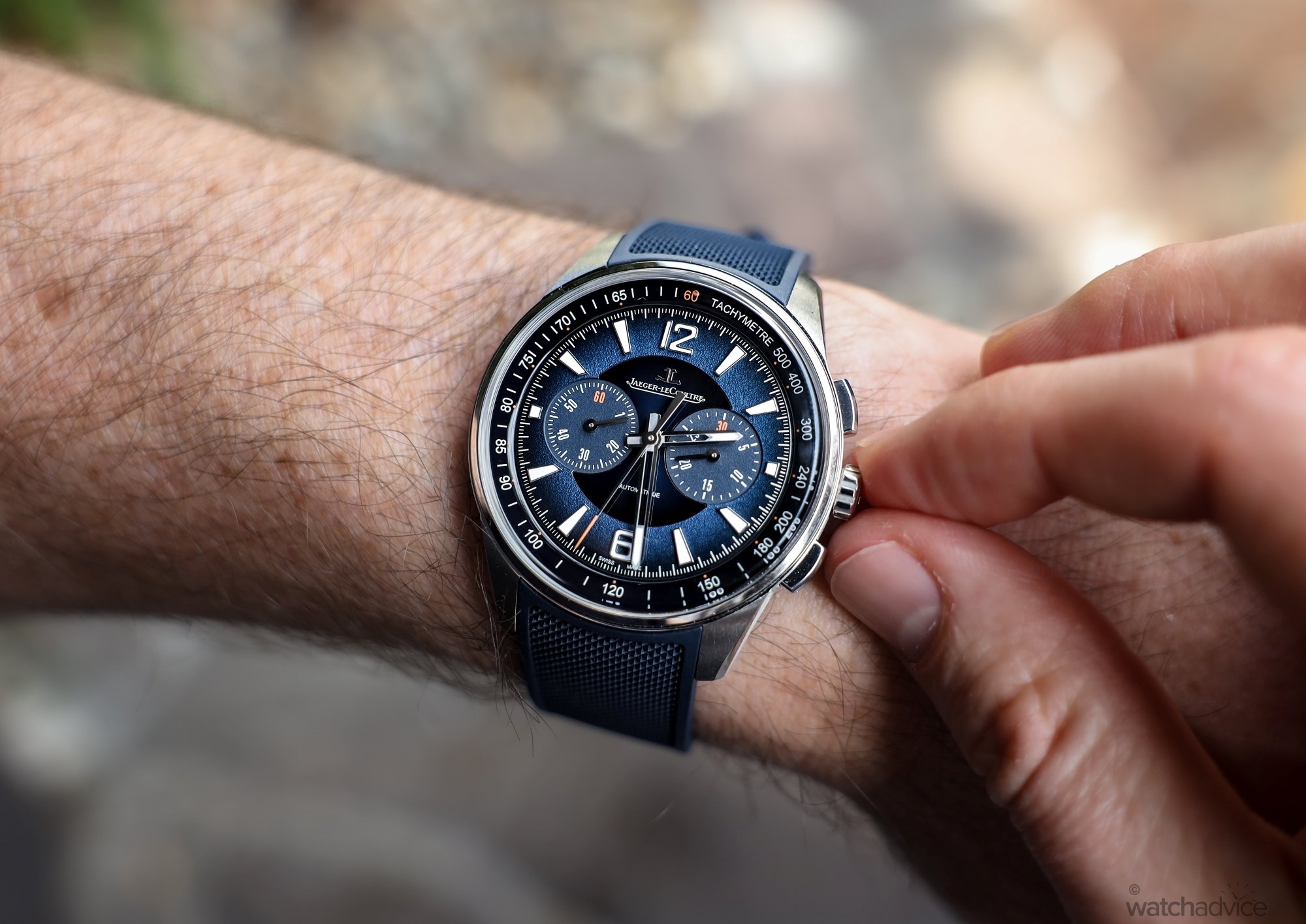
Jaeger-LeCoultre released their latest Polaris Chronograph a couple of weeks ago, and we had the first look, and quite frankly it’s stunning. Now we’ve gone hands on to review the blue dial variant! What We Love Super comfortable on the wristBeautiful textured lacquered dialLegibility and lume both day and night What We Don’t Clasp is a little fiddly with no push buttonNon-screw down crown makes me nervous on WRMovement isn’t as finished as you would expect Overall Rating: 8.75/10 Value for money: 8/10Wearability: 9/10Design: 9/10Build quality: 9/10 The Polaris is a quiet hit for Jaeger-LeCoultre in my opinion, and the new Chronograph released at the start of September was a nice surprise to most. We were lucky enough to get our hands on it before it’s release, and you can read the details on it here. However, being able to wear it around for a week for review really gives you a sense of how this watch really wears and looks on the wrist. In short, the blue dial pops, but recently, we also compared it to the grey dial variant, call it curiosity to see which is better – my initial thoughts are… it’s a very hard choice! The new Polaris Chronograph in Blue and grey dials The Design Let me say this first. The JLC Polaris Chronograph needs to be seen and felt in person. Photo’s really don’t do it justice, especially the texturing and gradient through the centre and main part of the dial. Both the blue and grey variants differ in this aspect, and whilst we’...

Now in the Shop: Six Playful New Models from Paulin Watches Worn & Wound
Sep 15, 2023

Now in the Shop: Six Playful New Models from Paulin Watches

Paulin Watches made their appearance in the Windup Watch Shop with an exclusive (and now sold out) green dialed version of their Neo watch. Now, they’re back in full force with six new variants of the Modul – a vintage inspired tonneau-shaped case with some really fun modern design touches. Let’s take a closer look at these 35mm timepieces that have an interesting secret within their modular case design. Paulin Watches made their appearance in the Windup Watch Shop with an exclusive (and now sold out) green dialed version of their Neo watch. Now, they’re back in full force with six new variants of the Modul – a vintage inspired tonneau-shaped case with some really fun modern design touches. Let’s take a closer look at these 35mm timepieces that have an interesting secret within their modular case design. The post Now in the Shop: Six Playful New Models from Paulin Watches appeared first on Worn & Wound.

You’re Invited to the Launch of the Next Zodiac x Worn & Wound Collab Worn & Wound
Zodiac x Worn & Wound Sep 15, 2023

You’re Invited to the Launch of the Next Zodiac x Worn & Wound Collab

In 2021 Zodiac and Worn & Wound teamed up to create a collaborative watch inspired by outdoor gear and 90s design sensibilities. It earned the nickname “Saved by The Bell” and became a cult hit, because of its fun colors and throwback packaging. Now, for 2023, Zodiac and Worn & Wound have teamed up once again to create yet another nostalgia-fueled collaboration launching 9.28.23 at 12pm Eastern. Join us for an evening of lasers, lights, and lume all in celebration of the era back when bangs were big, spandex was in, and a little bit of pizza grease on your trigger finger only made you a better shot. The battle begins Thursday 9.28.23 in Brooklyn at 7PM. Click here to register for your chance to join us for a launch party you’ll never forget!   The post You’re Invited to the Launch of the Next Zodiac x Worn & Wound Collab appeared first on Worn & Wound.