Watch brandsWatch wikiWatch videosVariousWatch calendarSaved articles
PopularRolexOmegaPatek PhilippeAudemars PiguetTudorGrand SeikoCartierSeikoIWCTAG HeuerBreitlingJaeger-LeCoultreA. Lange & SohneZenith

Results for Travel Time / Dual Time

15,140 articles · 88 videos found · page 482 of 508

The People Have Spoken: Seiko’s Crowd Favourite 62MAS SJX Watches
Seiko s Crowd Favourite 62MAS Sep 8, 2026

The People Have Spoken: Seiko’s Crowd Favourite 62MAS

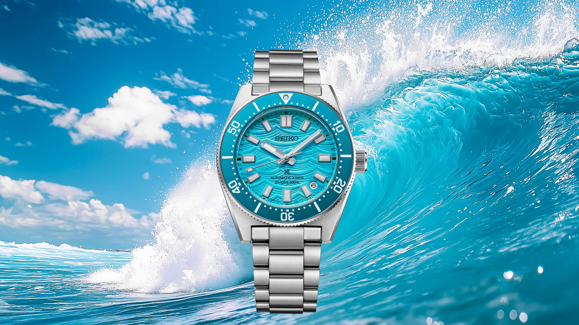
Last year Seiko let fans vote on which of four vibrant dial colours would adorn an upcoming diver, and the people made the right choice, picking this vibrant Daytime Blue for the Prospex 1965 Heritage Diver Fan-Selected HBC011. While a bit late to hit the beach, the latest 62MAS homage maintains all that was already good about Seiko divers, namely looks and tenacity, with key upgrades to the bracelet, for a reasonable price. Initial Thoughts Last year marked 6o years of Seiko diver’s watches, which can be traced back to the original 62MAS (refs. 6217-8000 and -8001) launched in 1965. Seiko let the many fans of its diver’s watches decide how to celebrate, giving collectors a choice of four colourways: Sunrise Orange; Daytime Blue; Late Afternoon Green; and Sunset Red. The online poll was open for the entire month of July, which was long enough for me “to get around to later” but short enough that it had already closed by the time I remembered to vote. Unsurprisingly, the trendiest colour, and the one I would have voted for, Daytime Blue, won. From left to right: Sunrise Orange; Daytime Blue; Late Afternoon Green; and Sunset Red. Seiko has disclosed no plans to bring the other three colourways to market at this time. The vibrant blue and stamped dial make the HBC011 stand out from the pack of 62MAS-inspired models, though it changes the character of the watch so entirely that this bubbly beach watch doesn’t feel like a 62MAS at all. Which is a good thing, as the mo...
Here Are The Finalists for the 2026 Grand Prix d'Horlogerie de Genève Hodinkee
Sep 7, 2026

Here Are The Finalists for the 2026 Grand Prix d'Horlogerie de Genève

Last week, the Grand Prix d'Horlogerie de Genève (GPHG) announced the finalists for the 2026 edition of watchmaking's premier awards ceremony, which will be held in Geneva on November 7. Being a finalist has the potential to be a big deal for any participating brand, but it can be a watershed moment for small first-timers (of which there are a couple this year). It's also a list I've been waiting for with some anxiety. The winners of the 2025 Grand Prix d'Horlogerie de Genève. Photo courtesy GPHG. This year, I'm lucky to be on the jury with 23 other journalists, collectors, and watchmaking industry members, including the jury's first-time president, Wei Koh. Among them are many talented friends and people whom I've gotten to know over my years in the industry, including Michael Tay (Group Managing Director of The Hour Glass in Singapore), Hind Abdul Hamied Seddiqi (CEO of Dubai Watch Week), the talented watchmaker Rémy Cools and incredible automaton maker François Junod, my friend Justin Hast, artist Wes Lang, and a few others.  Without going on too long or being too saccharine about the whole thing, it really is quite cool to be on the jury with such smart and talented members. Nothing is without flaws, and like I'll get to in a moment, there are a lot of brands not competing that I would love to see in the mix. But one of the things that I think about a lot (and which goes unmentioned far too often) is the number of people putting their heart, soul, and tremendous a...

TAG Heuer Carrera Chronograph Sport Hands-On Review: A Bigger, Sportier Carrera WatchAdvice
TAG Heuer Carrera Chronograph Sport Hands-On Sep 7, 2026

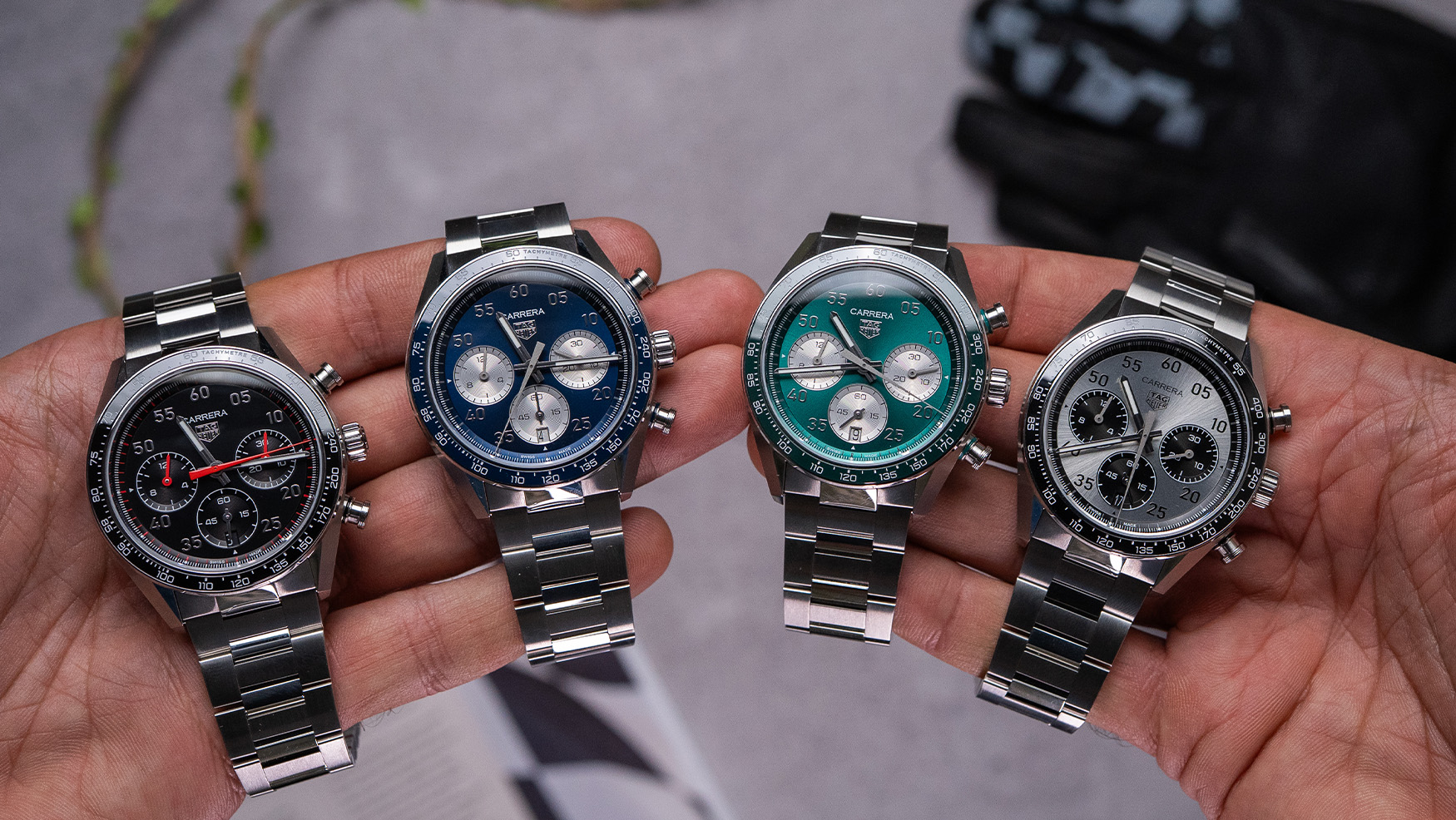
TAG Heuer Carrera Chronograph Sport Hands-On Review: A Bigger, Sportier Carrera

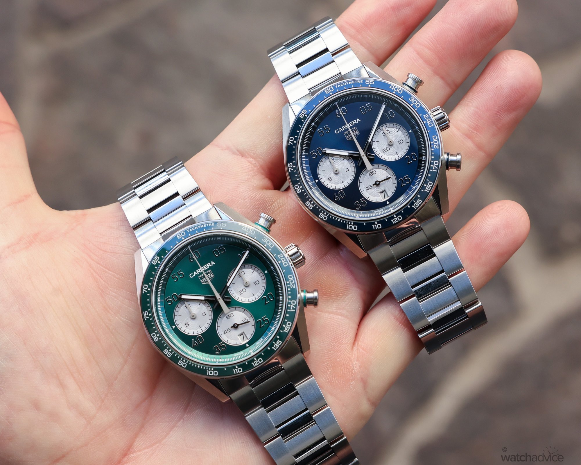
TAG Heuer has just unveiled the new Carrera Chronograph Sport, staying true to the model’s DNA, but in a more beefed-up fashion! What We Love The classic Carrera case shape is still immediately recognisable The move to 42mm makes the Carrera Sport much more wearable than the previous generation The green dial and silver dial variants look particularly good in person What We Don’t At 42mm, it is still a reasonably substantial watch The more robust design won’t have the same versatility as the 39mm Carrera Glass Box The blue dial and black dial models are not as eye-catching Overall Rating: 8.5 / 10 Value For Money: 8/10 Design: 8.5/10 Wearability: 8.5/10 Build Quality: 9/10 The TAG Heuer Carrera has never really needed an introduction. It has been one of the defining chronographs in the TAG Heuer collection since Jack Heuer introduced it in 1963, and over the years I’ve had the chance to wear and review plenty of different versions. Now, with the new Carrera Chronograph Sport, (just in time for the Madrid Grand Prix, as TAG Heuer is the race sponsor, I might add), TAG Heuer has taken the familiar Carrera formula and given it a little more presence, a sportier feel and, importantly, some better proportions. The new TAG Heuer Carrera Chronograph Sport models As you may imagine, this is not my first time wearing a TAG Heuer Carrera. I’ve reviewed plenty of Carreras over the years, from the revamped Glass Box models introduced in 2023 through to the Rose Gold Carrera ...

TAG Heuer Monza Flyback Chronograph Review: The Past Meets The Future For Its 50th Anniversary WatchAdvice
TAG Heuer Monza Flyback Chronograph Review Sep 4, 2026

TAG Heuer Monza Flyback Chronograph Review: The Past Meets The Future For Its 50th Anniversary

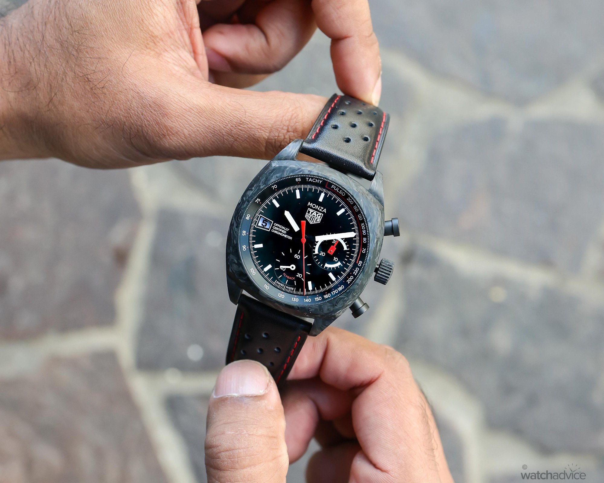
We take the new TAG Heuer Monza Flyback Chronograph hands-on to see how it brings 50 years of racing heritage into the modern era. What We Love Forged carbon makes the watch lightweight Heritage inspired dial design Flyback calibre delivers exceptional performance What We Don’t 50.85mm lug-to-lug can be challenging for smaller wrists with 15.22mm thickness, it remains noticeably substantial Chronograph pushers miss the forged carbon treatment Overall Rating: 8.6 / 10 Value For Money: 8.5/10 Design: 8.7/10 Wearability: 8.5/10 Build Quality: 8.5/10 TAG Heuer has introduced the latest chapter in the Monza story just in time for Formula 1’s return to the legendary Italian circuit. This time, however, the Monza is returning to its roots. Created to celebrate the collection’s 50th anniversary, the new Monza Flyback Chronograph brings back the black, white and red identity that made the original 1976 model such an iconic design. It also combines contemporary elements from the 2023 Monza edition, which, in many ways, makes this new Monza a meeting of the timepiece’s past and future. The story of the TAG Heuer Monza first begins in 1971, when Heuer established a significant partnership with the Formula 1 racing team Scuderia Ferrari. This momentous relationship extended well beyond a conventional sponsorship between a watch brand and a racing team, as Heuer supplied Ferrari with its sophisticated Centigraph electronic timing system. This electronic timing system allowed...

De Bethune Revives the Digitale in Style SJX Watches
De Bethune Revives Sep 2, 2026

De Bethune Revives the Digitale in Style

One of De Bethune’s earliest models was a jumping hours wristwatch and now the brand has returned to concept with the DB25 Digitale. While largely similar to the earlier version in terms of function, the latest Digitale is presented in a new format. This is the third iteration of the Digitale – the second was introduced some 12 years ago – and the most elaborate yet in decorative terms. The case is in the wearable DB25 style, but the dial is decorated with the brand’s hallmark techniques, wavy guilloche and star-studded heat-blued titanium. Initial thoughts The DB25 Digitale revives one of De Bethune’s initial concepts, the “digital” time display, but now presented in the De Bethune greatest-hits livery of expansive blued titanium decorated with both the sea and the stars. With its striking, high-contrast colours, the new Digitale looks more current than its predecessor that carried something of an Art Deco pocket watch aesthetic. Admittedly, the DB25 Digitale is a cosmetic makeover and doesn’t add much novelty in technical terms. But it is still very much up to date in technical terms, illustrating the remarkable technical innovation, driven by Denis Flageollet, which continues to serve as De Bethune’s foundations. The DB2144V3 movement remains a sophisticated calibre even though it’s over two decades old. In fact, it arguably boasts substantially more technical content that “new” movements recently debuted by startup independent watchmakers. At CH...

Introducing: Vacheron Constantin Métiers d'Art Tribute To The Animal Kingdom Hodinkee
Vacheron Constantin Métiers d'Art Tribute Sep 1, 2026

Introducing: Vacheron Constantin Métiers d'Art Tribute To The Animal Kingdom

What We Know Last week, Vacheron Constantin presented the latest in their Métiers d'Art collection, the Métiers d'Art Tribute to the Animal Kingdom. The impressive collection, which is based on Vacheron's four-aperture display Métiers d'Art watch, is made up of six watches, each featuring a facsimile of an animal made out of an unexpected blend of materials and construction. Notably, each dial in the series was created not by a watchmaker, but rather by an independent artist. This last part is key to the Métiers d'Art idea, which offers watches as a platform for artistry of all sorts, resulting in a collection unlike any other I can think of. The six watches that make up this collection are the: Feathersnake, which features a snake made of several hundred pieces of Lophophore and Goose feather; Glassoctopus, which features a hand-melted and shaped glass octopus set on a hand-guilloched gold-base coated in dark blue; Oraygami, which sets a fever of origami paper rays again against a hand-guilloched gold-base finished in blue; Tigerbroidery, which renders a tiger through an embroidered silk dial using yellow and white gold wire, black ceramic–coated wire, and British and Japanese silk; Papercroc, which uses paper sculpture to evoke a crocodile; and Woodenwings, which features a marquetry dial rendition of a flacon. To go into the process behind each of these dials would take up far more time and space than is available here (maybe something to go into if ever I get to ...

The Tudor Northflag Returns Sharper and Stronger SJX Watches
Tudor Northflag Returns Sharper Sep 1, 2026

The Tudor Northflag Returns Sharper and Stronger

A decade after it first debuted, Tudor has revived the Northflag. Originally a 1970s-inspired sports watch to showcase Tudor’s first-ever in-house movement, the Northflag has been upgraded inside and out. The rebooted Northflag gains a GMT function plus refinements all round, ranging from superior detailing on the case to lume blocks on the dial. And the movement is now a Master Chronometer, while the price stays true to Tudor’s value-oriented focus at just over US$5,500. Initial thoughts The original North Flag was a bit quirky with its power reserve indicator, and also probably ahead of its time; a Tudor with an in-house movement seemed like an odd concept back then. I liked it then, but the North Flag wasn’t a commercial success, so it is surprising that Tudor has revived the model. But the new Northflag is an immediately appealing watch, reflecting Tudor’s advancements in design, manufacturing, and branding. In fact, the Northflag is one of the most interesting watches in the current Tudor catalogue, alongside the equally recent Monarch. Although practically everything Tudor makes is well priced and an easy recommendation, almost all of Tudor’s best watches are variations of the Oyster case and Black Bay diver. The Northflag, on the other hand, is something else entirely. The angular, 1970s-style case is different, as is the dial. But all the elements are harmonious, and the design works. This is one of my strongest recommendations in the Tudor line-up today,...

Hands-On With Longines Master Collection Chrono Moonphase: A Complicated Classic, Refined WatchAdvice
Longines Master Collection Chrono Moonphase Aug 28, 2026

Hands-On With Longines Master Collection Chrono Moonphase: A Complicated Classic, Refined

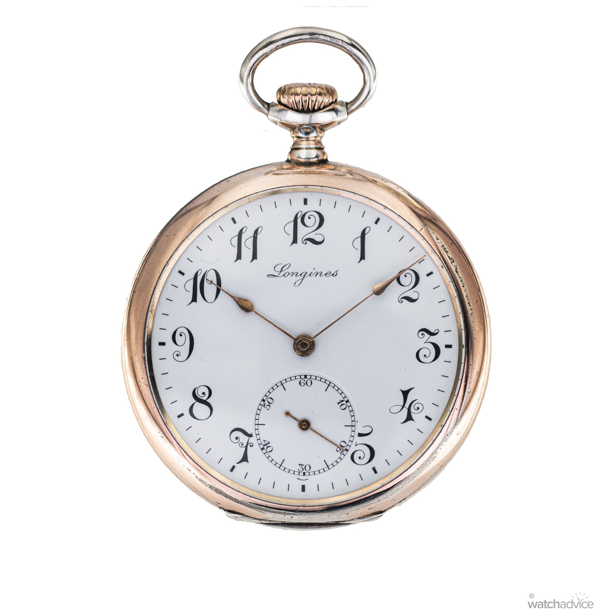
I’ve had the chance to take the newly redesigned Longines Master Collection Chrono Moonphase for review to see how the subtle refinements elevate this complicated favourite! What We Love Refined, less cluttered dial design Exceptional complications for the price Beautifully matched blue leather strap What We Don’t Limited 30m water resistance Substantial thickness for smaller wrists Busy display may not be to everyone’s liking. Overall Rating: 8.9 / 10 Value For Money: 9/10 Design: 9/10 Wearability: 9/10 Build Quality: 8.5/10 There are few watches that bring together Longines’ classical design language and mechanical expertise as completely as the Master Collection Chrono Moonphase. This is one of my favourite Longines models, and I have finally had the opportunity to review the latest evolution of one of the brand’s most iconic timepieces. View this post on Instagram A post shared by Watch Advice (@watchadvice) Longines first introduced the Master Collection in 2005 to showcase its traditional watchmaking expertise through an entirely mechanical collection. It was created as a meeting point between the brand’s classical elegance and its ability to produce increasingly complicated mechanical timepieces. This distinguished the Master Collection from Longines’ sportier models through its more traditional dial designs, decorative finishing, and mechanical complications. The 1911 Longines pocket watch serves as the inspiration behind the aesthetics of the Chr...

Introducing: Seiko Prospex 1965 Heritage Diver's Watch HBC011 Hodinkee
Seiko Prospex 1965 Heritage Diver's Aug 28, 2026

Introducing: Seiko Prospex 1965 Heritage Diver's Watch HBC011

What We Know Seiko has launched a new version of their popular vintage-inspired 1965 Heritage Diver, with a dial and color palette chosen by you. Okay, well, maybe not you directly, but through a fan-selection process that Seiko launched last year to mark the 60th anniversary of the original 62MAS diver. Seiko fans were presented with four variants of a watch that would eventually reach production, each inspired by a different tone and color the ocean can take on over the course of a day. In the end, the winner of last summer's campaign was this "Daytime Blue" color, which evokes the clear blue waters you'll find in tropical locales where the water is clear and the sun is shining. Other options included a bright yellow, deep green, and orange-y red. It's not wholly surprising that the blue dial would have won in a public ballot, but each is compelling, and I'll be curious to see whether Seiko, having developed and shown off the full range, ever chooses to release any of the other colors. The watch itself is a familiar one. The HBC011 shares a spec sheet with the enthusiast-favorite (and James') favorite SPB lineup of dive watches, specifically with the '20MAS' generation released in 2024, which brought with it a host of quality-of-life improvements, including a refined case and new movement. That case, which Seiko claims to be 40mm wide, 13mm thick, and 46.6mm lug-to-lug (and which James measured at 40.2mm wide, 13.4mm thick, and 46.6mm lug-to-lug in his Hands-On), is agai...

Introducing: Ming's New 57.05 'Comet' Worldtime Is Out Of This World Innovation Hodinkee
Ming s New 57.05 Comet Aug 26, 2026

Introducing: Ming's New 57.05 'Comet' Worldtime Is Out Of This World Innovation

What We Know It feels like Ming has another hit on its hands here. The new 57.05 "Comet" immediately looked like a cool watch before I even looked at the press release, but once you dig into the specifics, it's pretty impressive, with all the usual Ming flair to boot. That means, yes, there's a pretty cool dial (that has a touch of vintage inspiration). There's an intensely stylized case. There's lume used aplenty (and creatively), and yes, there's innovation in a new patent-pending daylight saving time (DST) world time adjustment system. Let's start from the outside and work our way in. The 316L stainless steel case measures 40mm by 10.3mm with a 47.8mm lug-to-lug. This is a part of Ming's 57 Series design language, so it's got triple-stepped lugs (requiring nine individual components for the lug construction). The next step is the world time bezel. That's where the magic really starts. With a normal 24-hour world time display, you can get by just fine. Yes, not all DST adjustments happen at the same time (if they happen at all), but adjusting for any of them is a problem. Ming has arranged all cities with DST on the outer bezel; non-DST cities are on the inner bezel. You can rotate the outer bezel one click (15º) to move only the DST cities forward by one hour against the 24-hour scale. The bezel will stay fixed in either position, but if you're trying to figure out whether or not DST is engaged or not, you can just look at the small aperture between eight and nine on t...

eBay Finds: Classics from Omega, a Well Preserved Bulova, and More Worn & Wound
Accutron Aug 21, 2026

eBay Finds: Classics from Omega, a Well Preserved Bulova, and More

eBay Finds is back! This bi-weekly installment will feature a selection of watches currently listed on eBay that have caught the eye of editor Christoph McNeil (@vintagediver). If you come across any hidden gems on the ‘Bay drop us a note at info@wornandwound.com for potential inclusion. Vintage Bulova  Starting off this week with a nice vintage Bulova dress watch. At first glance I thought it was an Accutron with the dial and hands, but it’s an automatic Bulova. The yellow gold fill case has a fancy etched bezel to go with the radial brushed dial. This gives the watch a low-key bling look that isn’t too loud. The case is in good shape, as is the dial and hands. This one is time only, no date window. The automatic Bulova caliber 11ALAC movement is clean and runs well per the seller. The watch comes on a handsome leather strap that really goes well. Great looking piece with a high quality movement that should be reasonably priced at hammer time. View auction here Vintage Omega Speedmaster Professional  Here’s one that will not be easy on the wallet, but a vintage Omega Speedmaster is worth the money, it’s all that and a bag of chips. This example is from the late 1970s/early 1980s and is likely a ref 144.022, but don’t hold me to it as there are no pictures of the inside caseback or the movement. The iconic case looks unpolished with razor sharp edges on the bombe lugs. The tachymetre bezel is also in superb condition. The black dial looks original and super c...

Hands-On: Vario’s Navi Collection Goes International Worn & Wound
Aug 18, 2026

Hands-On: Vario’s Navi Collection Goes International

As I expand my knowledge of microbrands, I was super excited to receive a sample from Vario, a Singapore-based company that’s been going strong for a decade. The brand’s latest offering builds on its Navi collection, which first joined Vario’s catalog in 2021. The line holds firm to its nautical roots with its sleek and refined interpretation of a porthole throughout the case and dial along with its compass and anchor hands and sailor-cap crown. Over the past five years, the Navi has taken a few forms, from the inaugural jump-hour to special editions like the Popeye and Vario’s collaboration with Watch Enthusiasts India (WEI). In 2024, we saw the introduction of a single-hand version, offering a slow-time display with an Engine Order Telegraph (EOT) 12-section dial in which each of the 12 sections is broken down into 15-minute intervals for a general reading of the time rather than one to the exact minute. Now, Vario builds on this design with five new colorways and, for the first time, new languages. With this extension of the Navi collection, Vario is taking the line into international waters starting regionally with Chapter One: Europe. The foundation of the models remains the same as what we saw in the original and now sold-out single hand version. The case is rendered in 316L stainless steel and executed in highly wearable proportions at 38mm in diameter and 11mm in thickness. The lugs strike a good balance of geometry and curvature that allows the model to si...

Hands-On: Frederique Constant Rebuilds Its Classic Worldtimer From The Ground Up Hodinkee
Frederique Constant Rebuilds Aug 17, 2026

Hands-On: Frederique Constant Rebuilds Its Classic Worldtimer From The Ground Up

I've always had a certain fascination with world timers—for one, it's a practical complication, but mostly because I love watching brands solve the problem of presenting a lot of information—text, numbers, data—and condensing it into a dial that actually works. When it works, it really works. So when I heard Frederique Constant was updating their Classic Worldtimer at Watches and Wonders this year, I was intrigued. The broader market is fascinated with world timers too. If the upper end is any indicator that world timers are trending, look at what the ref. 2523 "South America Map" Patek sold for a few months ago. Couple that with brands exploring different ways into the complication—our own Ben Clymer spent time in Geneva last fall and came back with lavish praise for a world timer from Andersen Genève, calling it the favorite thing he saw on the entire trip. But the big hiccup for me with world timers has always been simple: they're often quite expensive. World time, generally, was historically reserved for a brand's most exclusive references, in precious metals, running mid-five-figure to low-six-figure—only in recent years have brands like Nomos, Omega, Breitling, and IWC started offering steel versions, which dragged the entry point down to the mid-four-figure range. Frederique Constant has been chipping away at that problem for well over a decade now, and with the Classic Worldtimer Manufacture release at Watches and Wonders this year, I think they've crack...

Is The Piaget Polo Signature Date Exactly What The Brand Needed? (Hands-On) WatchAdvice
Piaget Polo Signature Date Exactly Aug 14, 2026

Is The Piaget Polo Signature Date Exactly What The Brand Needed? (Hands-On)

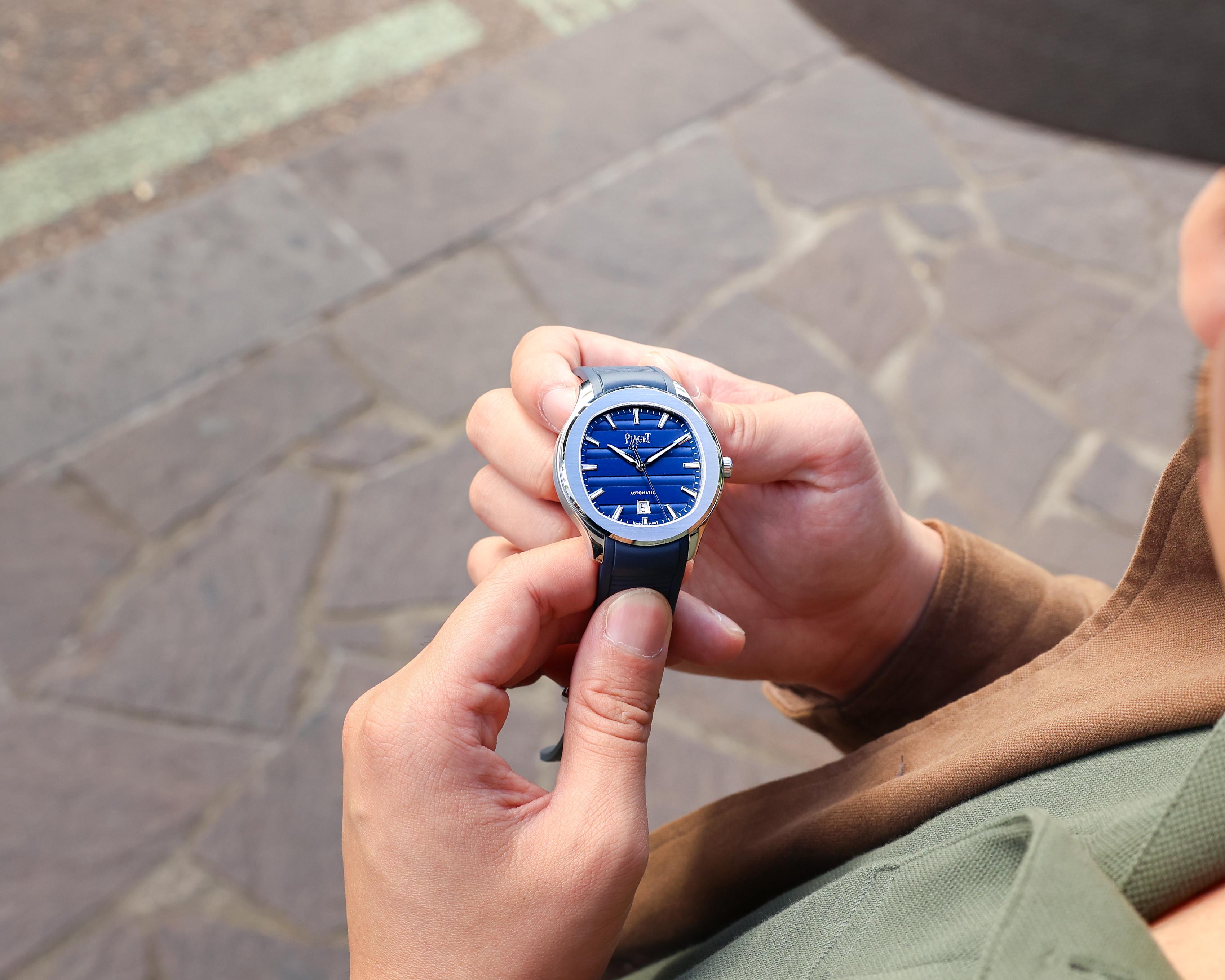
Piaget’s released a new iteration of their Polo Signature Date, but does it truly embody the brand’s modern creative vision? Let’s find out! What We Love: Shapely, wearable case More distinct dial & identity The rubber strap – still comfortable! What We Don’t: Crown feels slightly small Dead zone when changing times Is it finally recognisable? Overall Rating: 9.25/10 Value for Money: 9/10 Wearability: 9.5/10 Design: 10/10 Build Quality: 8.5/10 For as much as I love watches for their design, technology, or daring in either field, recognition must be recognised as one of the most important elements of a watch brand’s arsenal. When a watch brand goes ‘mainstream’ within the enthusiast community, it brings with it a significant amount of power within the watch world. But it’s usually easier said than done; scant few brands have managed to capture the attention of both hardcore enthusiasts and luxury lovers at the same time. Piaget is a brand that has perennially clung to the fringes of that audience. In the past, they hadn’t been able to tap into the enthusiast crowd with the same level of magnitude as some of their peers in Richemont. While one can easily point the finger towards characteristics like ultra-luxury and exclusivity, it hasn’t stopped other brands of a similar calibre from breaking through. So if not that, then what? Perhaps it’s due to a lack of distinctive visual identity, which in recent years has begun to change. While fans of the ...

Seiko Revisits the 1913 Laurel With New Enamel and Urushi Presage Models HCC005 and HCC006 WatchRider
Seiko Revisits Aug 13, 2026

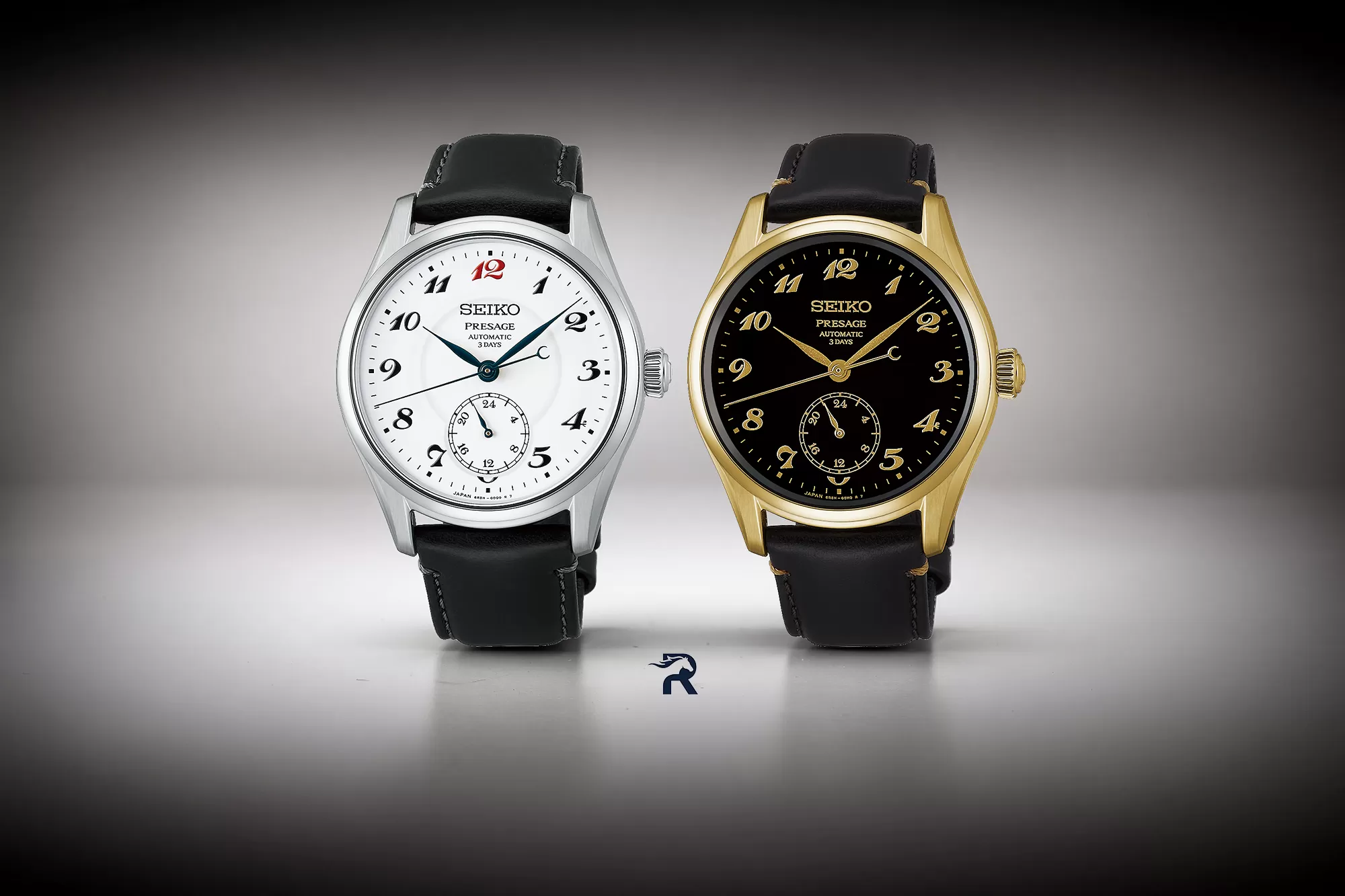
Seiko Revisits the 1913 Laurel With New Enamel and Urushi Presage Models HCC005 and HCC006

Seiko has introduced two new Presage Classic Series Craftsmanship watches that return to one of the most important designs in its history. The HCC005J1 uses a handmade white enamel dial while the HCC006J1 takes a darker route with black Urushi lacquer and a yellow-gold-coloured case. Both were announced on 13 August 2026 and are scheduled to reach Seiko boutiques and selected retailers in September 2026. These are not simple colour changes. Each model uses a traditional Japanese dial technique and each has its own character. The white version is the clearer tribute to Seiko’s original Laurel wristwatch from 1913. The black model keeps the same basic layout but changes the mood completely through lacquer, gold details and a warm case finish. A Return to the 1913 Laurel The Laurel is important because it was Japan’s first wristwatch. Its white enamel dial, expressive Arabic numerals and red 12 became a clear visual signature. Seiko has used those details before, but the HCC005J1 brings them together in a convincing modern package. The red numeral at 12 immediately catches the eye while the curved black numerals and blue hands keep the design easy to recognise. The new watches also add a 24-hour display at six o’clock. It gives the dial a little more depth without disturbing the balance of the numerals. This is not an independently adjustable second-time-zone function. It follows the main time and shows whether the watch is indicating the first or second half of the day...

Albishorn Just Expanded its Marinagraph Collection With Two Ultra-Classic Colorways Worn & Wound
Albishorn Just Expanded Aug 13, 2026

Albishorn Just Expanded its Marinagraph Collection With Two Ultra-Classic Colorways

It wouldn’t be summer without a proper skin diver or regatta timer, or how about both? Roughly one year ago, we got the latest reimagining from Albishorn, giving us a mash up of two seafaring classics with the brand’s signature vintage-inspired spin. The result was the Marinagraph, originally offered in two colors, one with a sunburst black dial with lume-filled applied silver indices called the “Classic Racing” and one with a bolder sunburst Paraíba tourmaline green dial with lume-filled black indices called the “Paraíba Racing.” The Classic Racing variant got its own pops of color with green accents on the bezel along with a red strap highlighting the red accents seen across both versions in the chronograph hand, tide indicator, regatta timer, and model name printed beneath the brand name in retro script. Needless to say, the debut duo of Marinagraph Classics offered an audacious combination of styling and functionality. This summer, Albishorn presents another pair of colors to join the collection, this time with a slightly more classic and sober design, aptly named the Classic Fume and simply the Classic. As a refresher, the foundation of the Marinagraph design draws inspiration from the America’s Cup crews, in particular those in the race’s renaissance. The 1958 edition marked the race’s return after a long hiatus post-war, and one of the standout vessels was Columbia, the American yacht representing the New York Yacht Club. This vessel notably feat...

Hands On: Patek Philippe Calatrava Ref. 5227G-015 “Rose Gilt” SJX Watches
Patek Philippe Calatrava Ref 5227G-015 “Rose Aug 11, 2026

Hands On: Patek Philippe Calatrava Ref. 5227G-015 “Rose Gilt”

Patek Philippe’s headline launches this year included the surprising Celestial ref. 6105G and Nautilus 50th anniversary editions, but also more classical, yet under-the-radar, watches, like the Calatrava ref. 5227G-015 with a “rose-gilt” dial and hinged case back. Though the Calatrava ref. 5227 with its distinctive “officer’s case” has been in the catalogue for well over a decade, the latest iteration is the best yet. The combination is somewhat formulaic – “salmon” dial and white gold case – but it is good looking and evocative of old-school Patek Philippe dress watches. At the same time, this new variant of the ref. 5227 contains a latest-generation automatic movement. Initial thoughts Ironically two of the standout launches by Patek Philippe during Watches & Wonders were fairly basic, essentially facelifts of references that have been in the catalogue for decades. One was the ref. 5396R-016 Annual Calendar, and the other is this, the Calatrava ref. 5227G-015. Though both are entirely different in function and price, they are similar in style. The designs are both restrained and evocative of vintage Patek Philippe watches; both also have dials in popular shades. “Salmon” is definitely overdone as a dial colour, but it doesn’t stop this Calatrava from being really appealing. The ref. 5227 is typical Patek Philippe in form. Even though it’s at the larger end of the range for Calatrava models, it still feels elegant. The case is thin and sits fla...

Arcanaut Introduces Fordite 2.0, Now Fully Customizable Worn & Wound
Ming Aug 10, 2026

Arcanaut Introduces Fordite 2.0, Now Fully Customizable

Arcanaut, the Scandinavian indie known for their innovation with and unusual use of uncommon dial materials, has announced a major update to their signature watch. The Arc II Fordite, a personal favorite of mine and a watch I’ve proudly owned for a number of years, has been rethought as a bespoke piece, customized by each individual owner in a number of ways. Some of the options available feel like natural evolutions for the line based on a number of things we’ve seen from the brand in recent years across other projects, but a few are genuinely surprising.  When purchasing an Arc II Fordite from Arcanaut directly, the customer is brought to their Fordite Configurator, which first asks for their choice in dial. This, of course, is the heart of a Fordite watch as every dial is inherently unique (they are made from paint drippings from American auto factories). Prospective owners have always been able to choose their dial of course, but the watches have been sold as finished products. The new process centers the dials and the surprising ways they vary in appearance, and asks customers to think about how best to complement it.  The most welcome new development in the new Fordite process is the ability to pick from multiple cases. A total of four options are available, in “Standard” and “Skeleton” varieties, coming in at 40.5mm (the original size) or a new 37mm diameter. A smaller size should be exciting news to many as the 40.5mm case can wear quite a bit larger ...

Hands-On: The New TAG Heuer Monaco Returns To Its 1969 Roots WatchAdvice
TAG Heuer Monaco Returns Aug 7, 2026

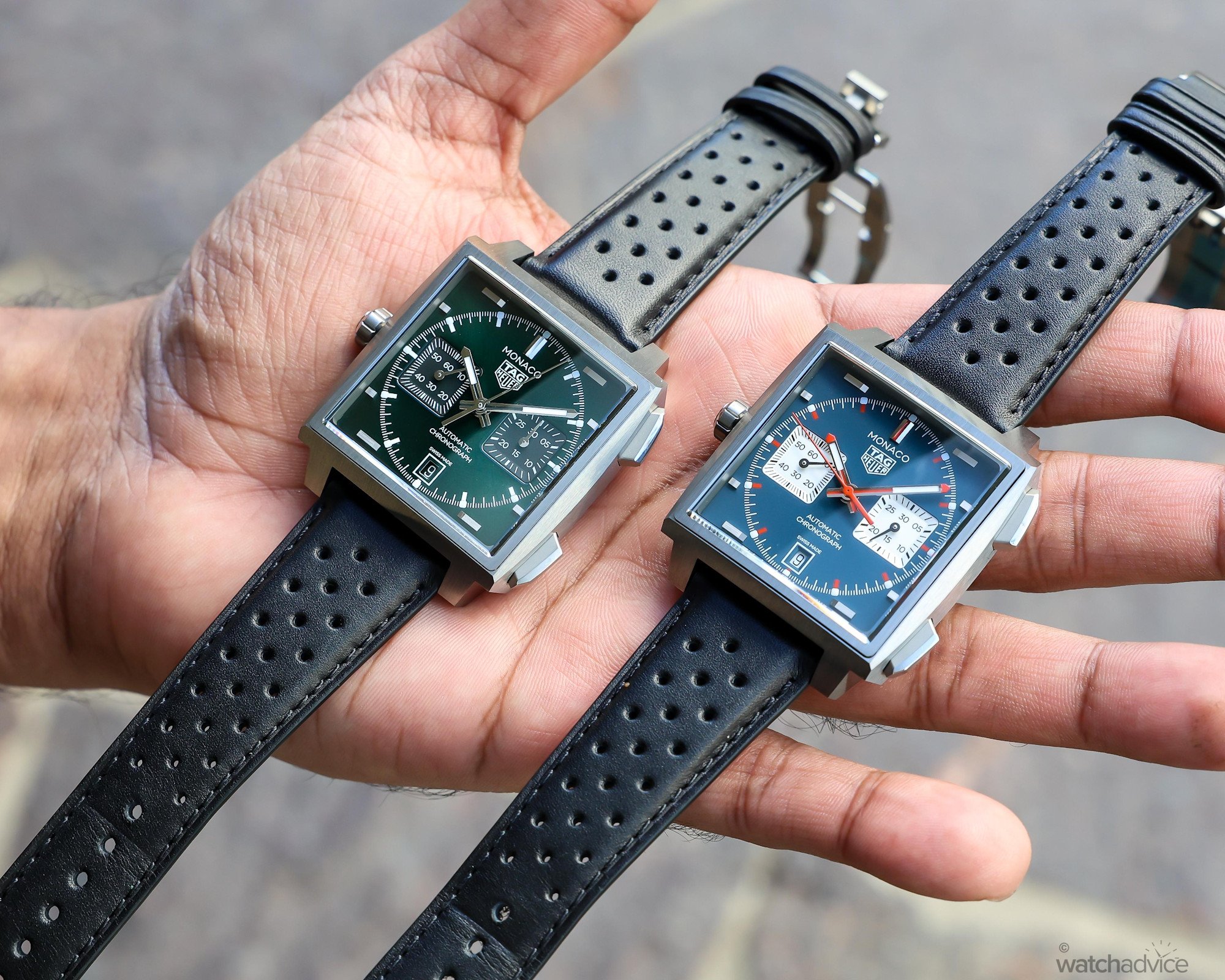
Hands-On: The New TAG Heuer Monaco Returns To Its 1969 Roots

I take the new TAG Heuer Monaco Chronographs in blue and green for a hands-on review to see how this watchmaking icon has evolved for a new generation! What We Love: Improved ergonomics for slimmer wrists Distinctive dial colours with different personalities Substantially upgraded TH20-11 movement What We Don’t: Limited strap options Square case still wears large 13.9mm thickness remains noticeable Overall Rating: 8.7/10 Value for Money: 8.8/10 Wearability: 8.5/10 Design: 8.7/10 Build Quality: 8.7/10 Few watches in the world of horology are as instantly recognisable as the TAG Heuer Monaco. Even more than five decades after its introduction, the iconic timepiece’s square silhouette remains one of its most distinctive features. If you aren’t familiar with the story of the Monaco, it was first introduced in 1969—and it has quite the story behind it. The Monaco arrived during one of watchmaking’s most defining technical contests: the development of the first automatic chronograph. The birth of the Monaco was closely linked to the Calibre 11 movement, which was developed through a collaborative effort between Heuer, Breitling, Hamilton-Büren and chronograph specialist Dubois-Dépraz. The Calibre 11 was essentially part of a movement “race” against Zenith’s El Primero Calibre 3019 PHC and Seiko’s Calibre 6139. The new generation of TAG Heuer Monaco Chronographs presented in blue and green dials. Jack Heuer, who was one of the driving forces behind the Cal...

Hands On: Breguet Classique Tourbillon Sidéral SJX Watches
Breguet Classique Tourbillon Sidéral Aug 7, 2026

Hands On: Breguet Classique Tourbillon Sidéral

The Tourbillon Sidéral debuted last year to mark Breguet’s 250th anniversary. This year, the brand is celebrating the 225th anniversary of its founder’s best-known achievement: the tourbillon. For this occasion, Breguet released a quartet of new references, among them the Classique Tourbillon Sidéral ref. 7255PT, a 50-piece limited edition in platinum, once again featuring an in-house aventurine enamel dial. Initial thoughts Despite being the brand’s first-ever flying tourbillon, the Tourbillon Sidéral feels somewhat familiar. That’s because its cal. 187M1 is derived from the brand’s original wristwatch tourbillon movement, the cal. 558, released in 1989. That explains the familiar off-centre dial arrangement and full-plate architecture visible through the case back. Within this lineage, the Tourbillon Sidéral can be considered the spiritual heir and technical successor to the Classique Tourbillon Messidor 5335 released 2007, a watch that seemed to suspend its tourbillon in mid-air. In fact, this mystery tourbillon was driven by a sapphire crystal drive wheel, and its upper pivot was supported by a sapphire crystal bridge. The Tourbillon Sidéral elevates this concept to its natural conclusion, dispensing with the upper support bridge entirely, resulting in a true flying tourbillon. Unfortunately, the two-armed tourbillon cage itself spans almost the entire width of the opening, and at times resembles an upper support bridge, at least until the eye registers ...

Hands-On: Laps Leaps into New Territory with the Arche, their First Mechanical Model Worn & Wound
Aug 6, 2026

Hands-On: Laps Leaps into New Territory with the Arche, their First Mechanical Model

What started as a fashion watch brand a decade ago is making a leap into more traditional watchmaking territory. Laps has introduced its first mechanical model, the Arche as part of a new Studio Series. The collection consists of four iterations, two with simple textured dials and two that take on one of classic watchmaking’s key artforms: enamel. The dial is arguably the main focus of nearly all watches. It conveys the most pertinent information and serves as the aesthetic centerpiece. When French designer and art collector Antonin Mercie created Laps in 2016, he took the emphasis on the dial a step further – this would not just be the core focus of the watches but the core focus of the brand. Examples of watches from the Laps “Signature” collection The base of the original Editions models varies slightly but overall carries a vintage aesthetic hailing from the funky eras of 70s and 80s watchmaking. Both the Prima and the Signature cases are rectangular, with the former being slightly smaller and squarer at 28mm by 23mm and the latter slightly larger and more rectangular at 35mm by 26mm. Each is topped off with the option of a leather strap or bracelet whose design is aligned with the retro theme, mimicking a stretch bracelet in texture but presented in a traditional manner with a buckle closure. Powering the models in the Editions series are straightforward, time-only quartz movements. All of this lays the foundation for the star of the show – the dials – whi...